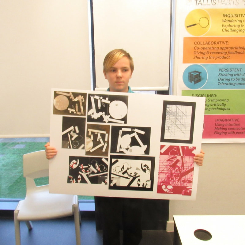
Summer abstraction photo shoot
First thoughts and research
For me the definition of abstraction is where something is toooooo common, very out of place or distorted or shaped in a weird way. The dictionary's definition is the quality of dealing with ideas rather than events or something which exists only as an idea.
but other places have it as an impractical idea; something visionary and unrealistic or Freedom from representational qualities in art or in other forms such as once we have recognised patterns in our problems, we use abstraction to gather the general characteristics and to filter out of the details we do not need in order to solve our problem.
but other places have it as an impractical idea; something visionary and unrealistic or Freedom from representational qualities in art or in other forms such as once we have recognised patterns in our problems, we use abstraction to gather the general characteristics and to filter out of the details we do not need in order to solve our problem.


|
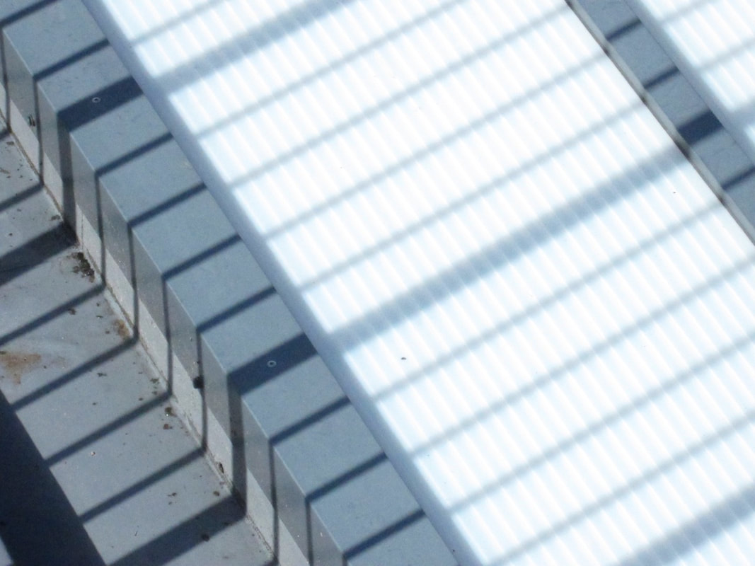
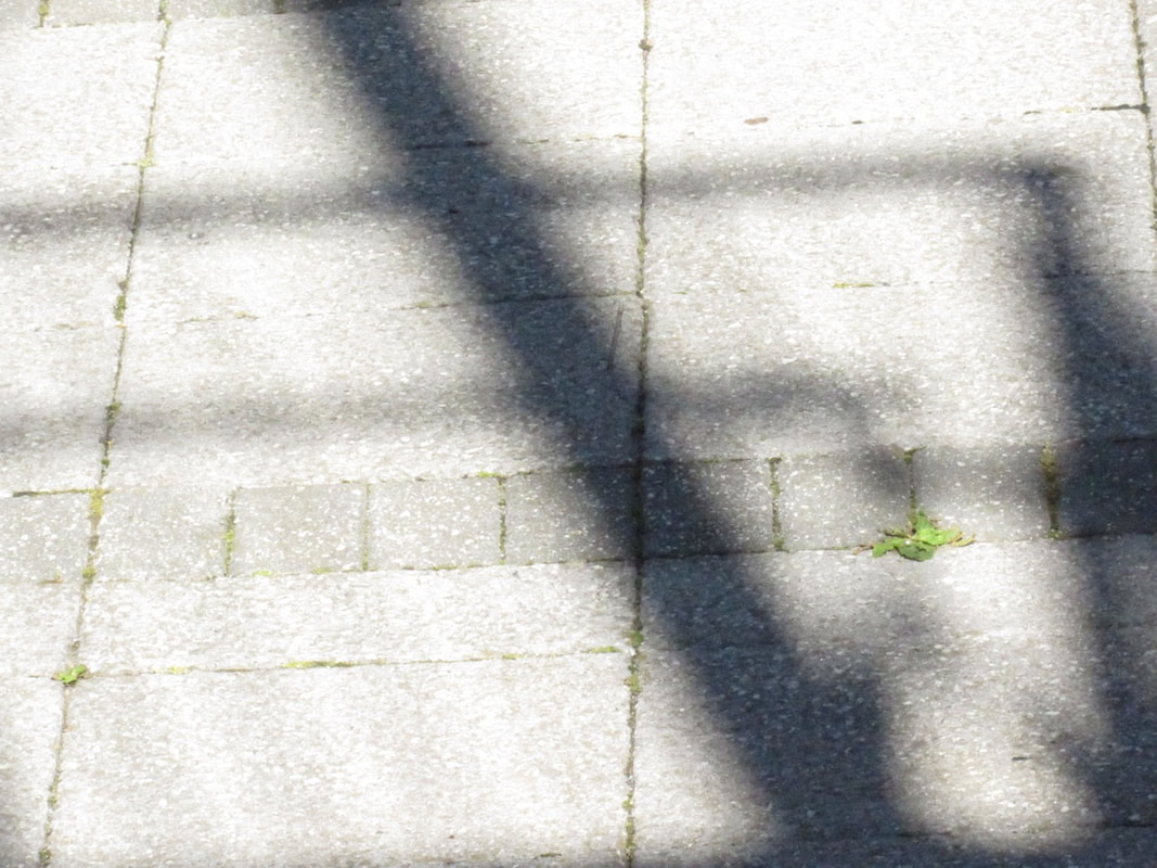
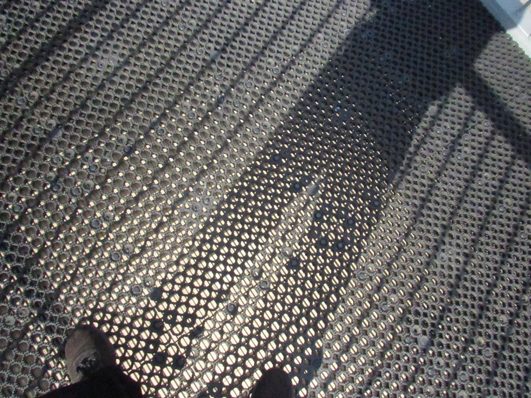
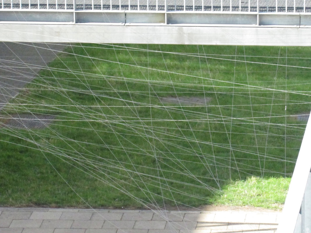
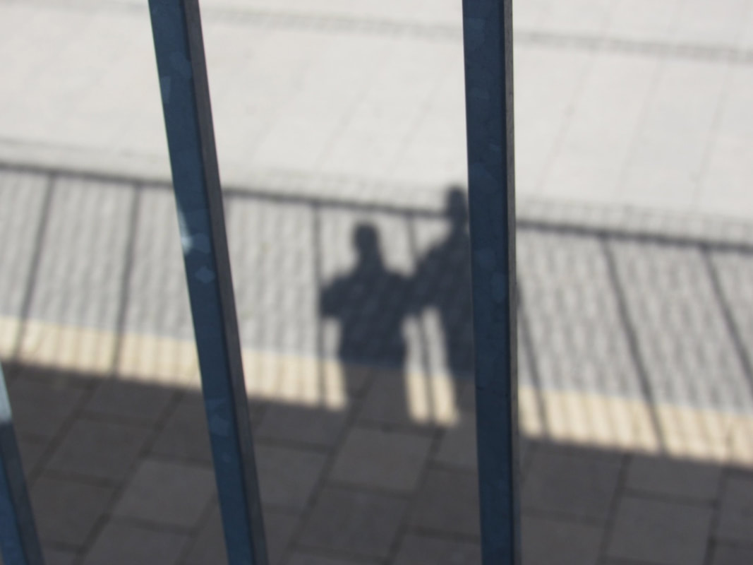
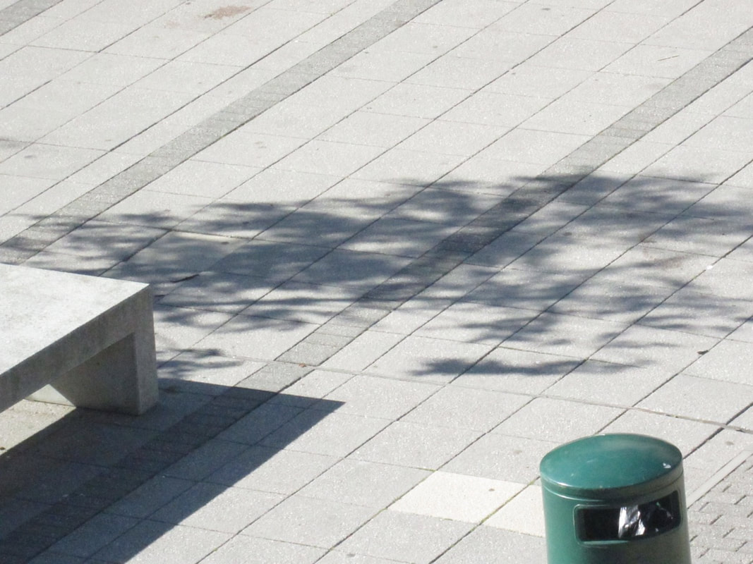
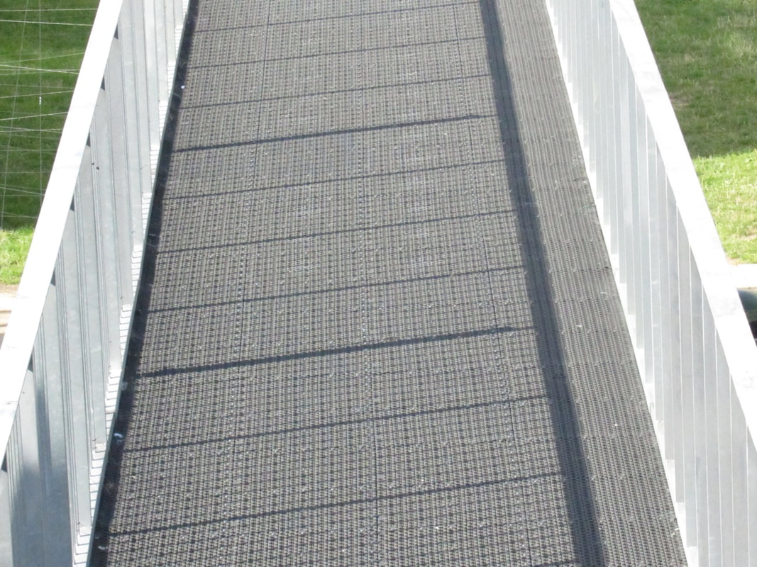
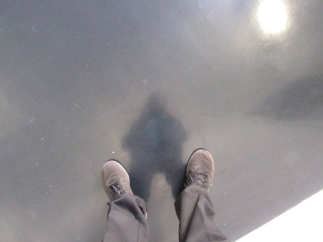
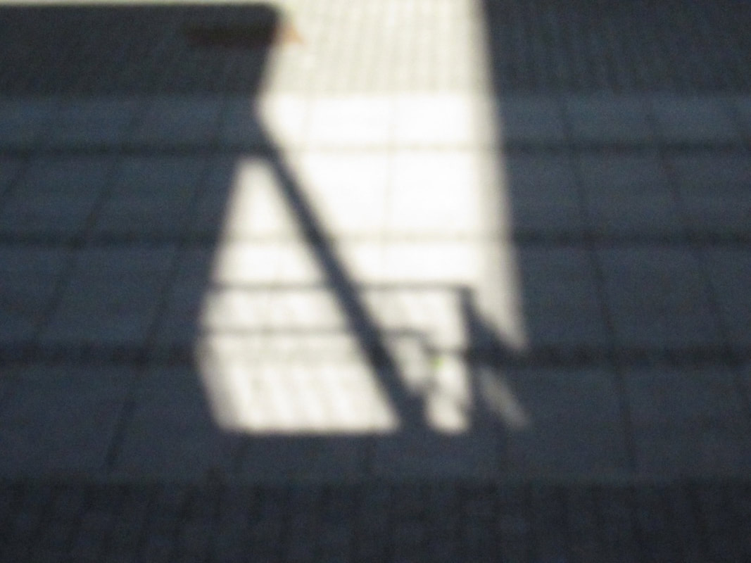
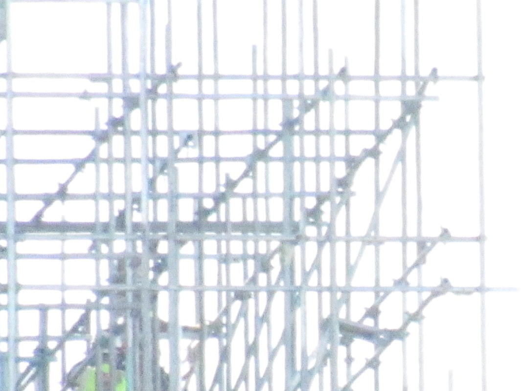
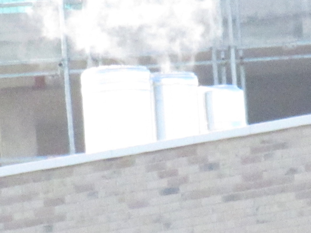
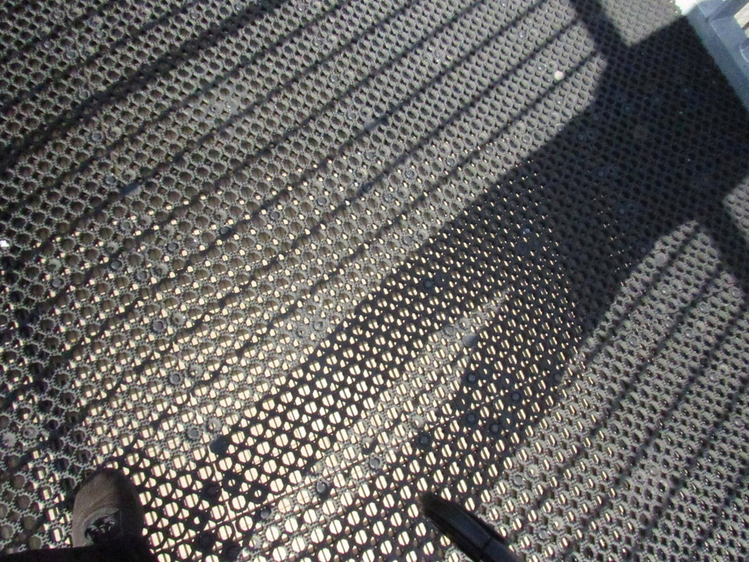
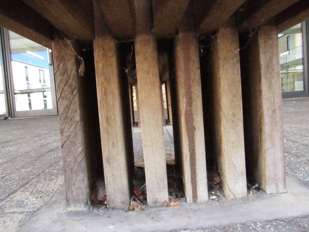
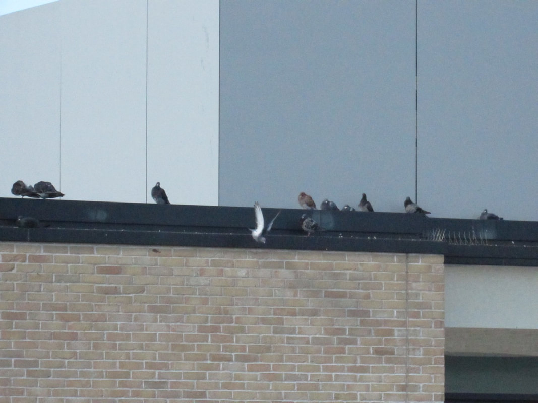
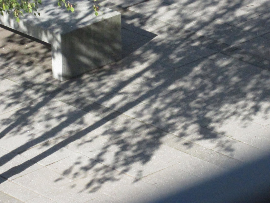
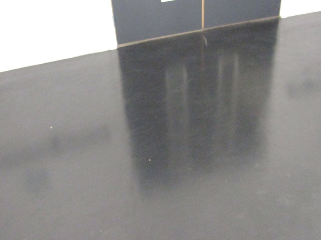
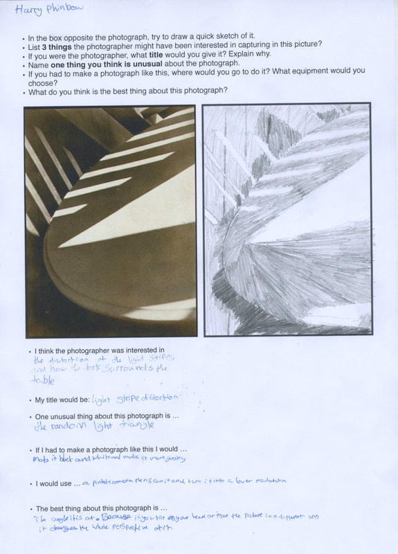
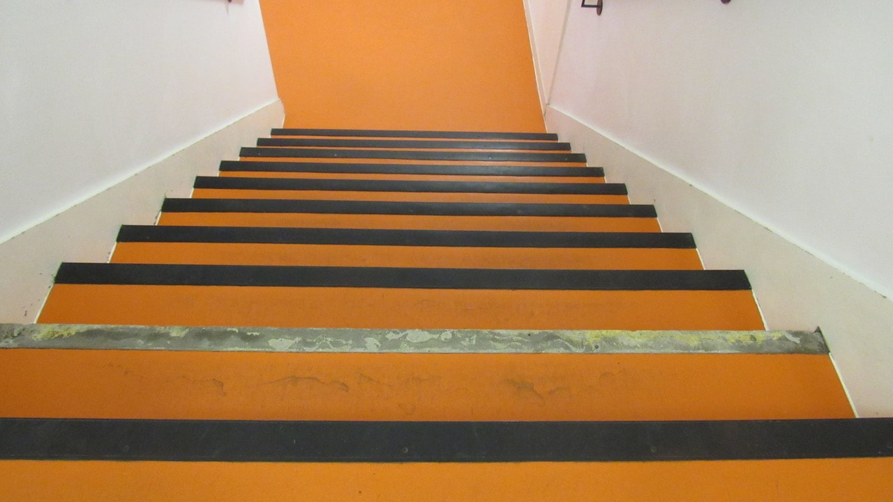
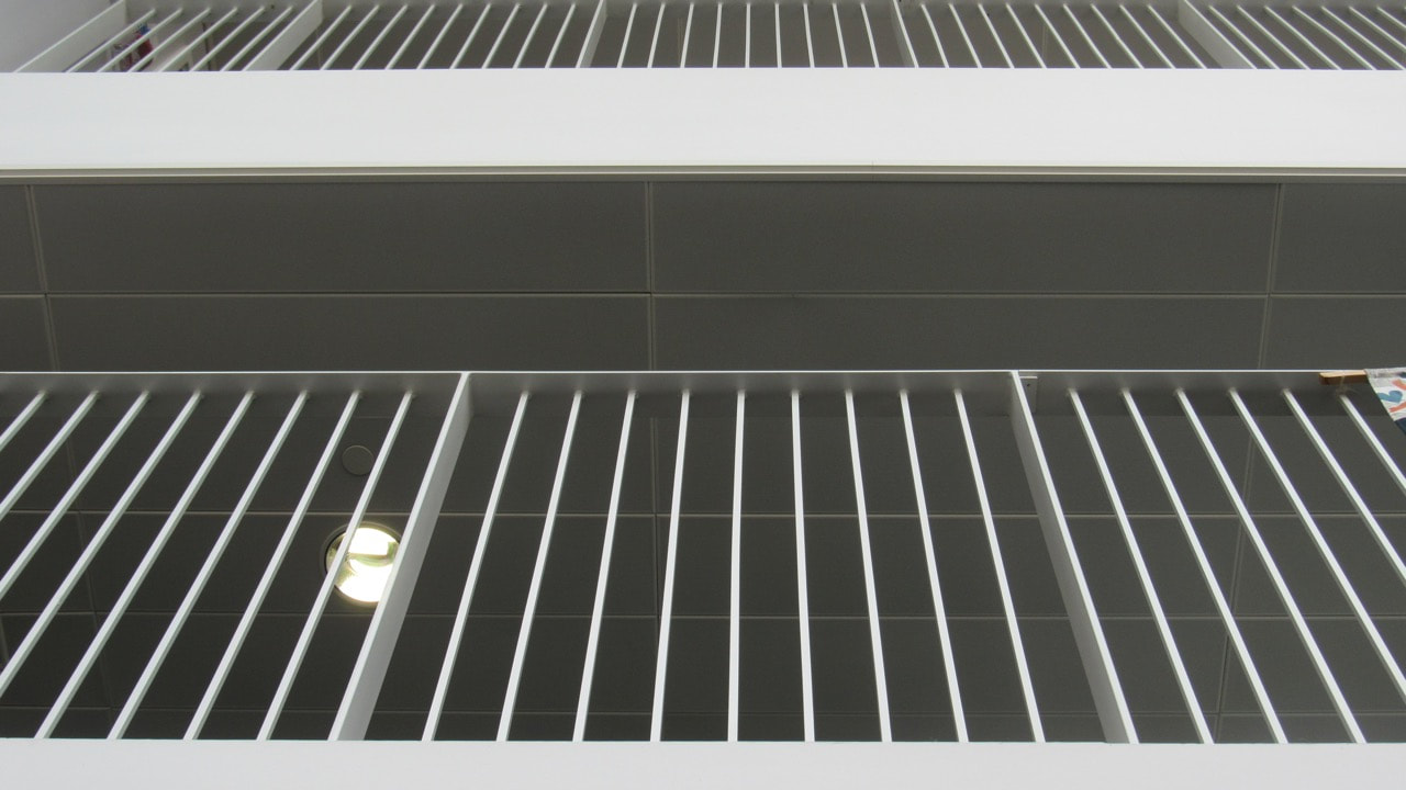
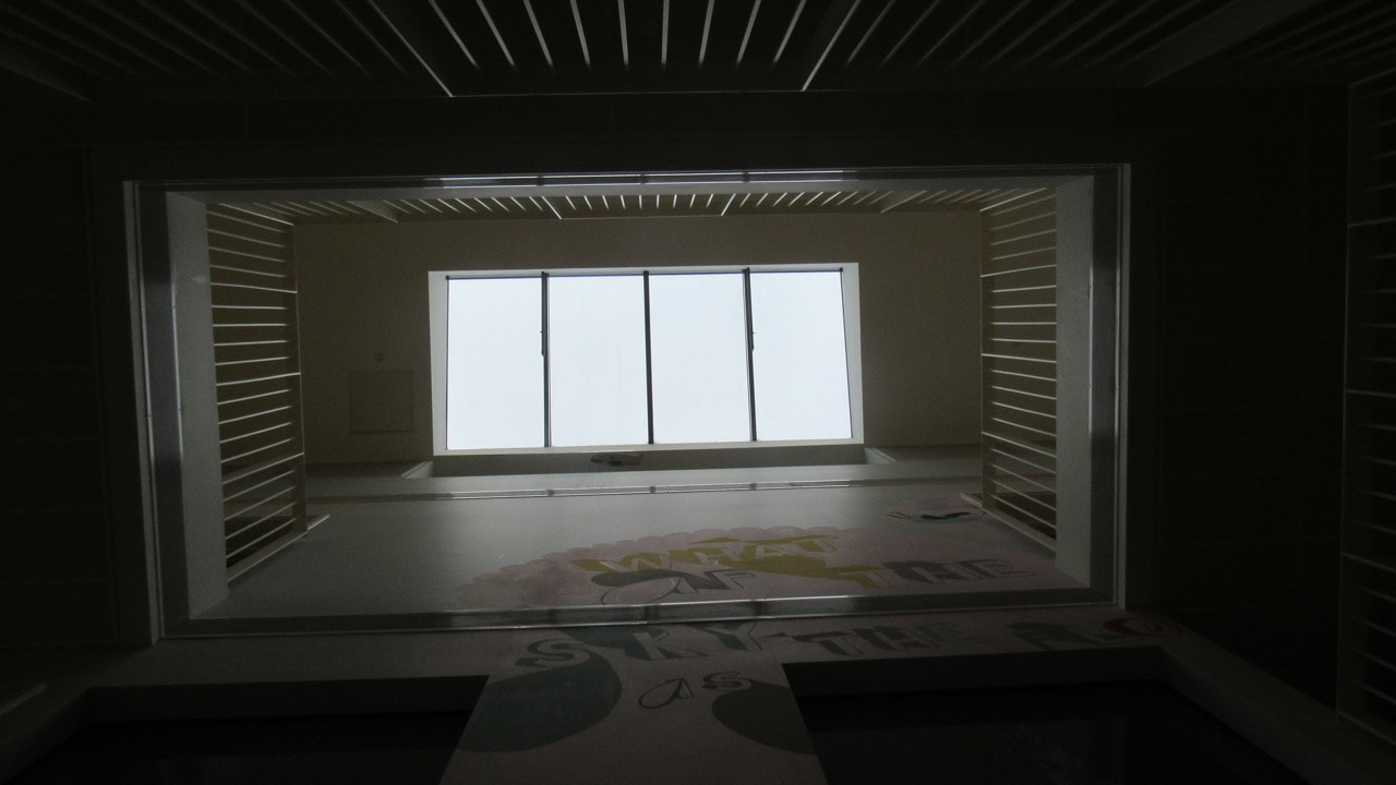
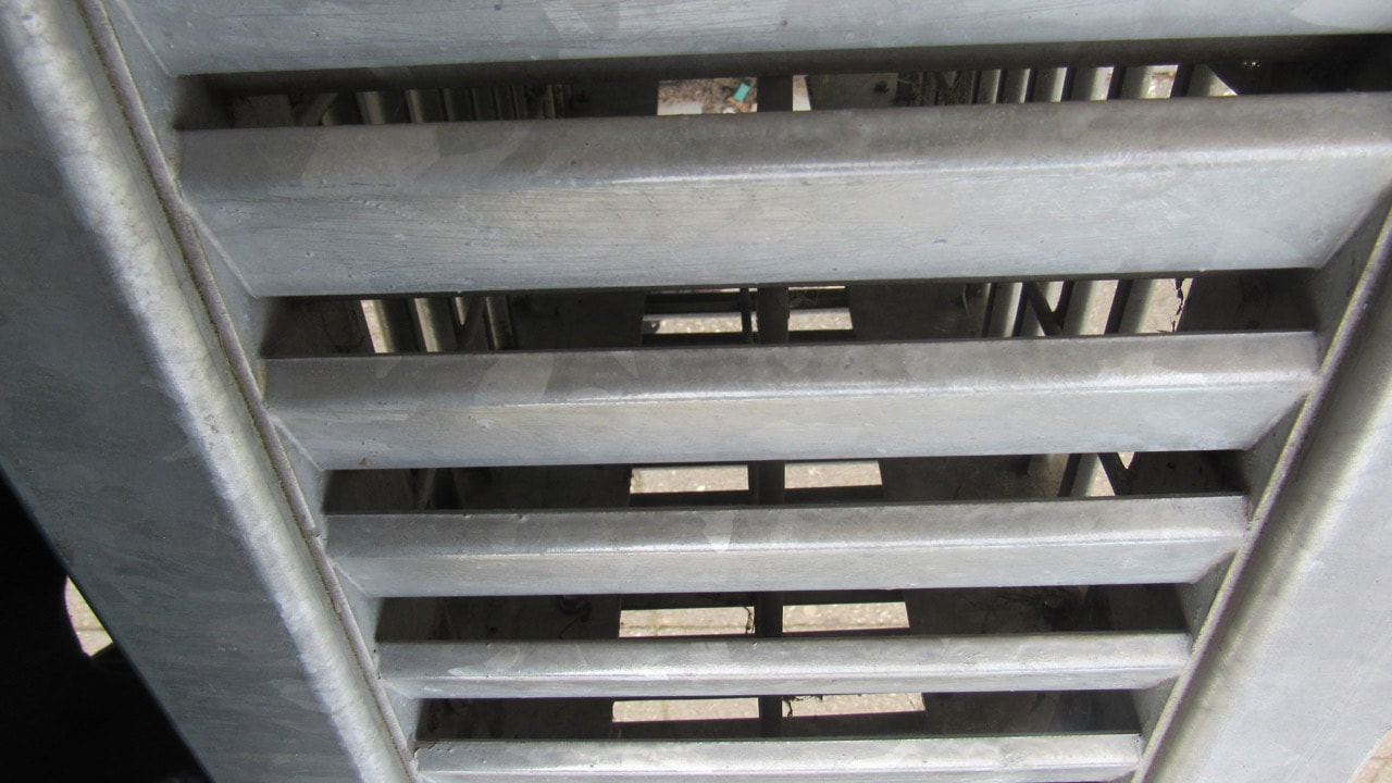
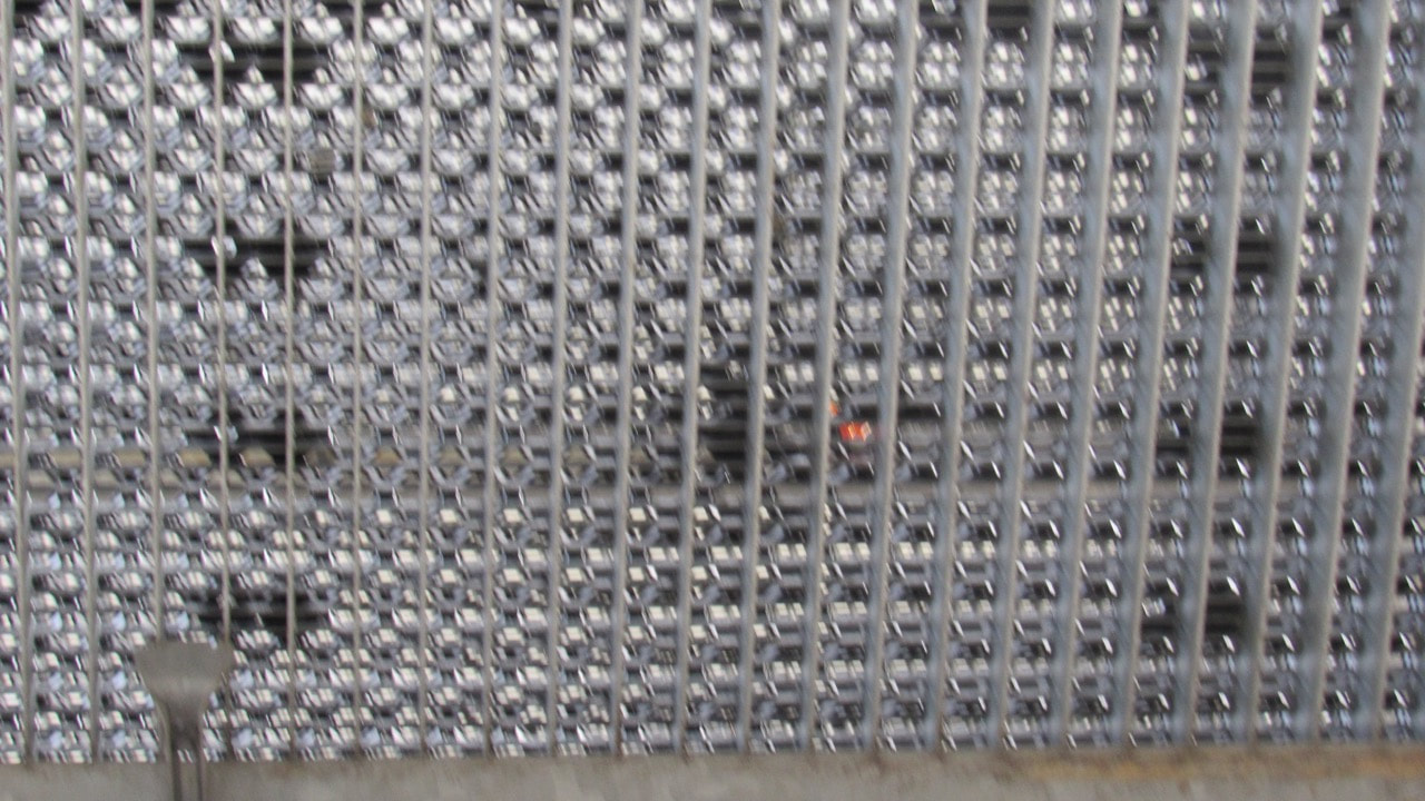
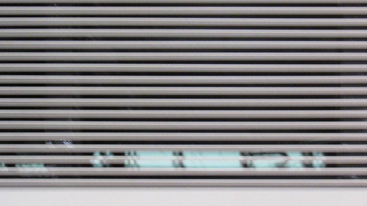
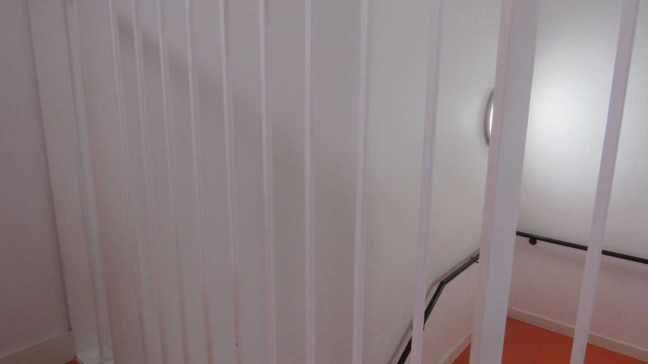
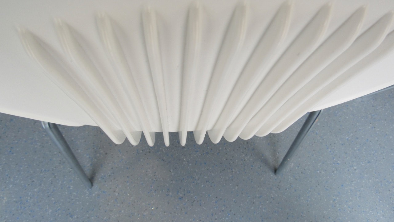
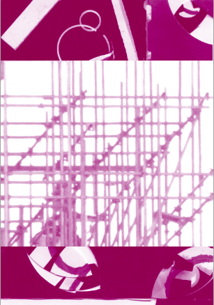
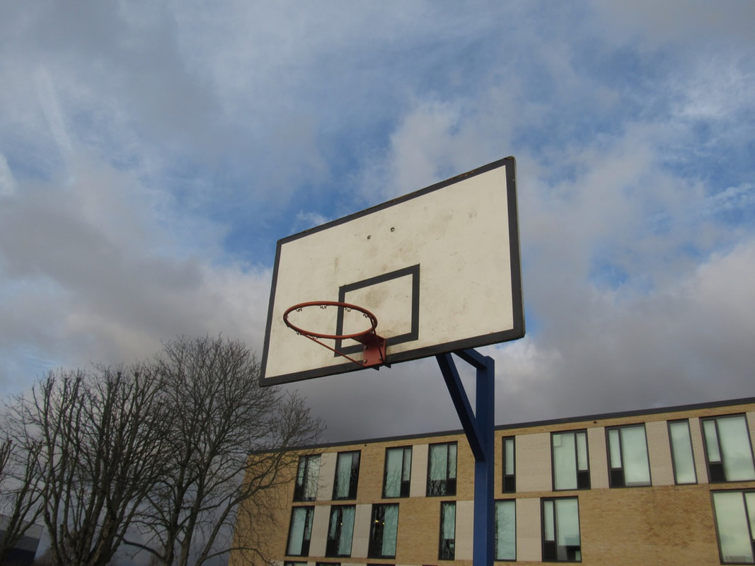
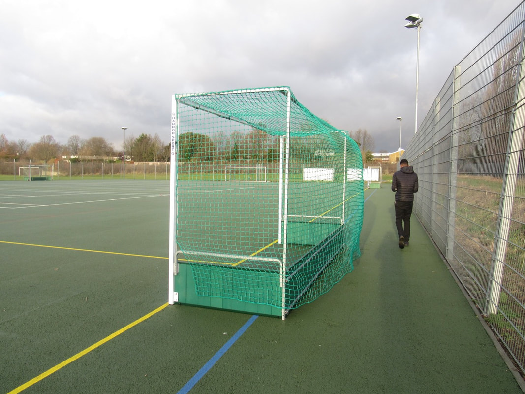
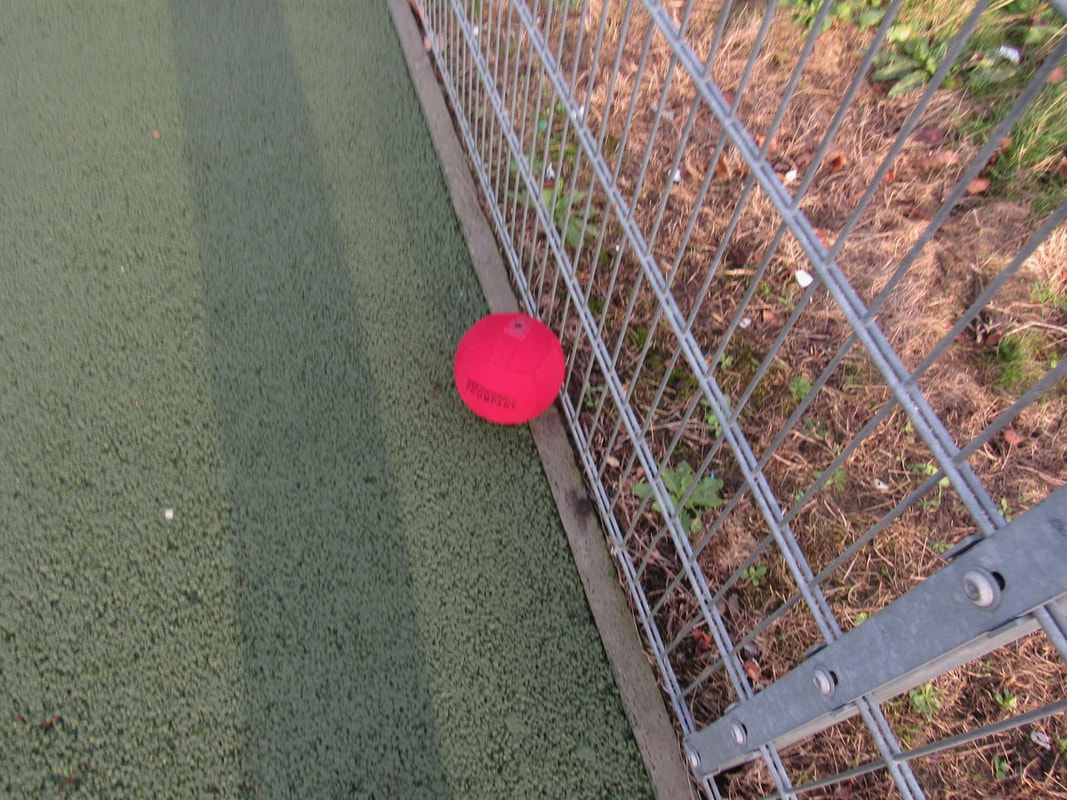
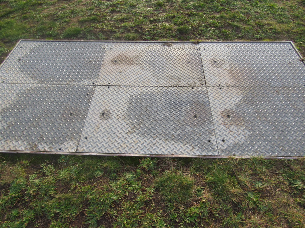
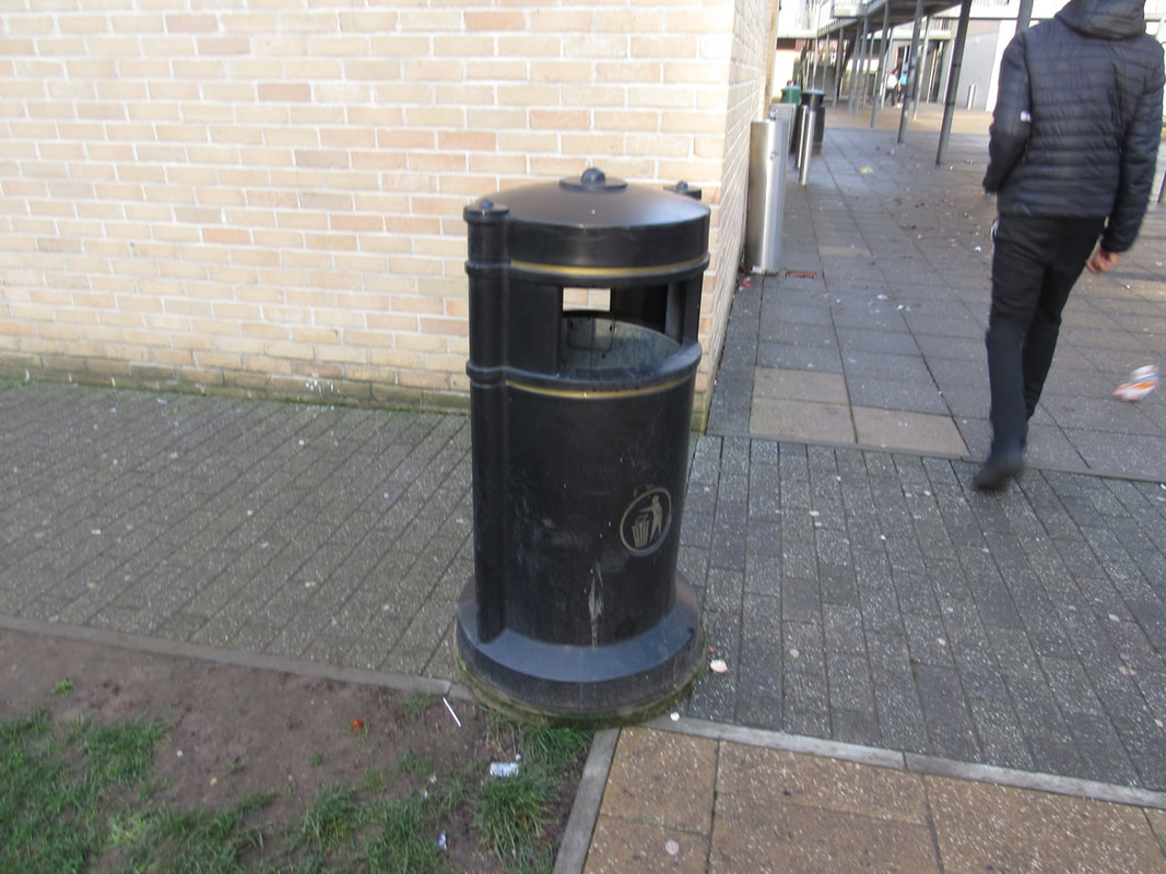
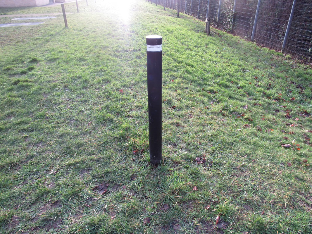
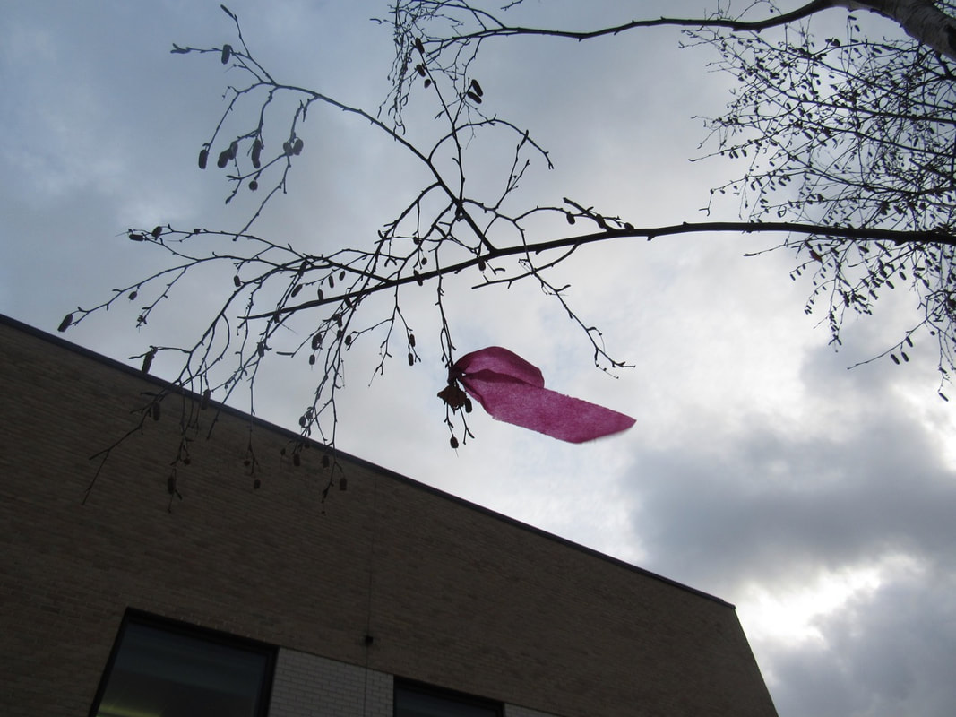
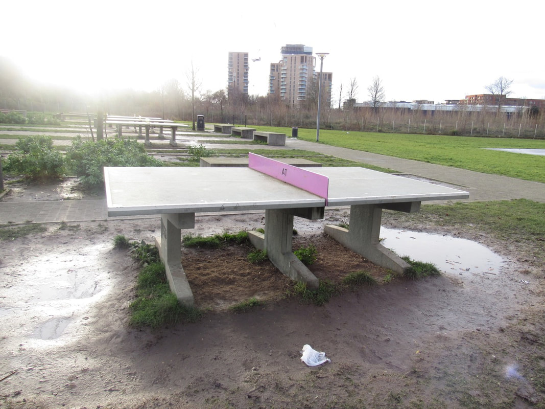
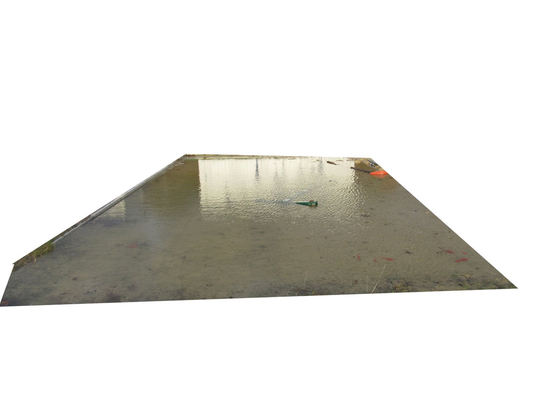
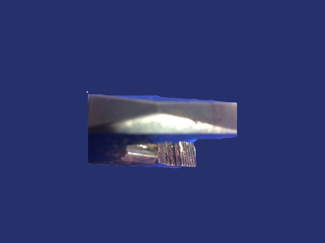
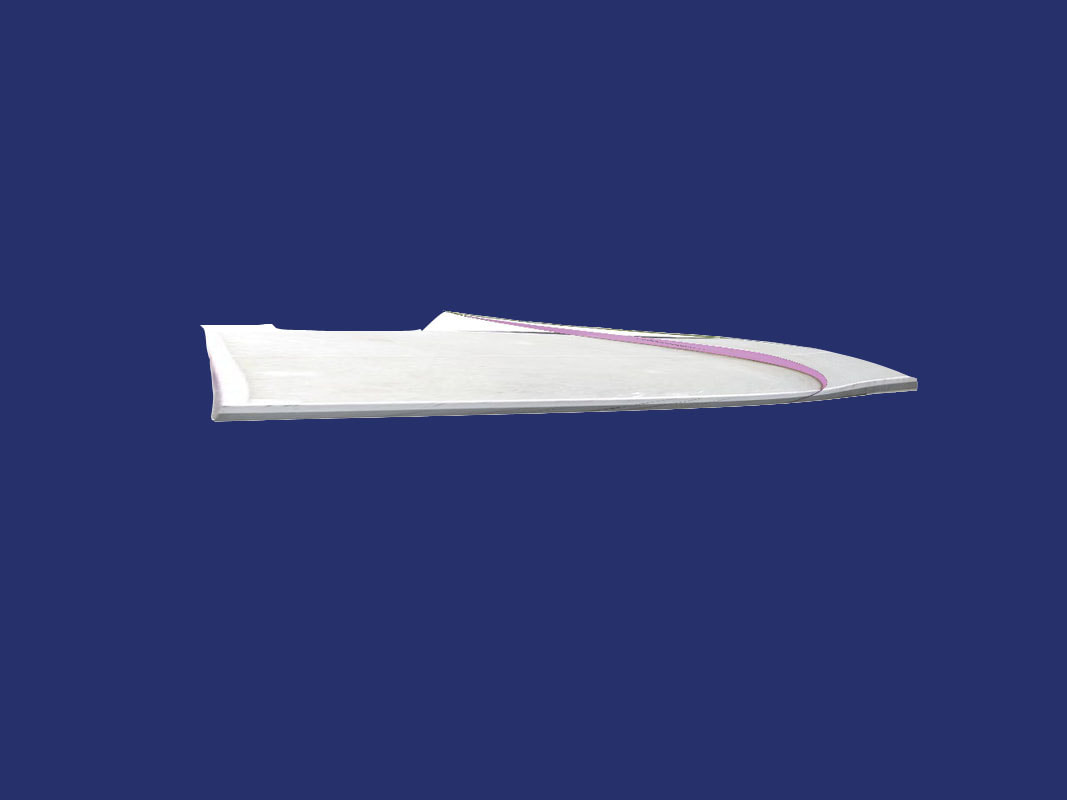
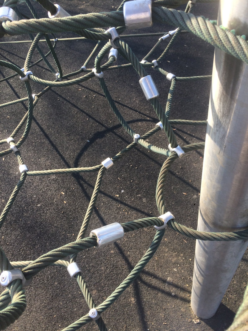
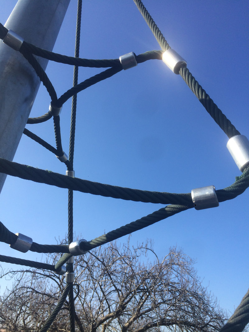
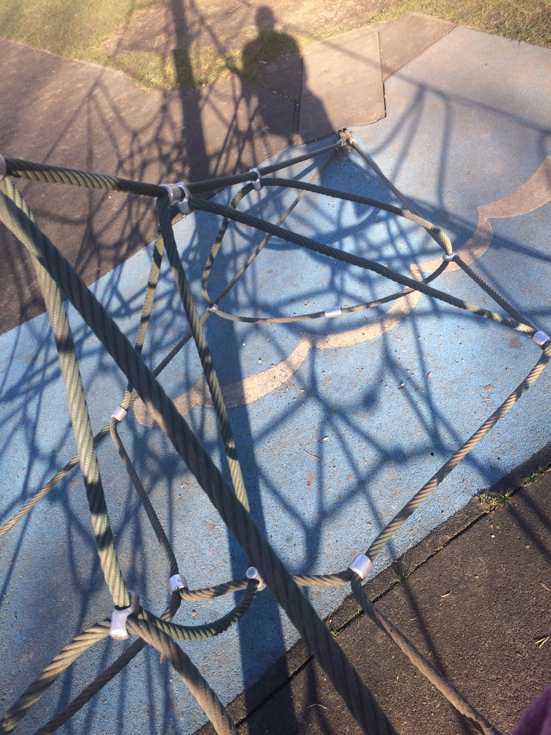
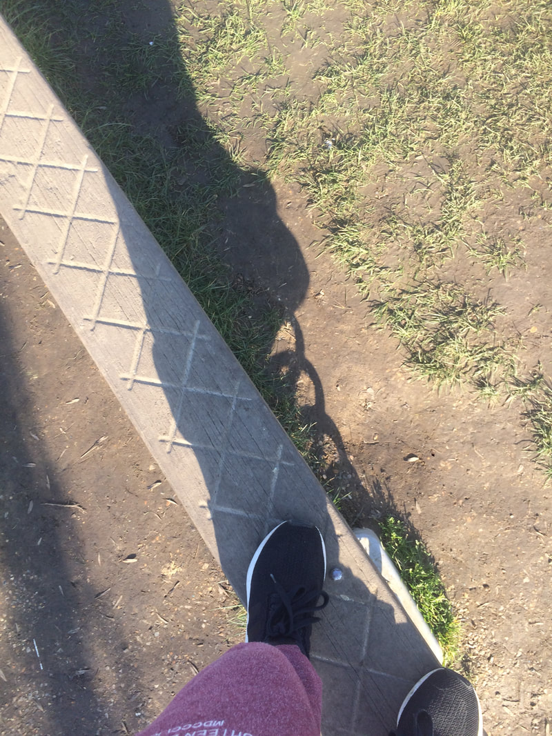
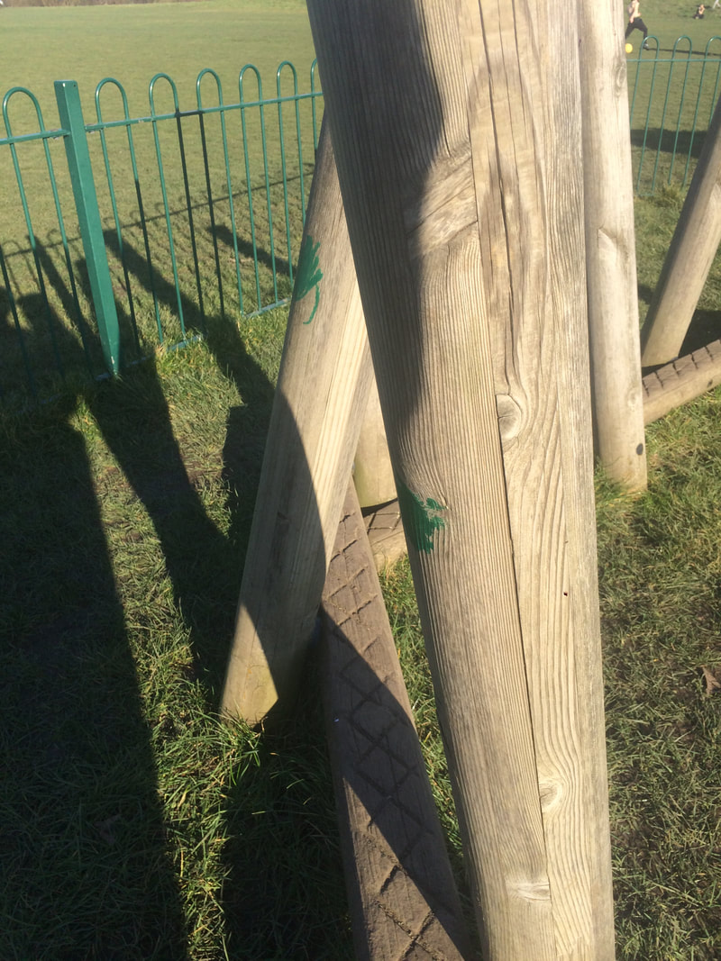
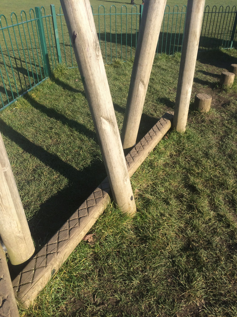
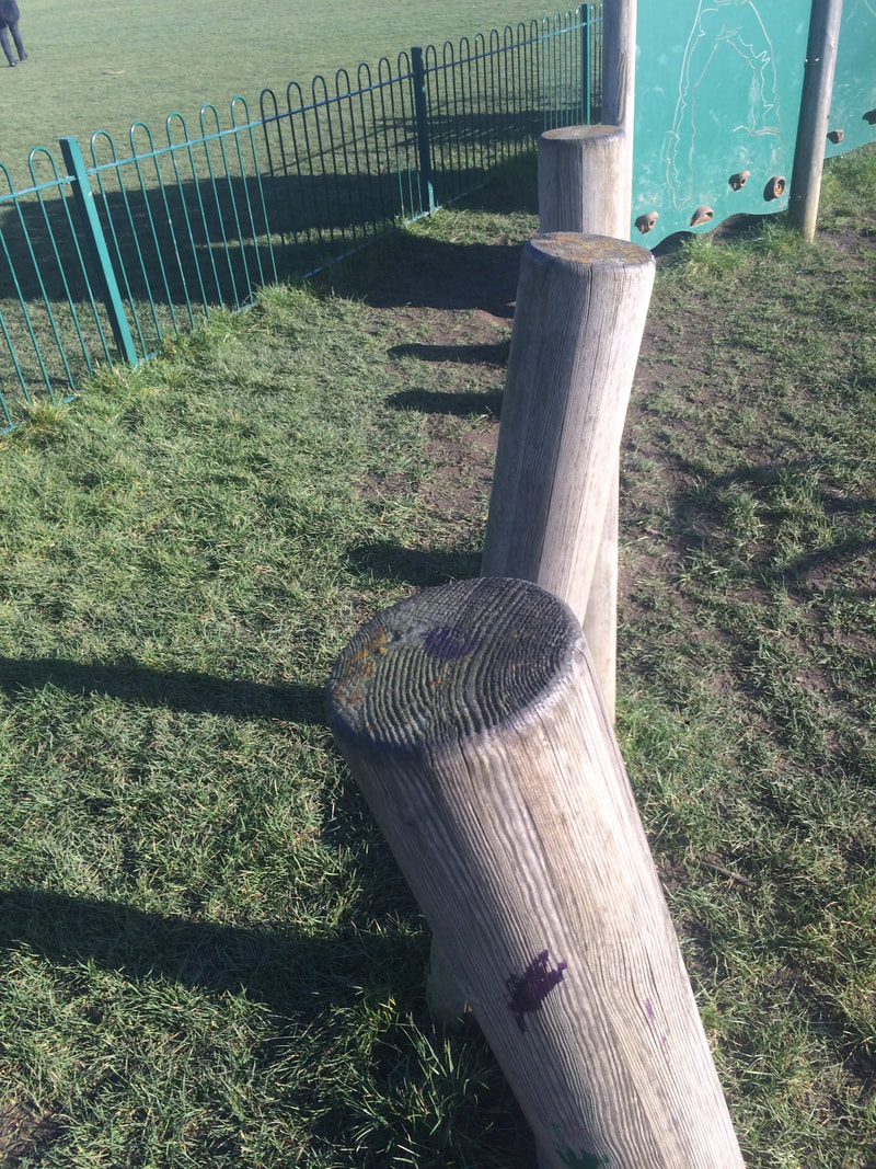
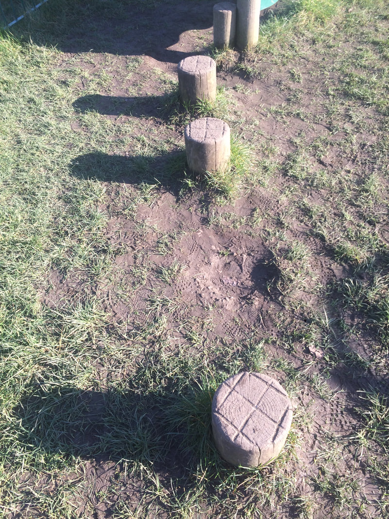
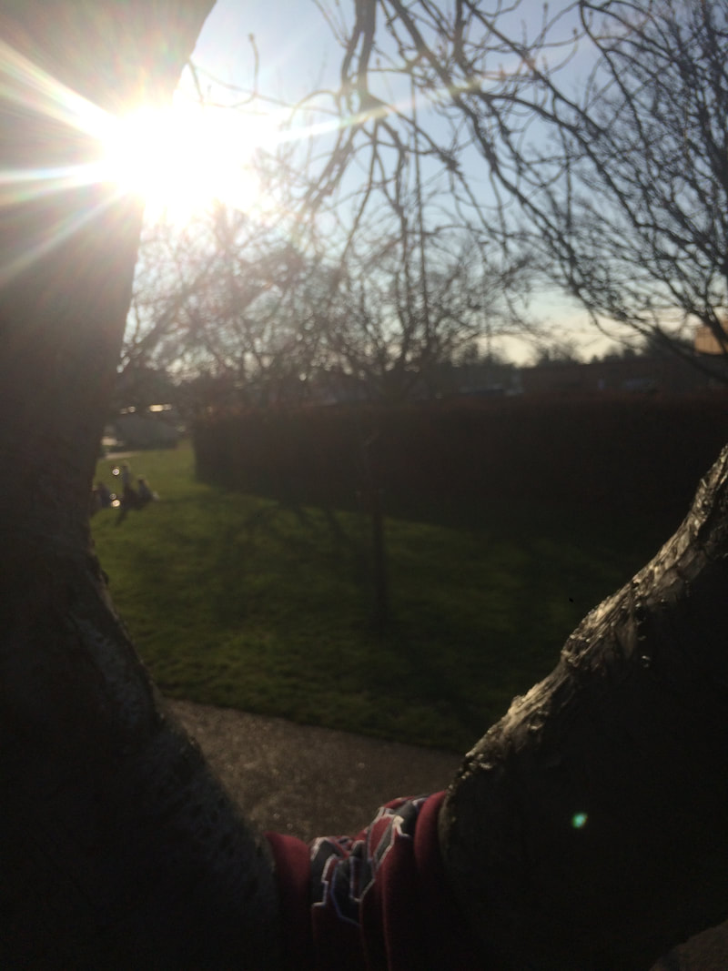
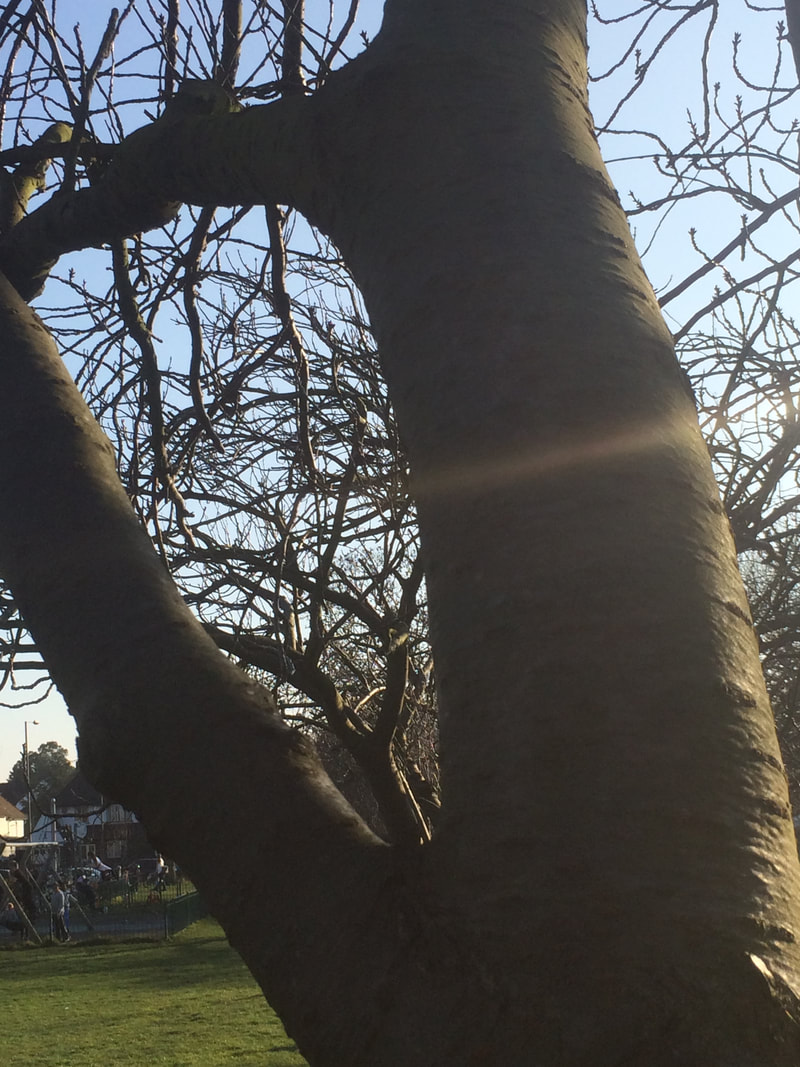
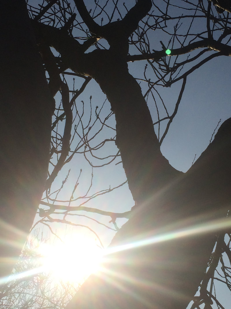
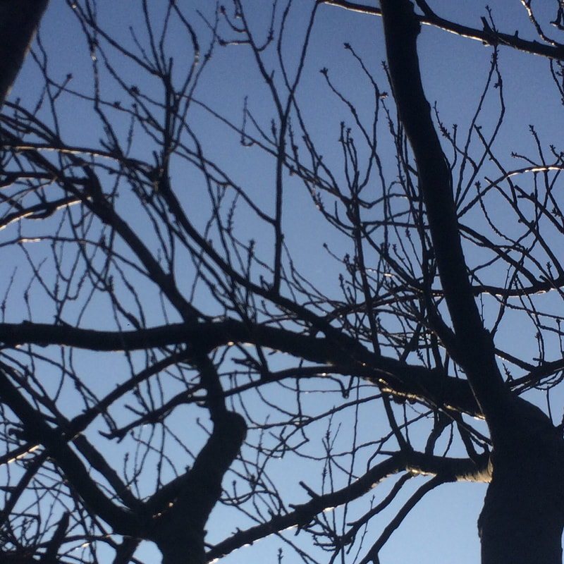
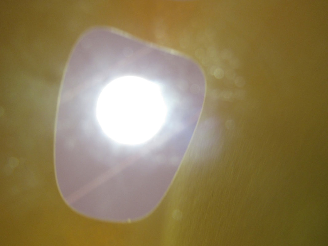
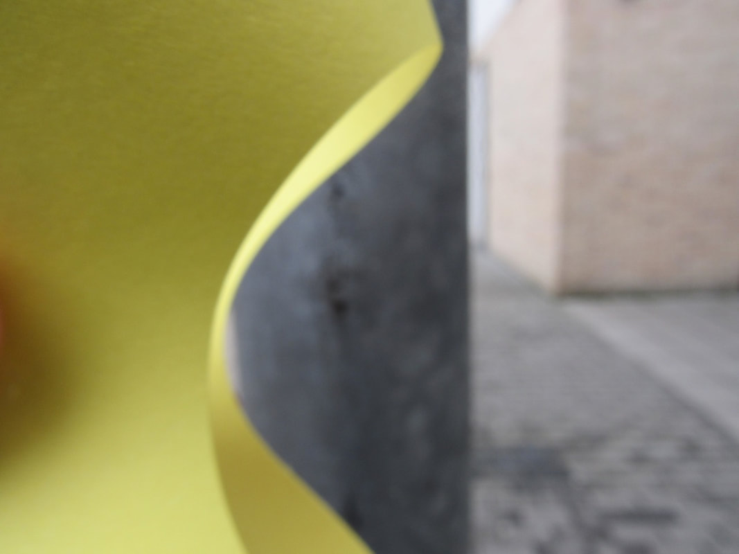
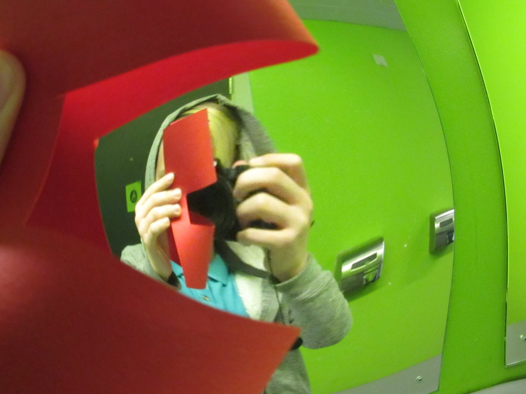
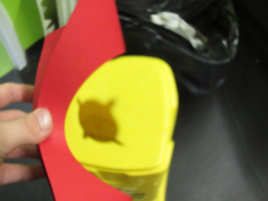
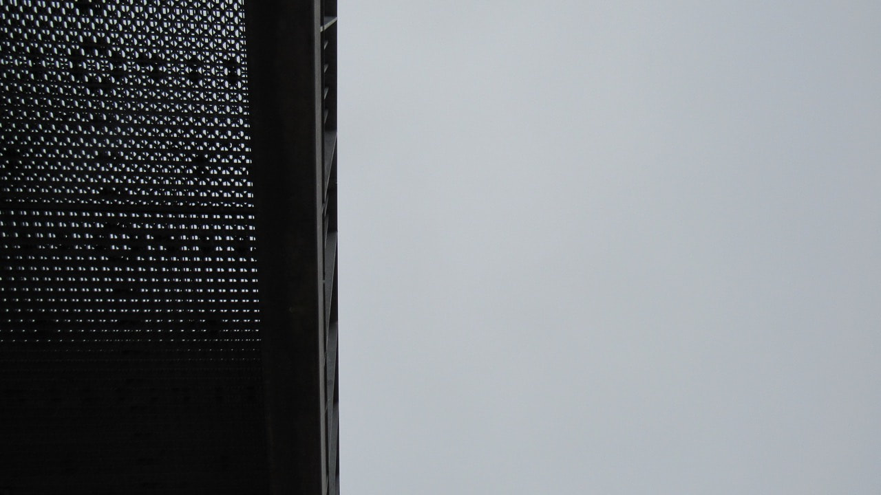
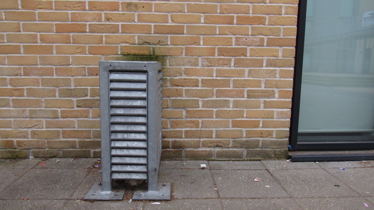
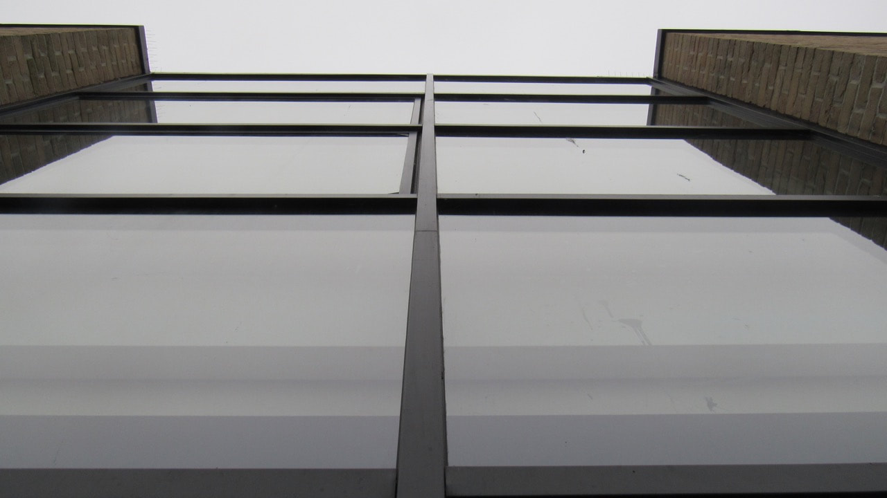
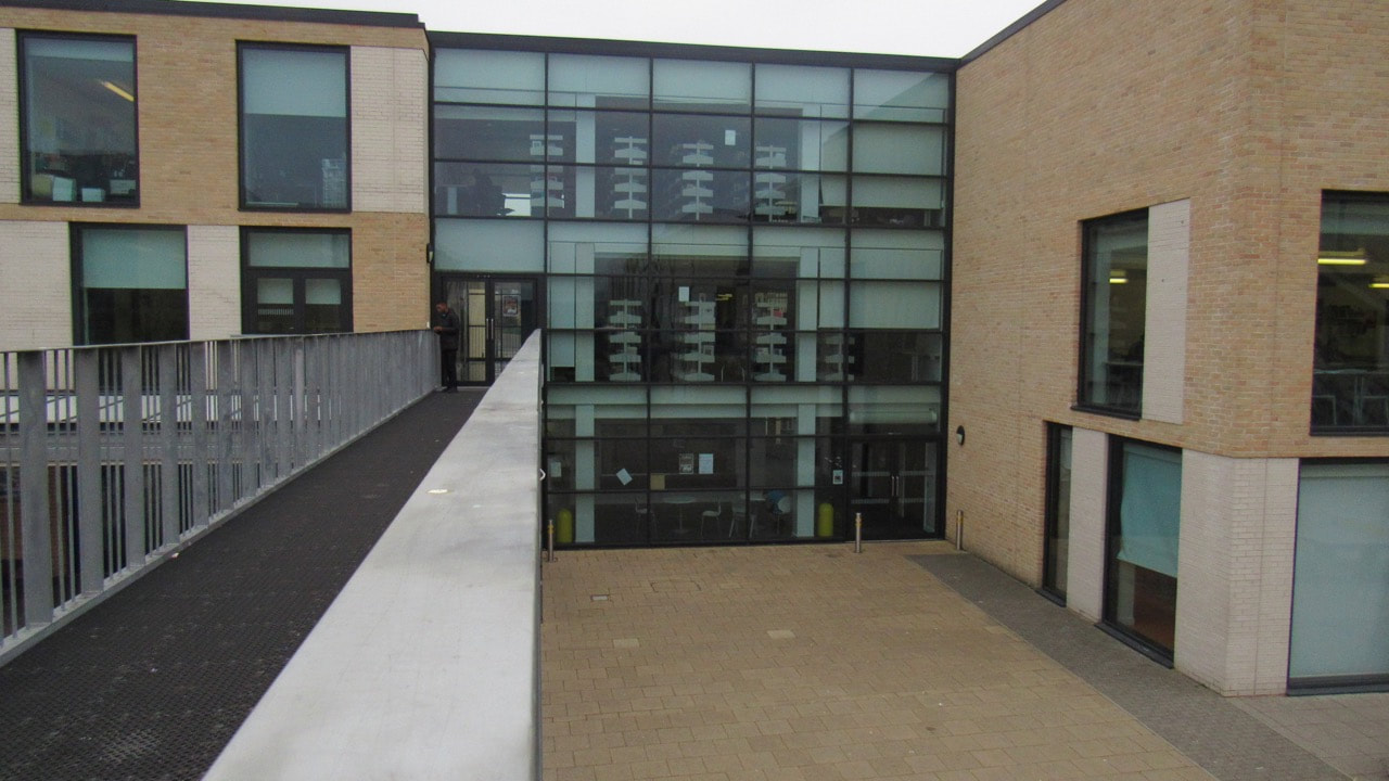
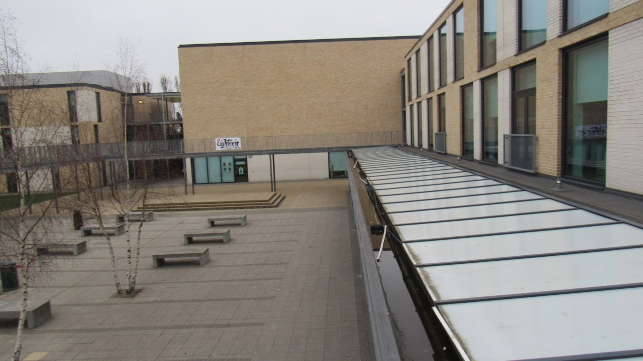
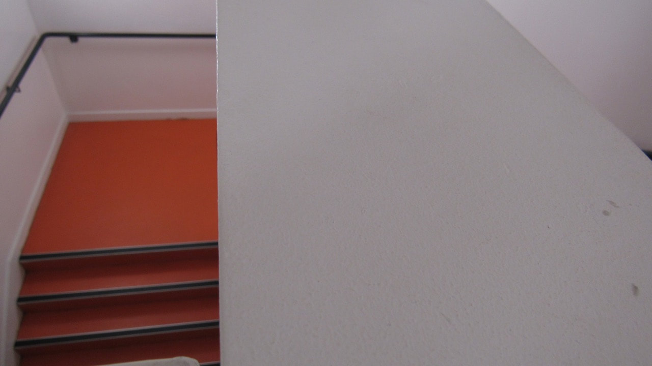
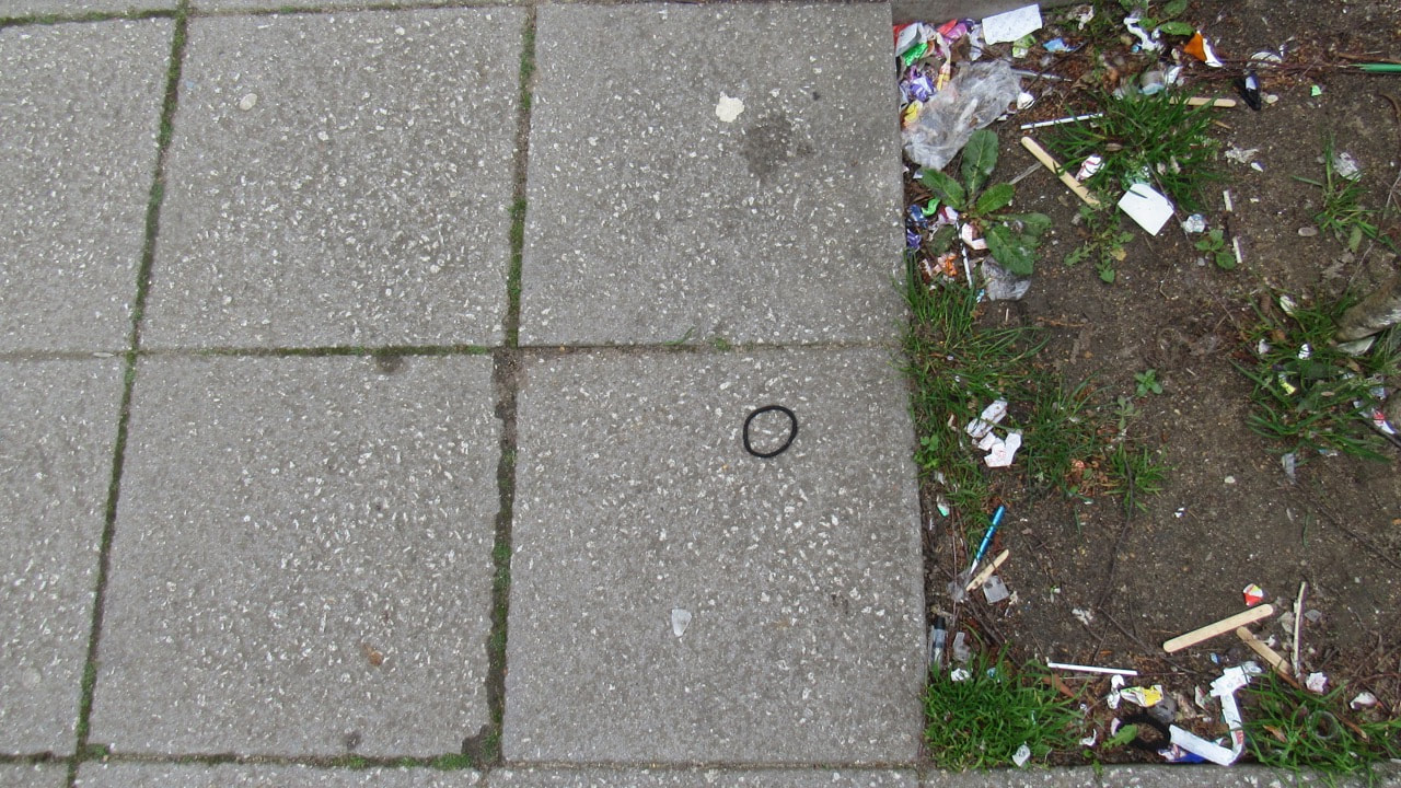
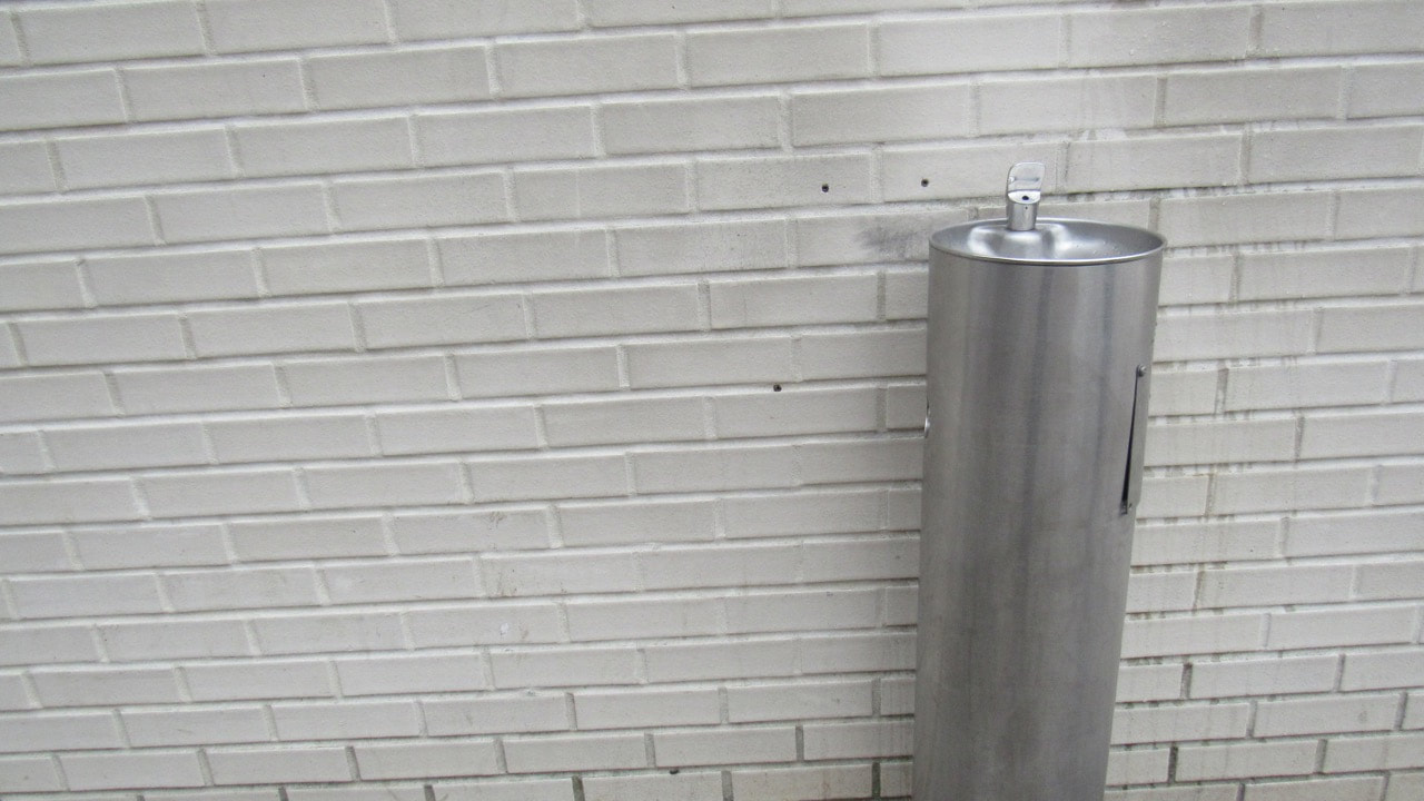
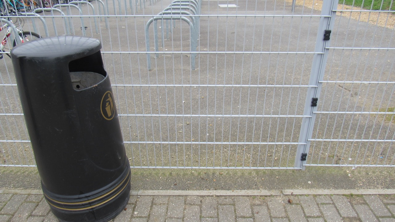
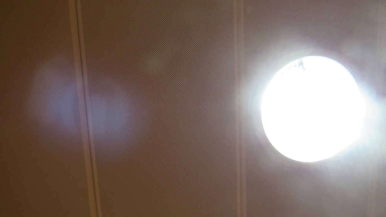
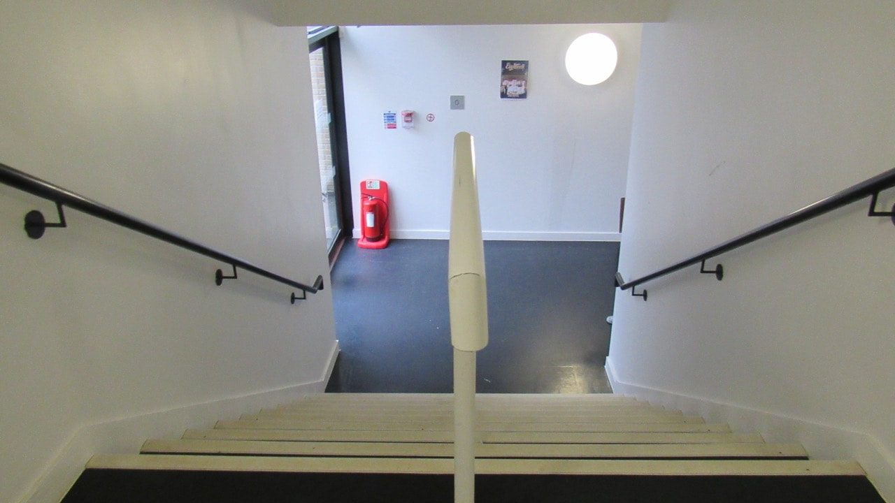
These are the first photos I took for when I thought about abstraction. Most of the photos where to do with shadows considering it was a sunny day, and got a idea from sir saying to use it.
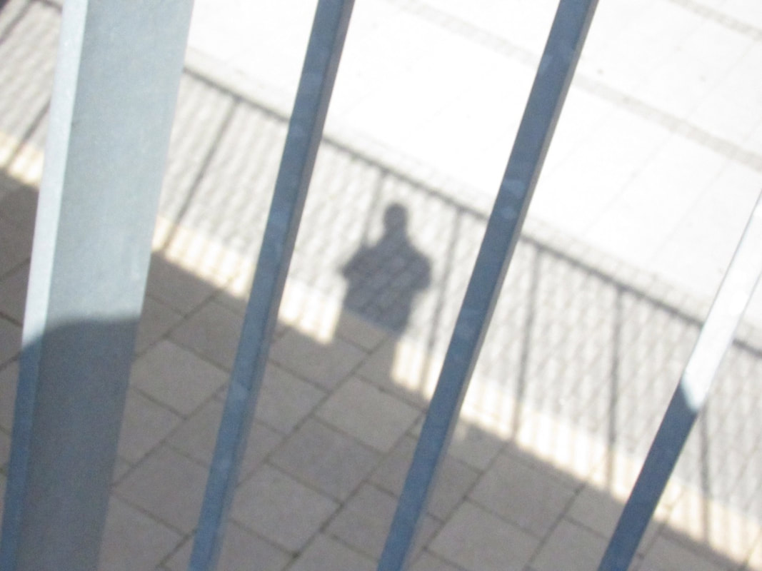
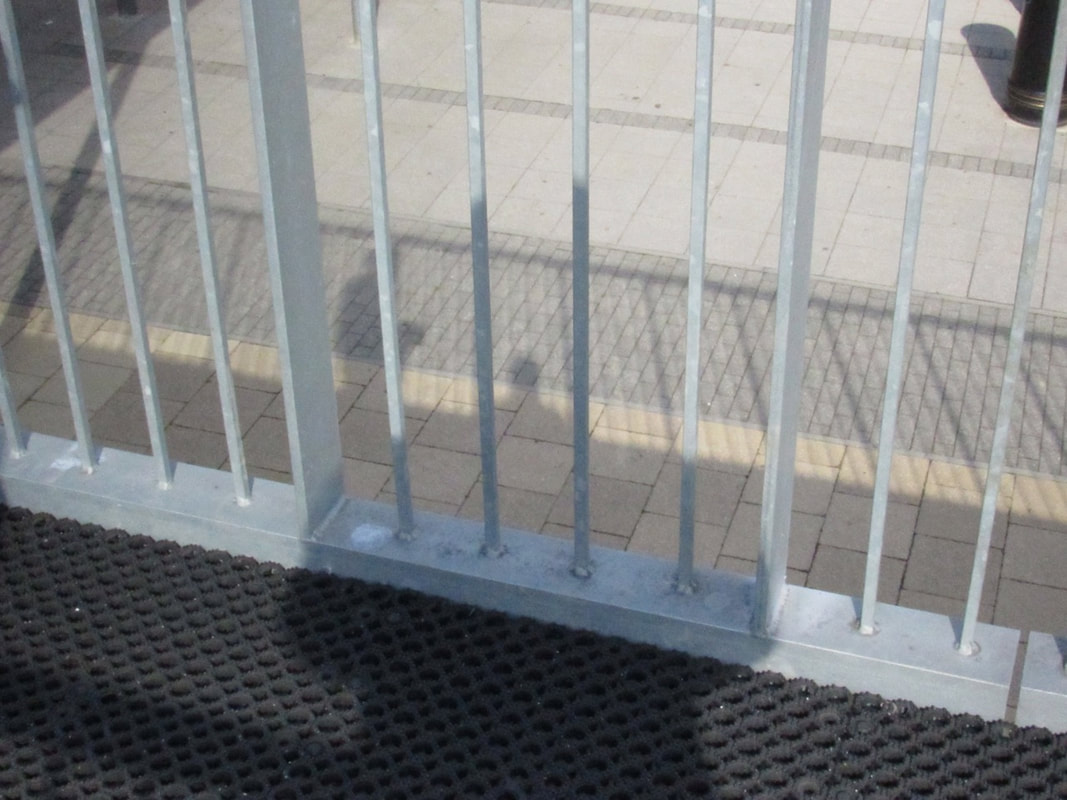
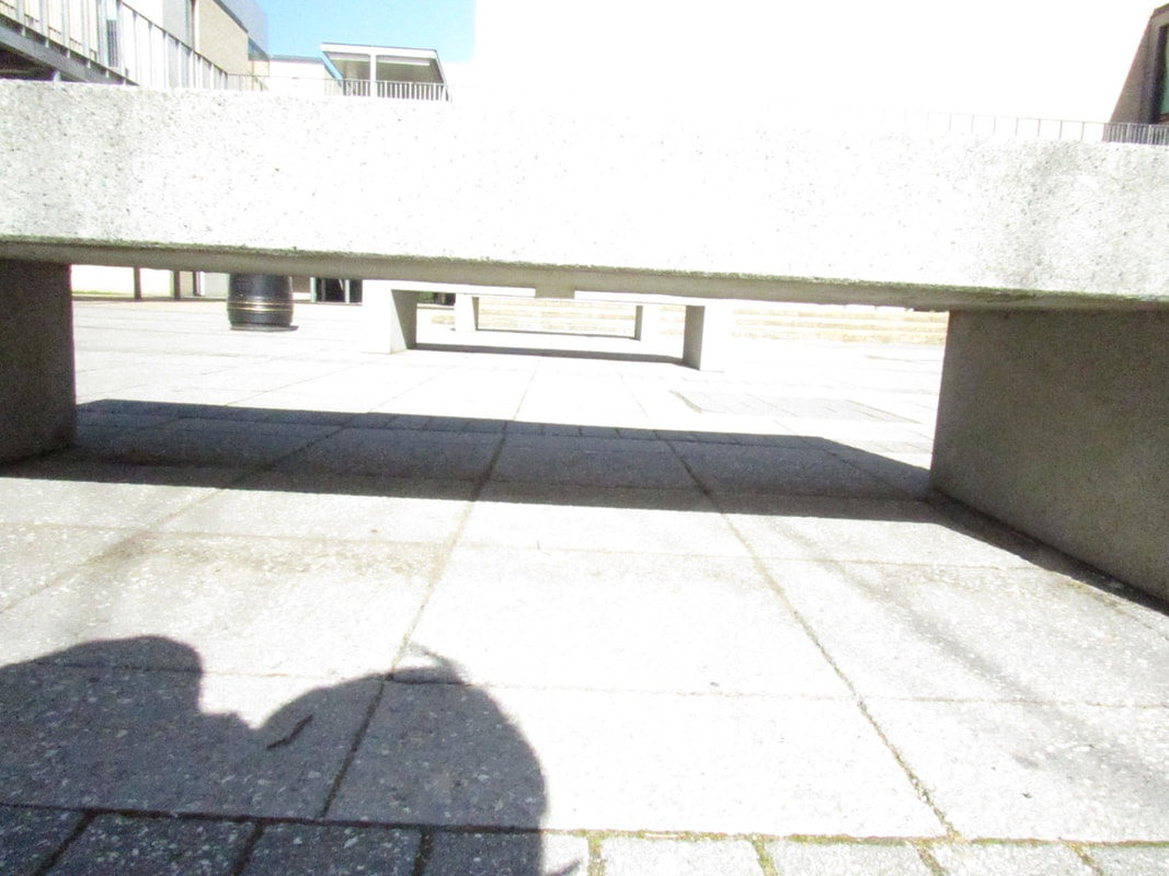
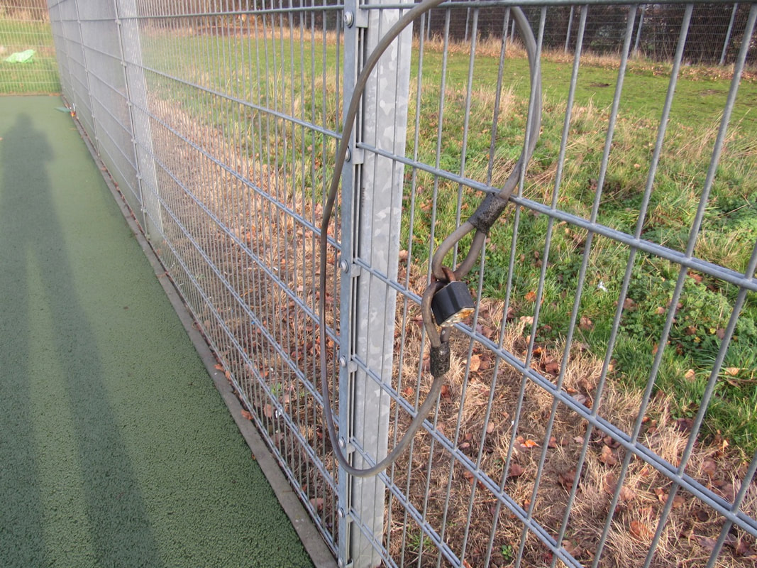
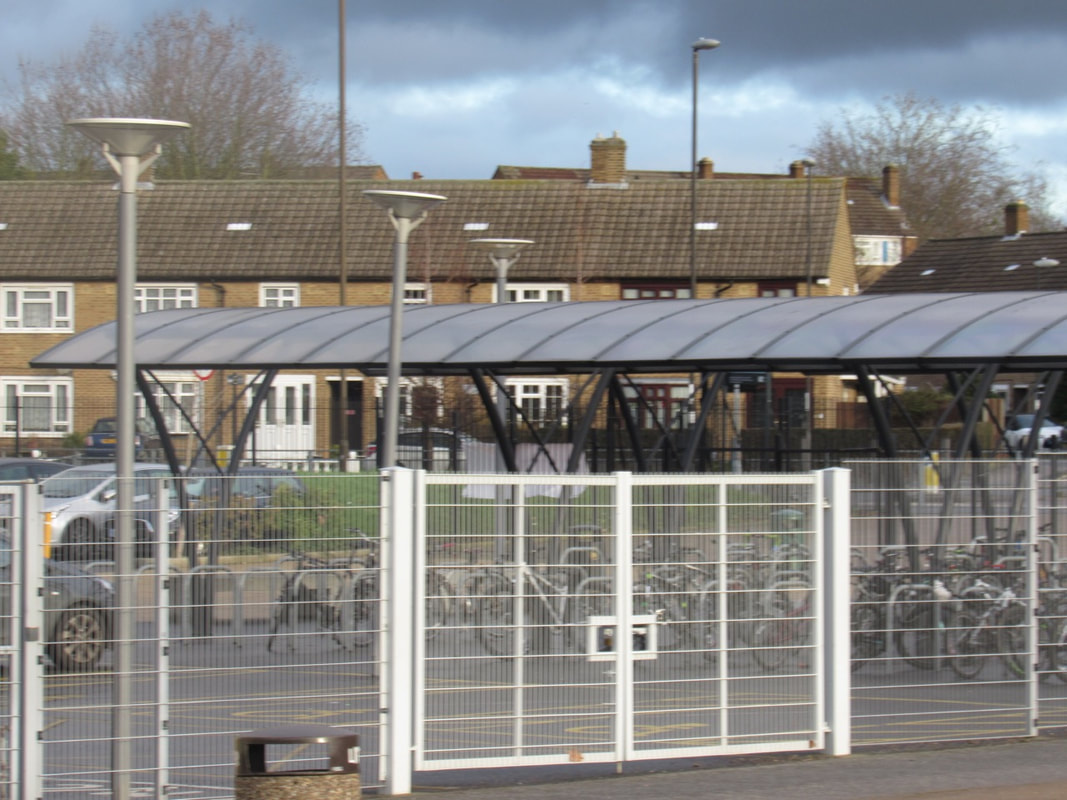
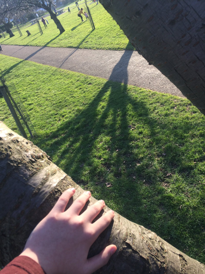
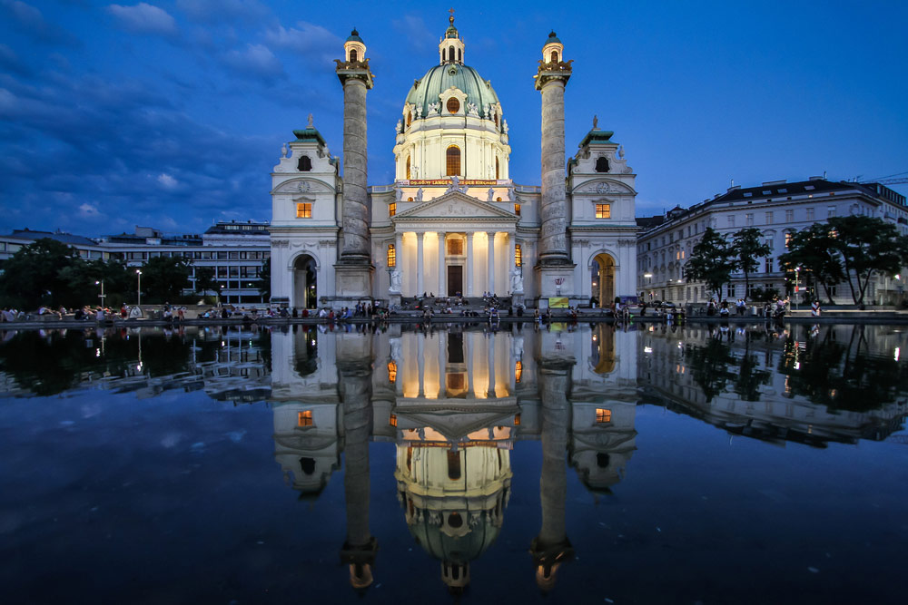
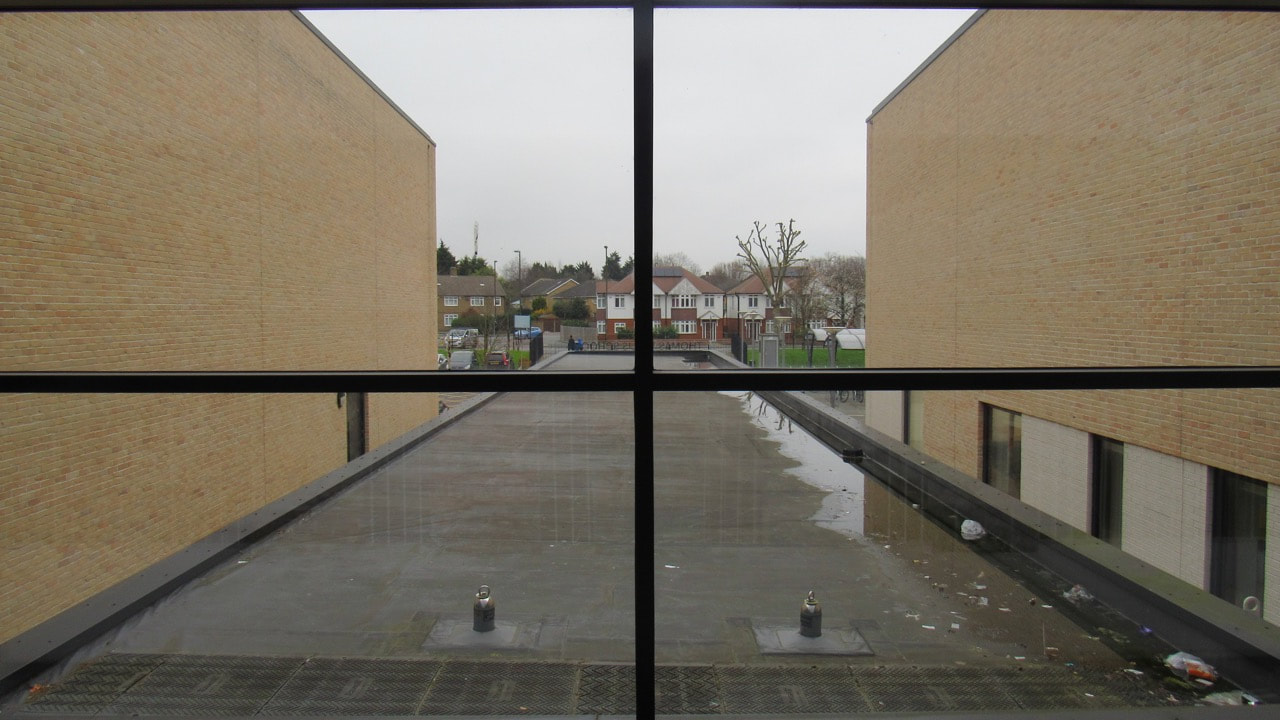
These two photos are my favourite and best with abstraction, with the repetition and angles of which I took them at. I am particularly proud of the picture of the poles considering they are it was using all of the zoom, and also proud of the repetition and the way the poles lined up in a diagonal formation. |
The formal elements
The formal elements are the base of a photo, and how it affects a photo
|
Focus:
Light: Line: Repetition: Shape: Space: Texture: Value/Tone |
Which areas appear clearest or sharpest in the photograph? Which do not?
Which areas of the photograph are brightest? Are there any shadows? Does the photograph allow you to guess the time of day? Is the light natural or artificial? Harsh or soft? Reflected or direct? Are there objects in the photograph that act as lines? Are they straight, curvy, thin, thick? Do the lines create direction in the photograph? Do they outline? Do the lines show movement or energy? Are there any objects, shapes or lines which repeat and create a pattern? Do you see geometric (straight edged) or organic (curvy) shapes? Which are they? Is there depth to the photograph or does it seem shallow? What creates this appearance? Are there important negative (empty) spaces in addition to positive (solid) spaces? Is there depth created by spatial illusions i.e. perspective? If you could touch the surface of the photograph how would it feel? How do the objects in the picture look like they would feel? Is there a range of tones from dark to light? Where is the darkest value? Where is the lightest? |
Paul Strand abstract picture
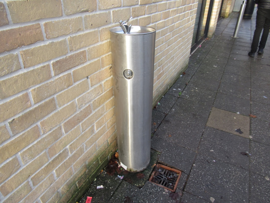
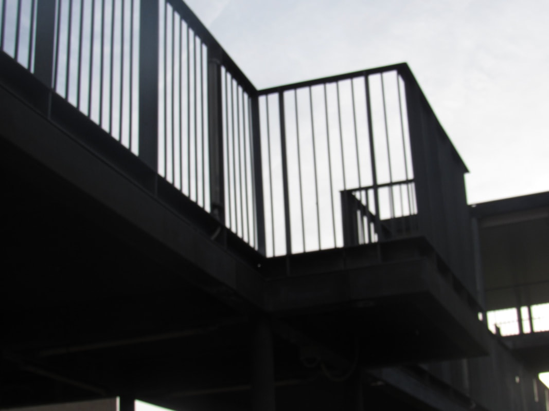
One formal element photo shoot
|
|
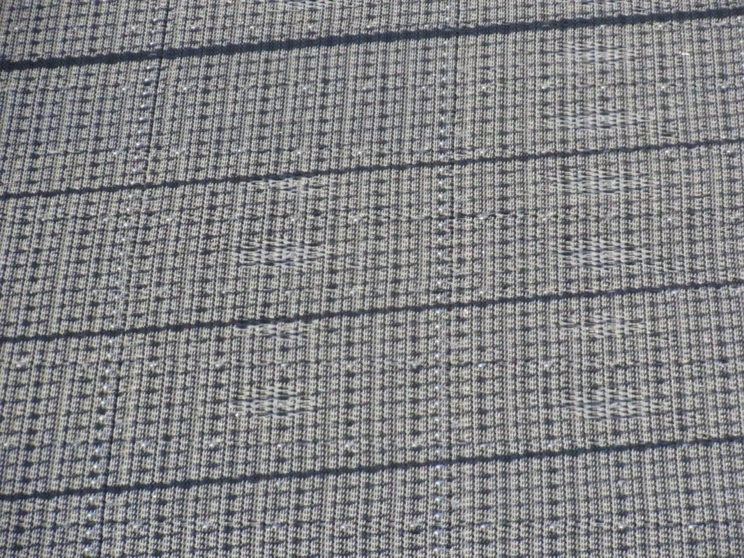
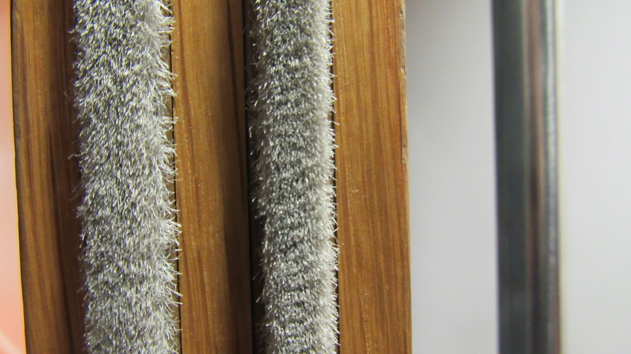
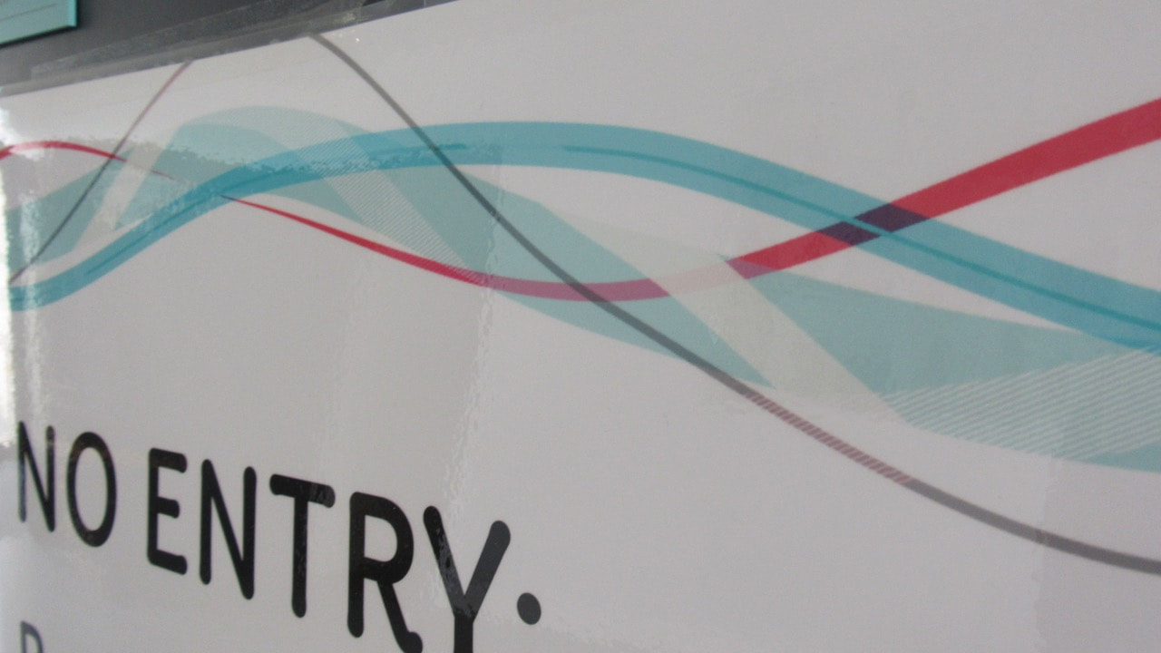
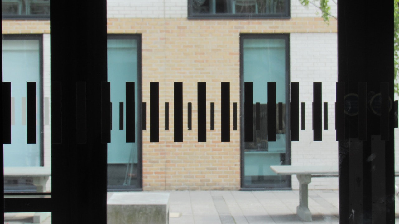
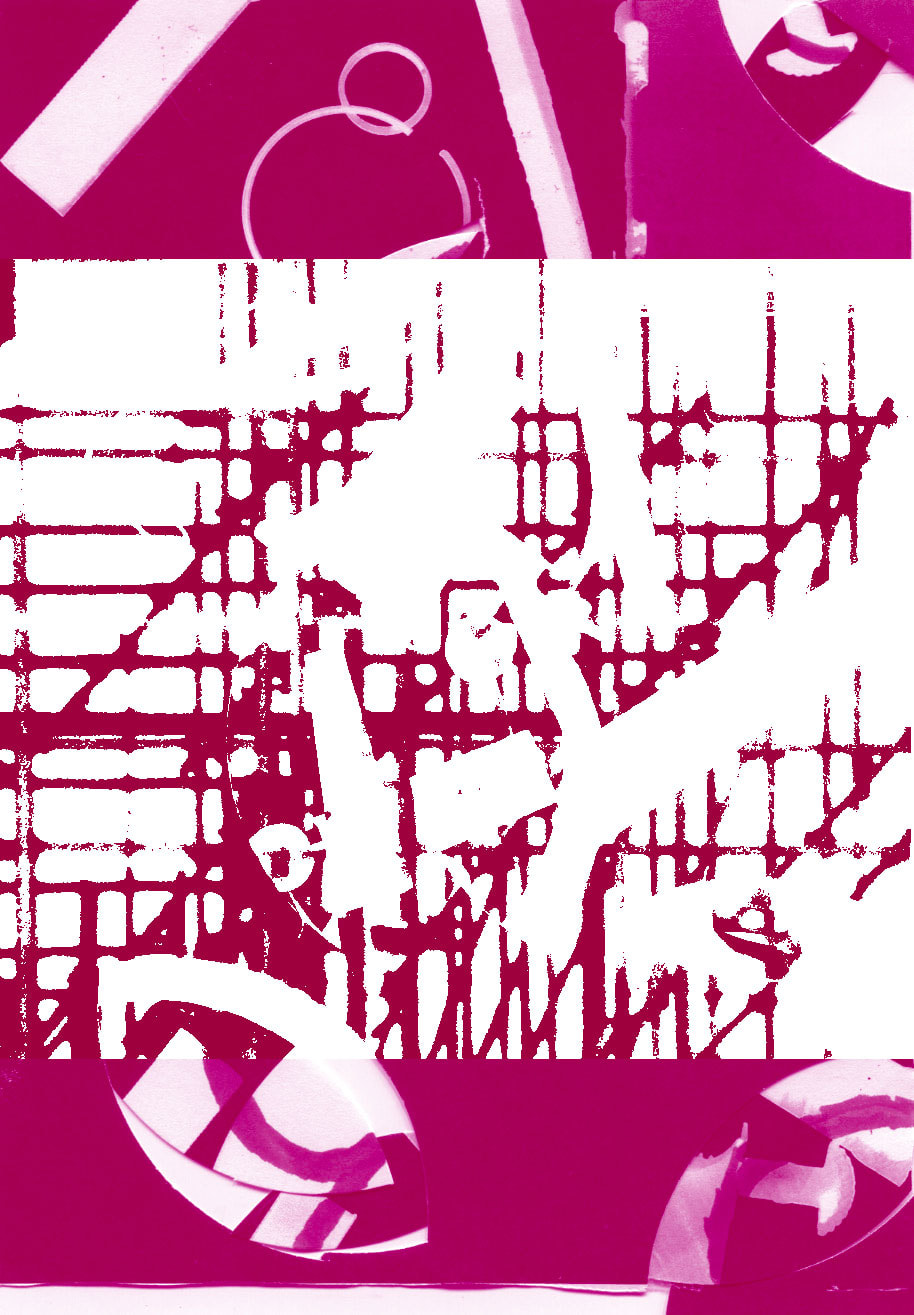
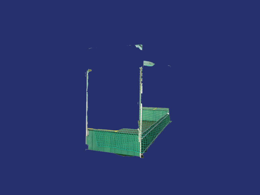
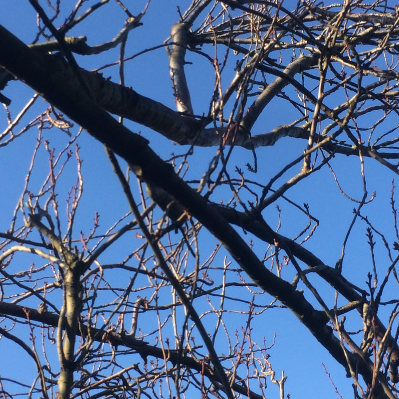
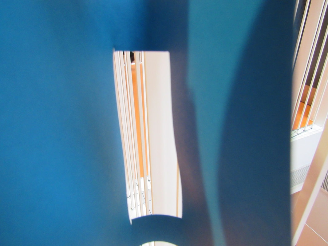
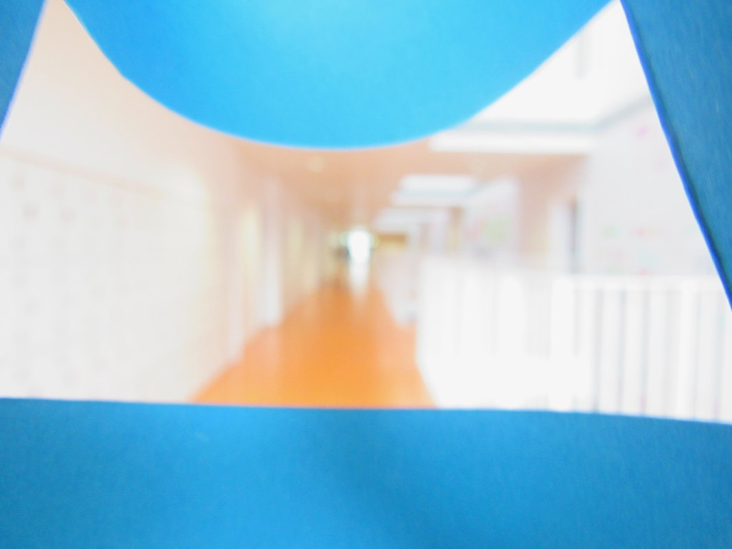
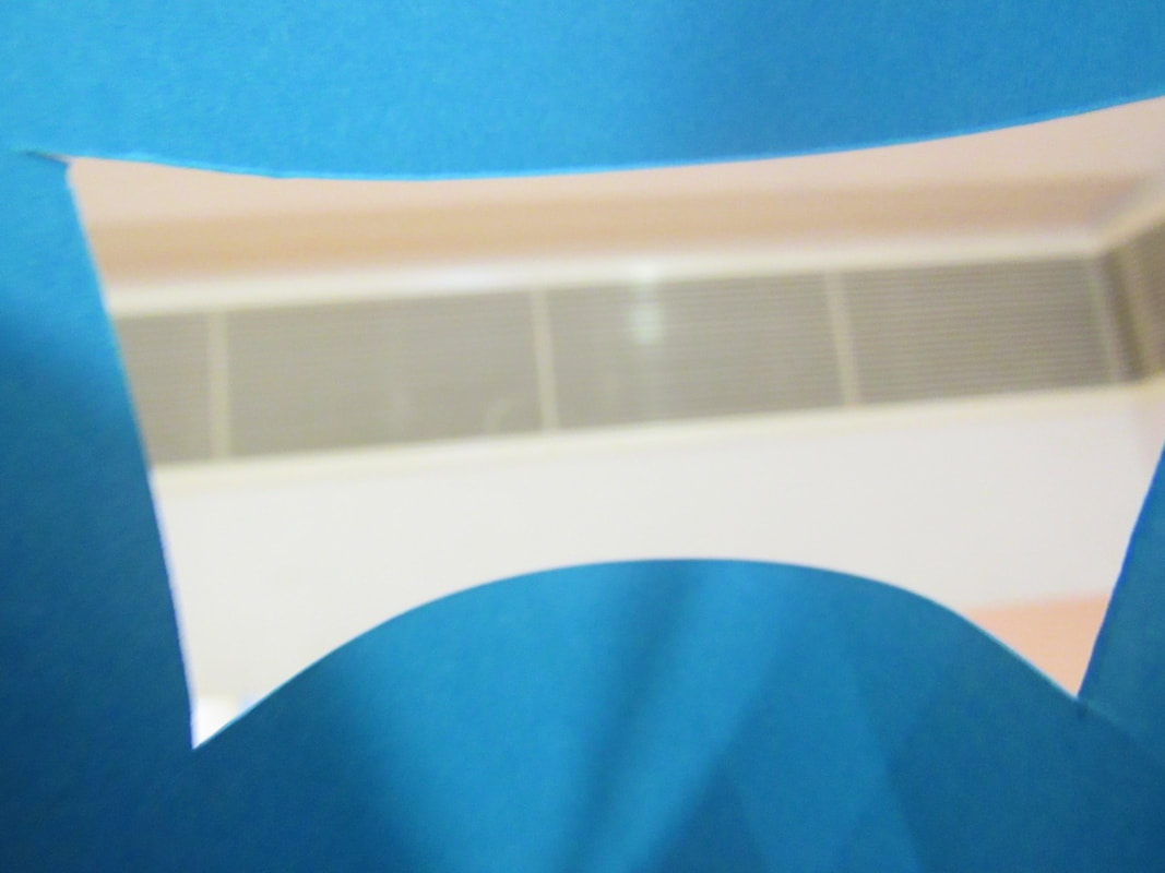
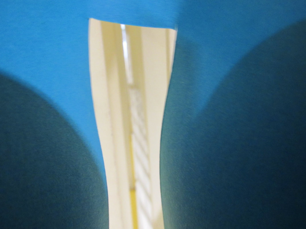
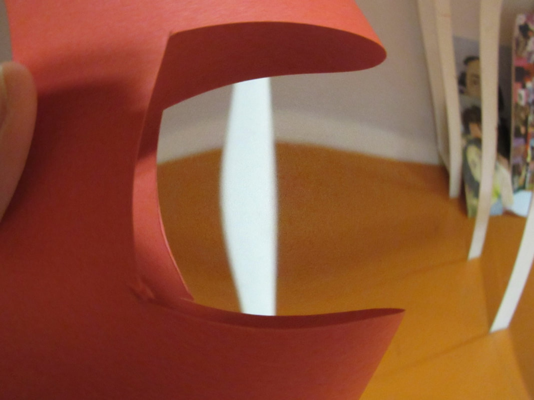
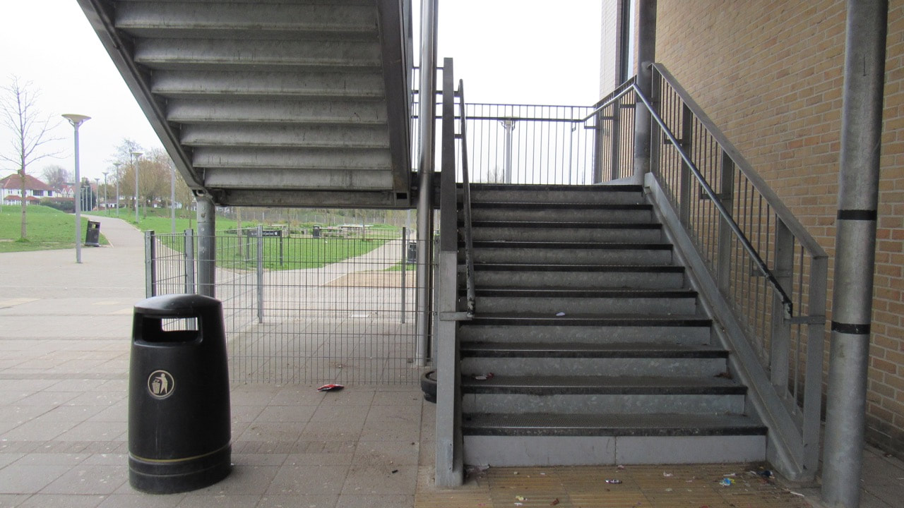
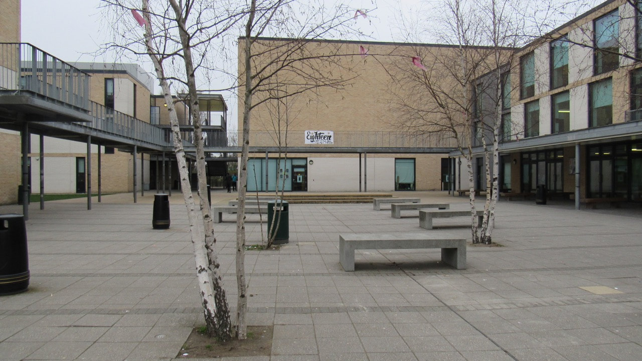
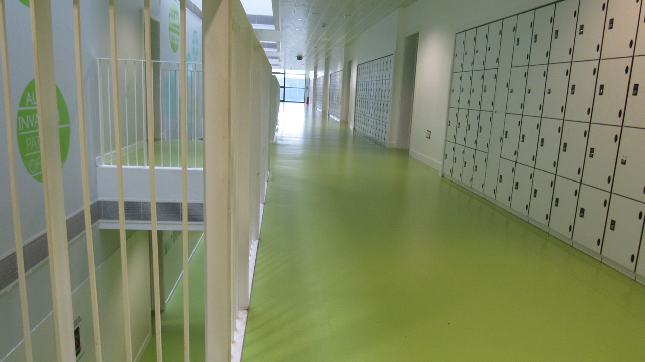
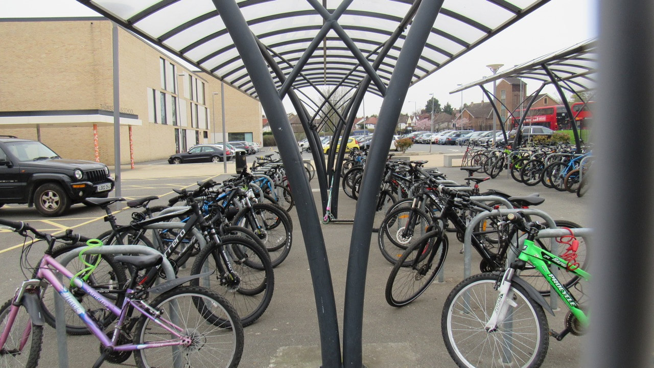
These photos are of the formal element of line where there is also abstraction and other photos. they all show certain difference like the curves or the distance between the lines and how you can see through them.
|
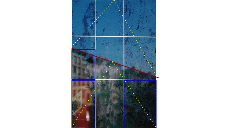
Analysing a abstract photo
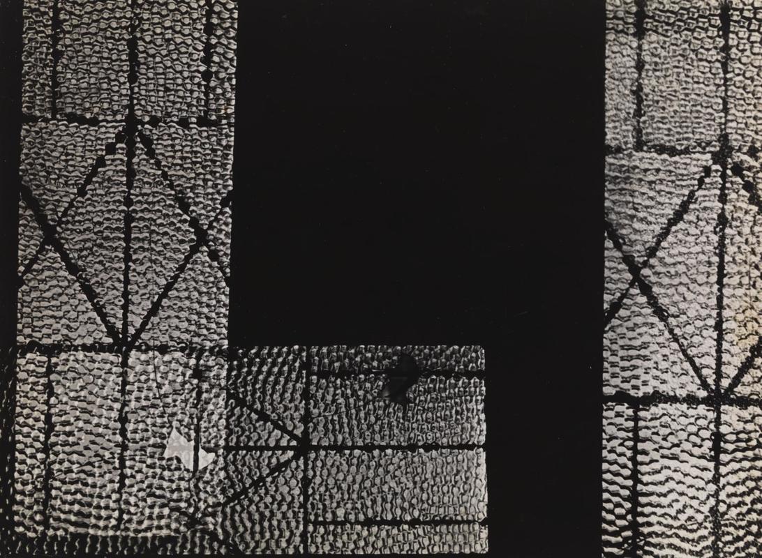
The artist is Geraldo de Barros 1923–1998 and the original title was Abstração (São Paulo)
at first glance I thought it was the tiny bubble in water but more I look at it the more detail I see with the fact that the lines between the bubbles are so straight that it can't be in water because they would be constantly moving. so I know think that it is some translucent bubble wrap on water but it was cut specifically this way but here are some mistakes with there is a bulge of darkness and parts of the bubble wrap are overlapping. also with the fact that he didn't use up all of the darkness he left gaps and cut out part of the bubble wrap in the photo on the right. there is also a pattern on it were part of the pattern on the left repeats lower down and on the right.
at first glance I thought it was the tiny bubble in water but more I look at it the more detail I see with the fact that the lines between the bubbles are so straight that it can't be in water because they would be constantly moving. so I know think that it is some translucent bubble wrap on water but it was cut specifically this way but here are some mistakes with there is a bulge of darkness and parts of the bubble wrap are overlapping. also with the fact that he didn't use up all of the darkness he left gaps and cut out part of the bubble wrap in the photo on the right. there is also a pattern on it were part of the pattern on the left repeats lower down and on the right.
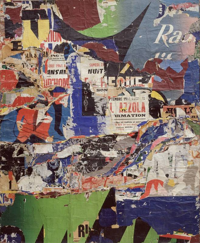
The person who made this is called Jacques Mahé de la Villeglé born 1926 and the original name is Les Jazzmen
the photo consists of different powers and torn pieces of magazines and paper and parts of the picture has made a image of a person in the bottom right and there is plenty more other imaginative pieces of art inside the art this is why I think go to as a abstractive photo because it is a picture with loads of different kinds pictures inside it.
the photo consists of different powers and torn pieces of magazines and paper and parts of the picture has made a image of a person in the bottom right and there is plenty more other imaginative pieces of art inside the art this is why I think go to as a abstractive photo because it is a picture with loads of different kinds pictures inside it.
Introduction of photograms
A photogram is a picture without a camera what they do is they get objects they put it on a light sensitive paper and then once they are happy with the layout they turn on the light wait around 8 seconds and then you need to develop it in a dark room. usually you make a photogram in a dark room and develop it and then after the first bath it gives it the image the second and third is to make sure it stays that way the in the light and then put it in water to clean the chemicals off of the photogram.
Some of my favourite photograms
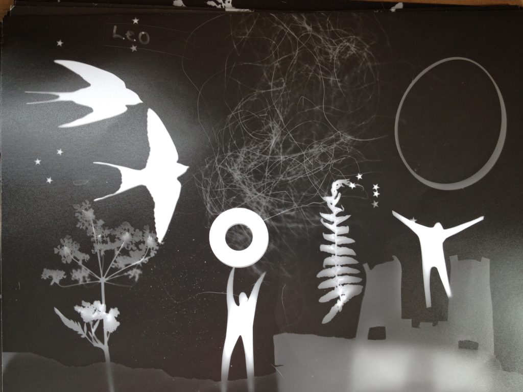
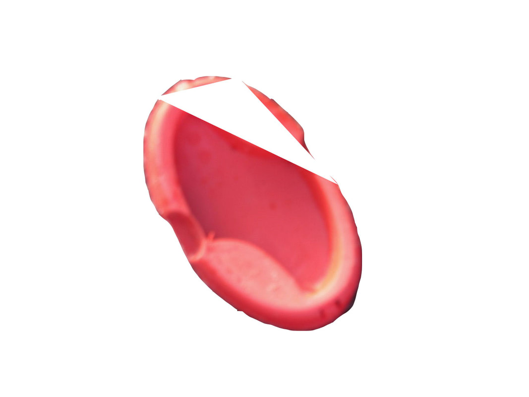
These photograms are my favourite because they are different to normal photograms with some of them telling a story some with no idea what it is and some with they exact opposite of what I expect which means all of them took something inside the box and took it outside to make a whole new image.
Photogram abstraction
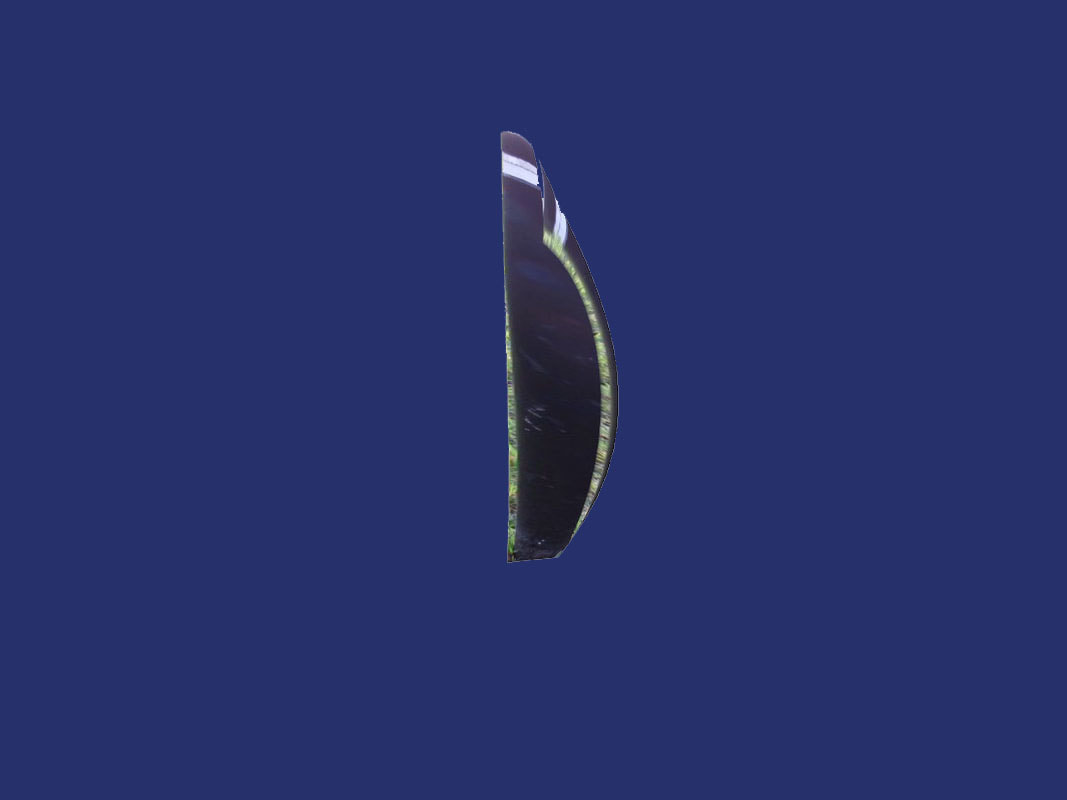
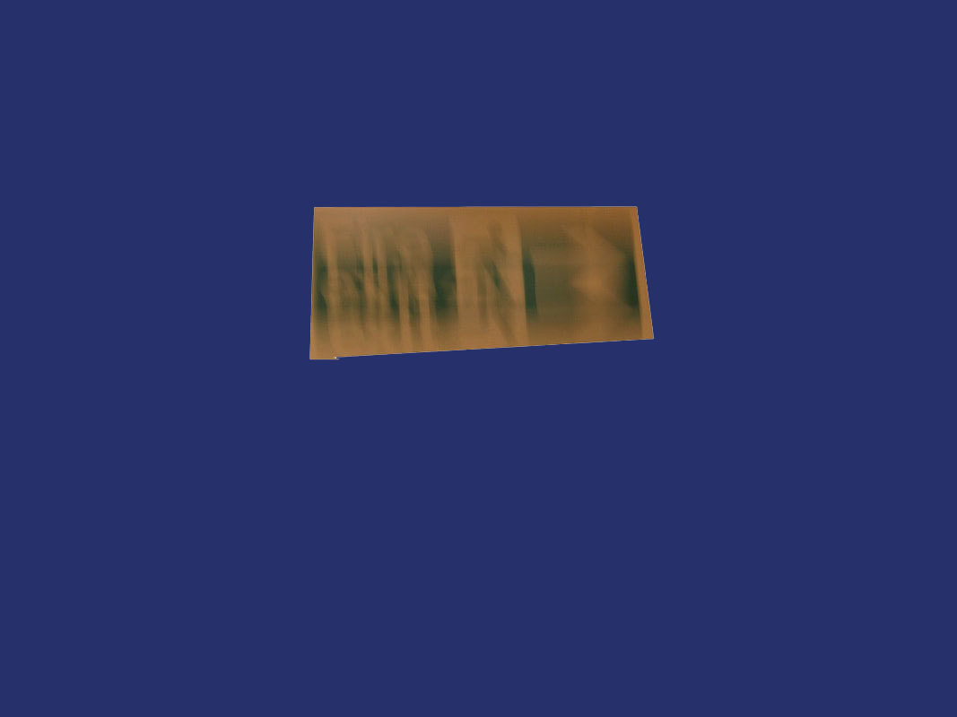
Over a couple weeks I have made photograms, 3 to be exact and I have photocopied the photograms and started to cut the copies up and creating a new abstract image.
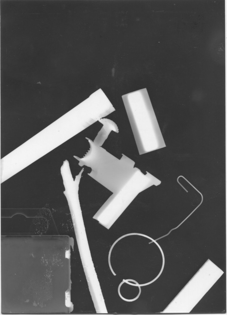
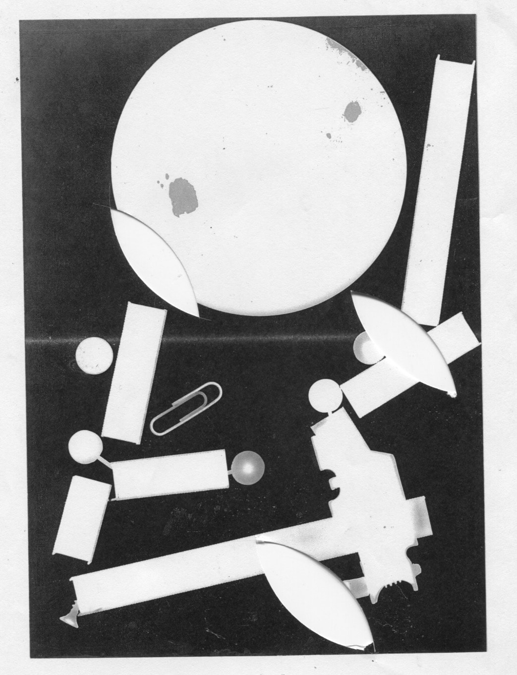
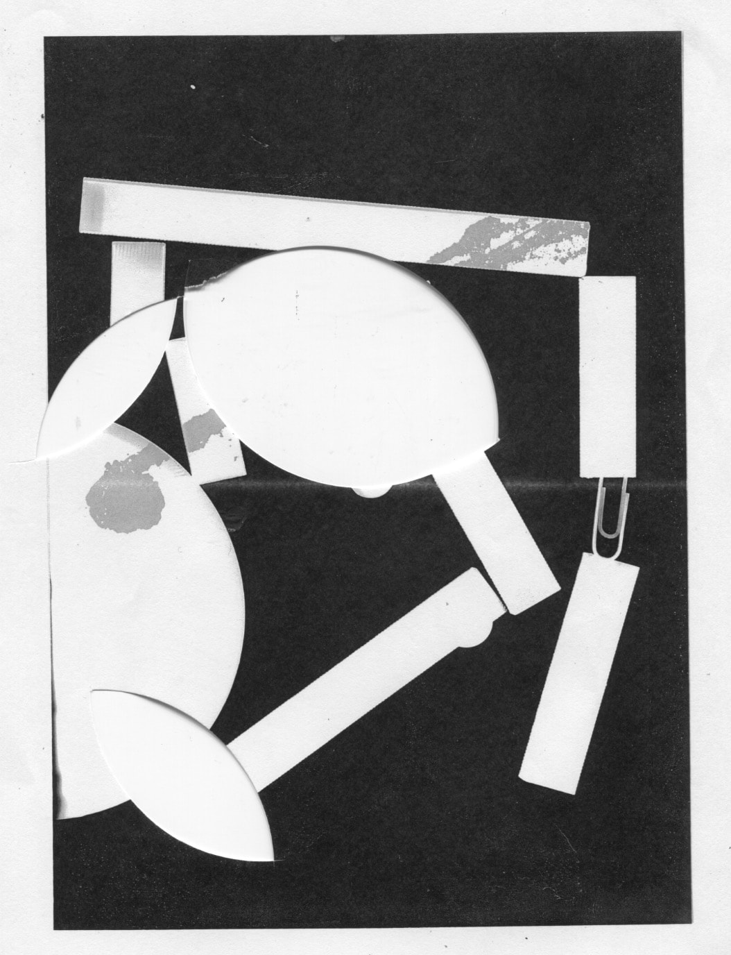
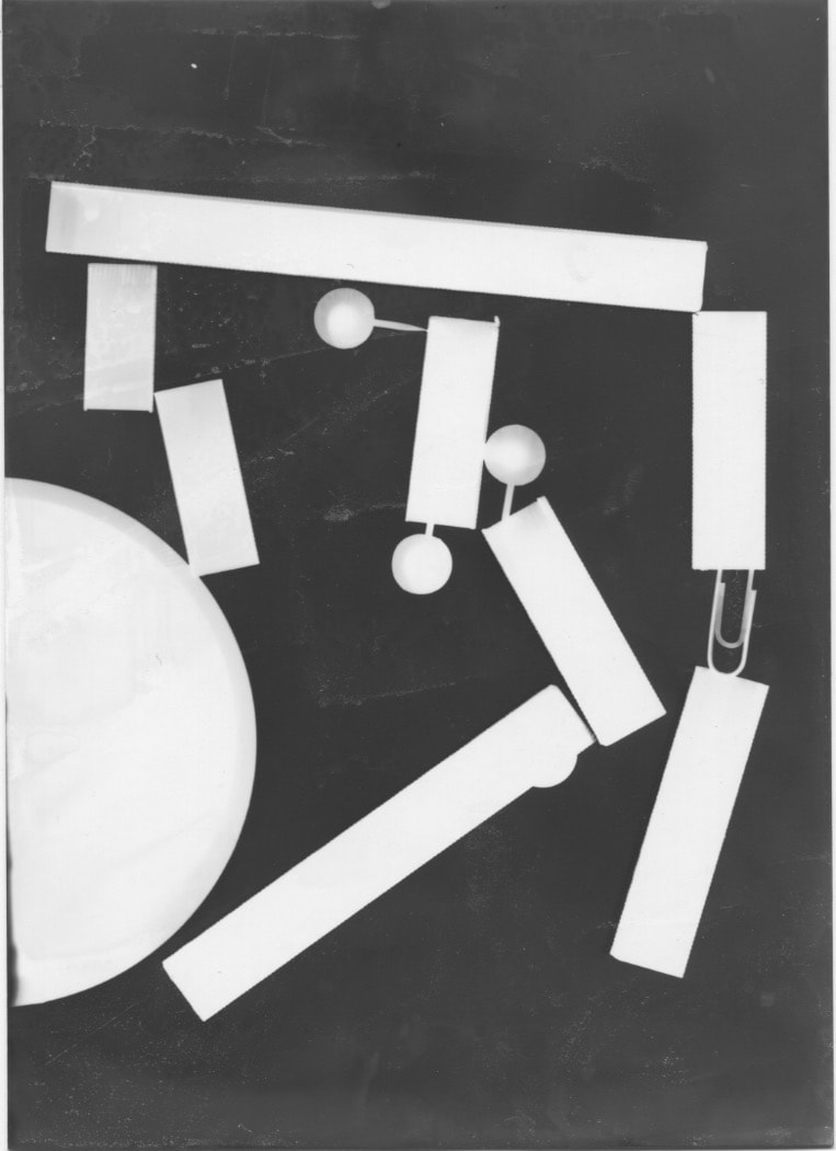
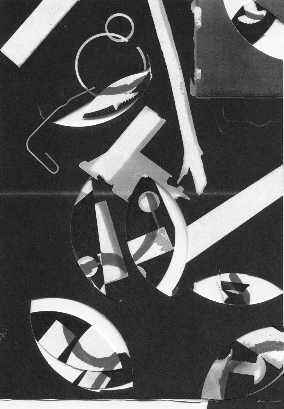
www: The image in the bottom left made a line where it was down on and the other images are what helped to create it.
EBI: I can make more abstract photograms with the bits I have left.
EBI: I can make more abstract photograms with the bits I have left.
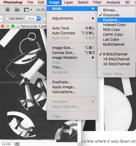
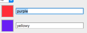
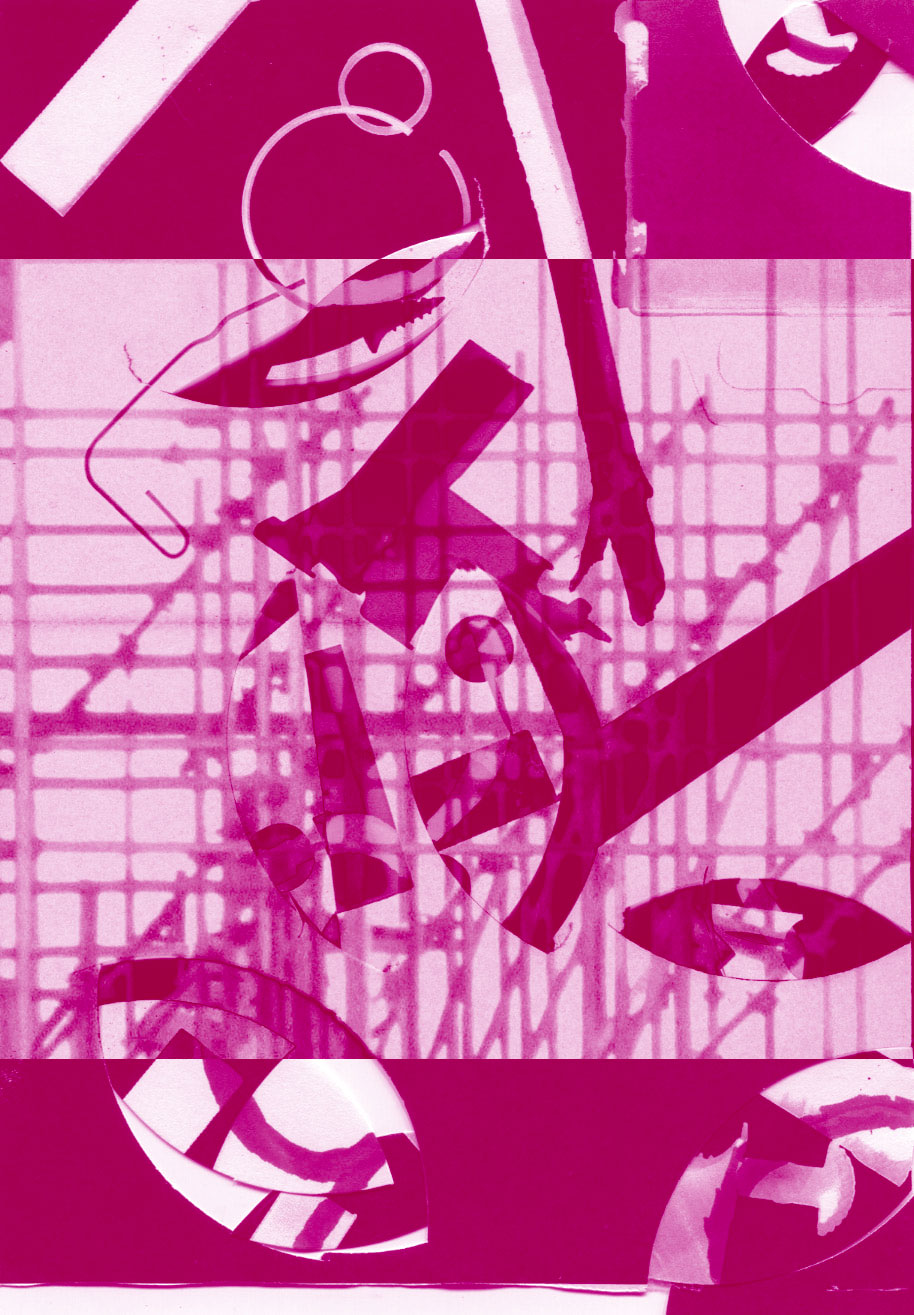
Duotone
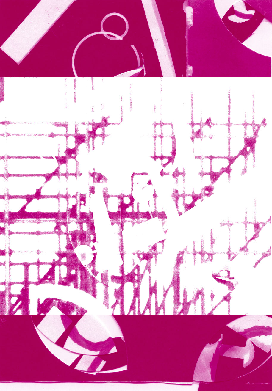
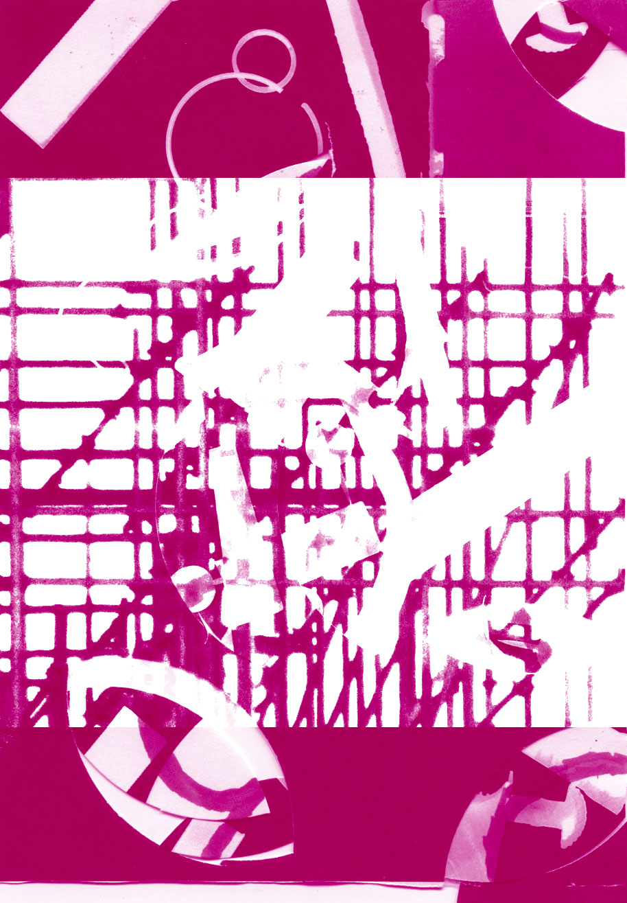
I made a duotone today with the cut up photogram and a normal image that I took.
|
|
|
|
|
The final images.
|
|
|
|
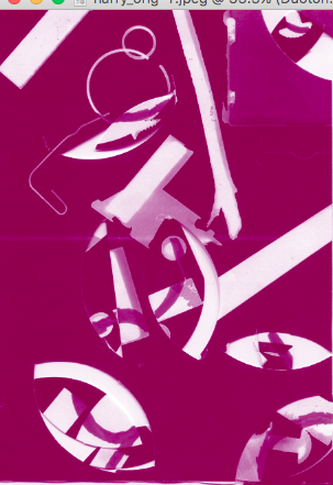
WWW: I made a duotone with some interesting results with the last one my favourite with it is completely different to the rest all of the blending options were at the end of the list.
EBI: If I could get more intricate results or used different images to see what results I would get.
EBI: If I could get more intricate results or used different images to see what results I would get.
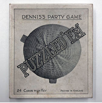
Assessment 'puzzled 'em'
Research
|
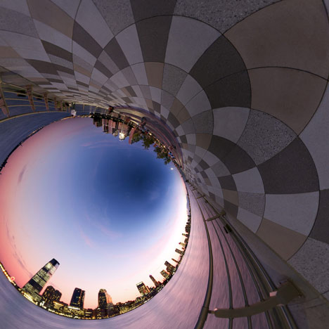
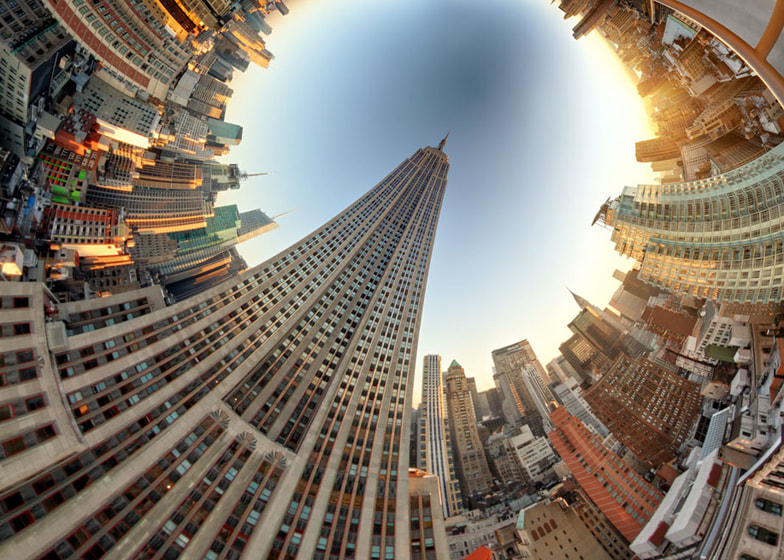
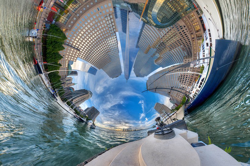
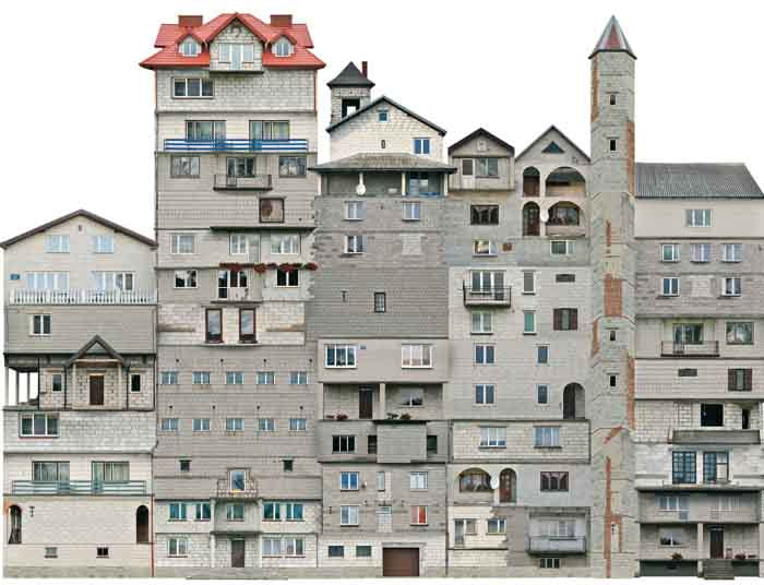
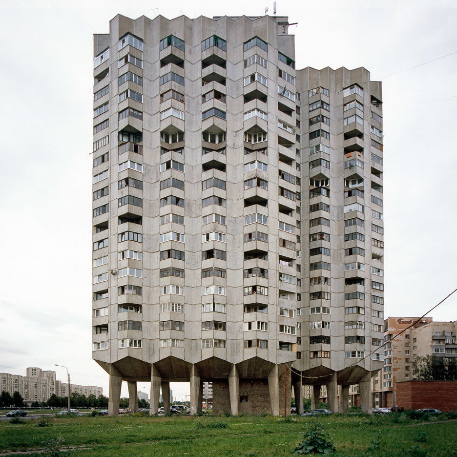
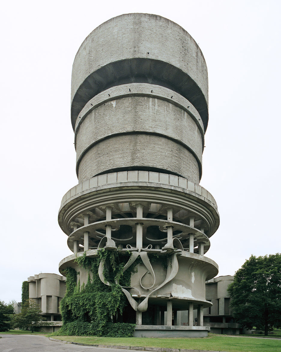
My assessment here today is about a game called 'puzzled 'em', at first 'puzzled 'em' was just a visual game and turned into a exhibition in south east London. They were told to buy unusual items from ebay, and one of the items turned out to be 'puzzled 'em'. The reason why I think they chose this to be our inspiration is because it shows one of the threshold concepts for photography no.8.
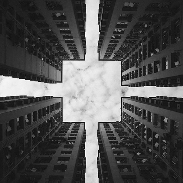
The reason why I think they chose this is because it is made to confuse the viewer into thinking about what the object is because the concept of the game is to look at the photo and try to figure out what it is who ever gets the most correct wins it makes you think outside the box. This reminds me of some photographers who confuse the viewer like Randy Scott Slavin who took photos of buildings in very peculiar ways like so. this confuses the viewer of where the photo was taken but also what building it is of. Another person who does take photos of buildings but in a different way Nicolas Grospierre who instead of making the photo different takes different kind of buildings.
|
|
Ideas
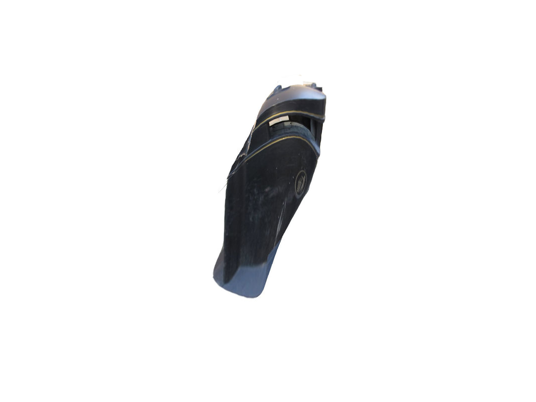
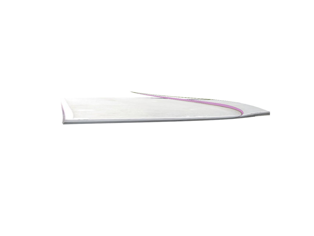
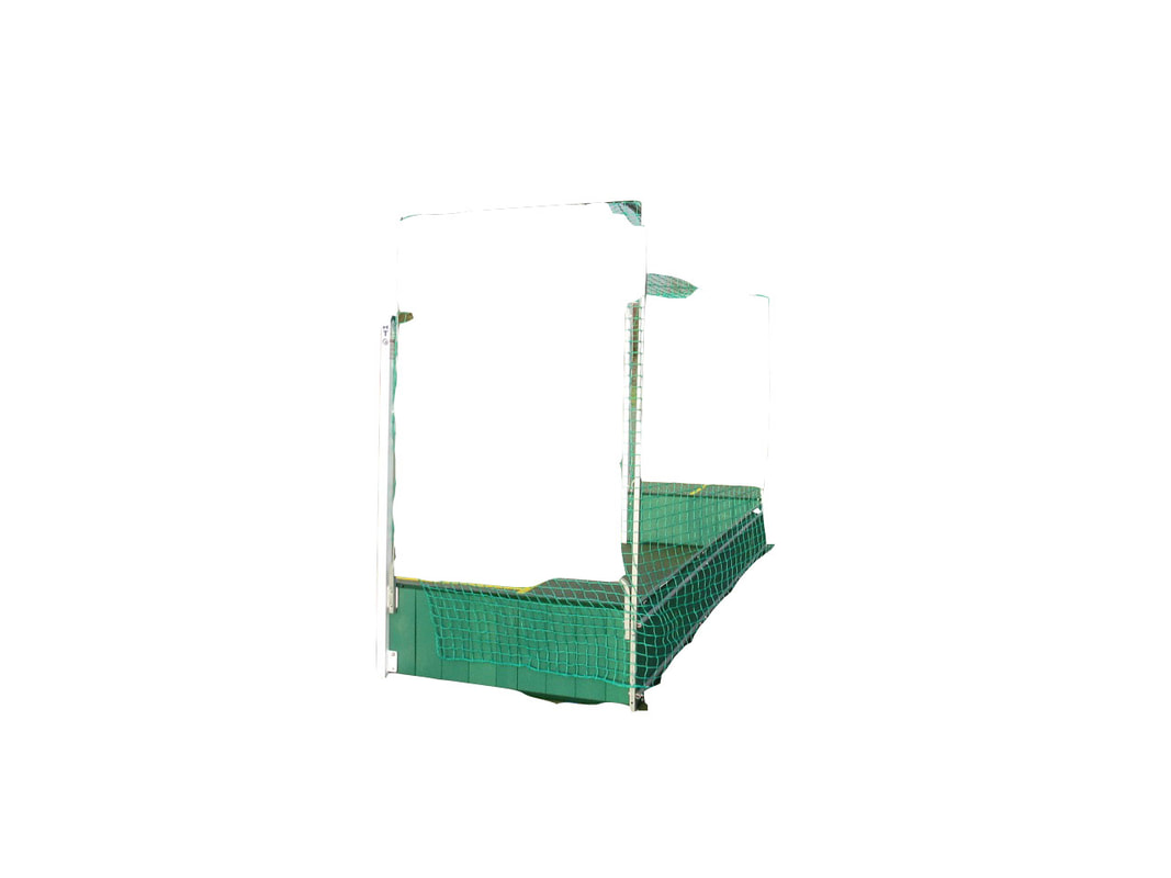
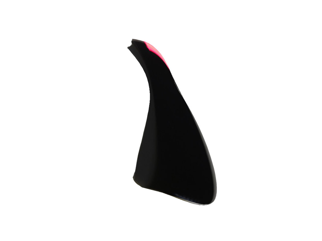
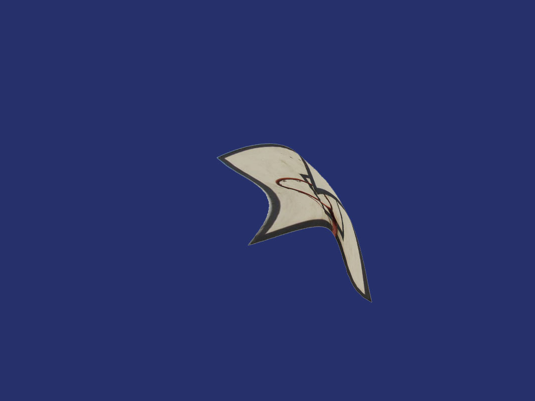
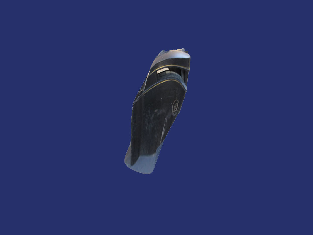
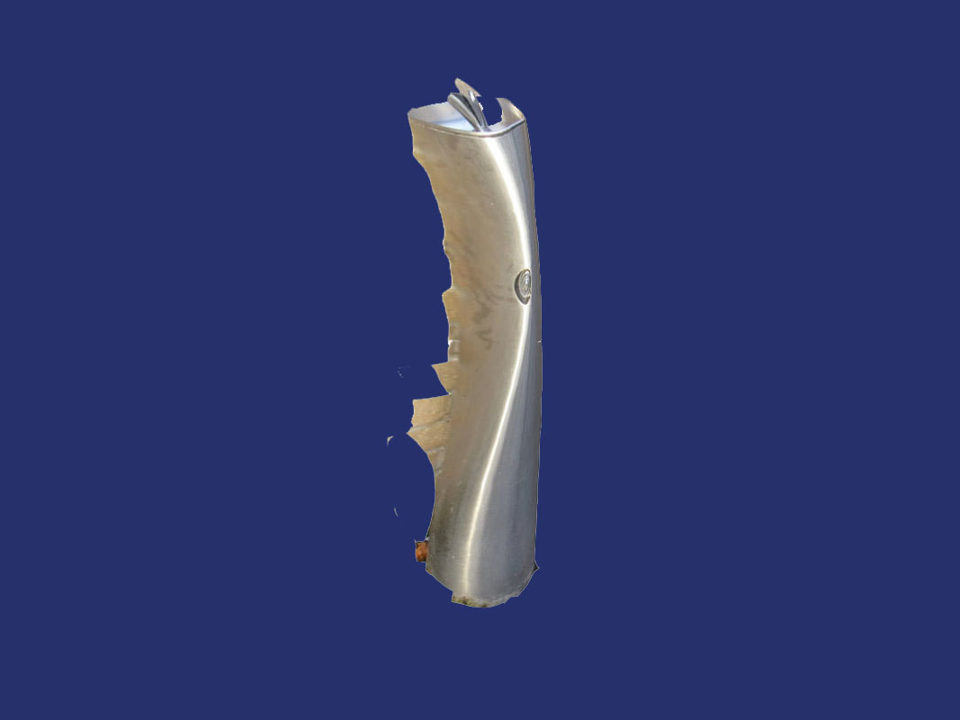
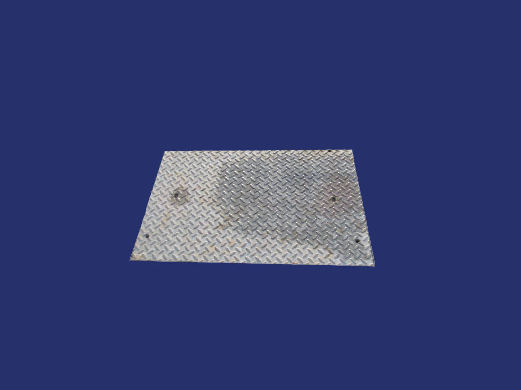
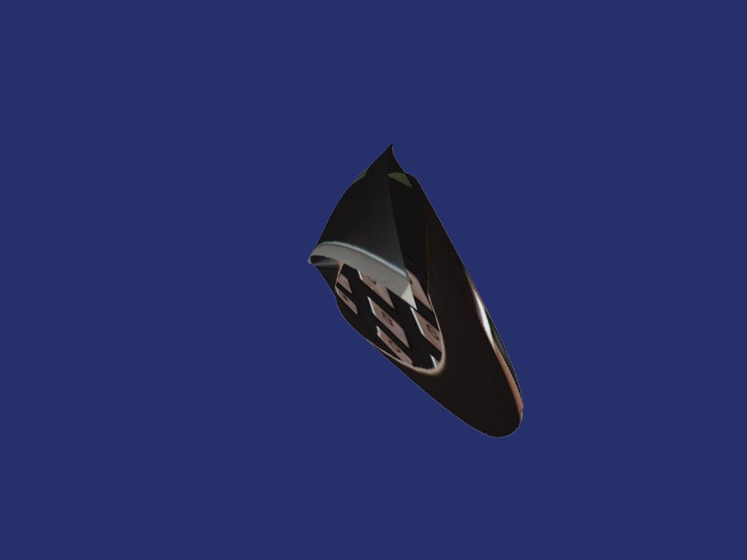
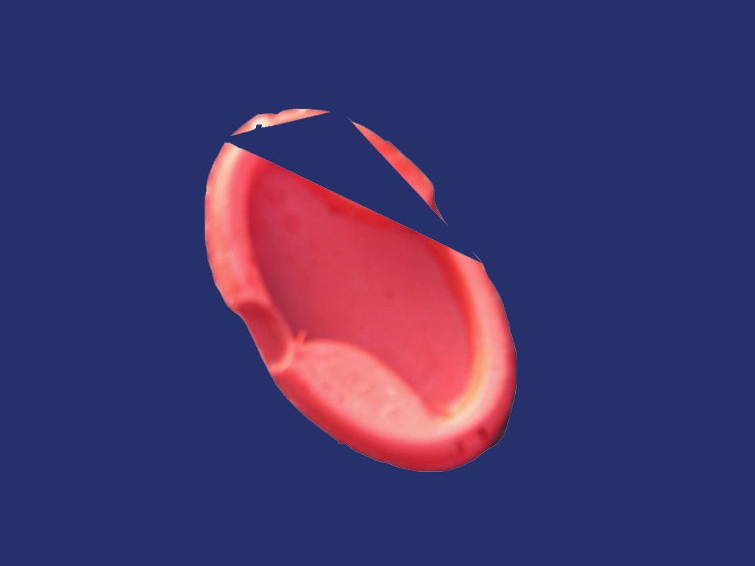
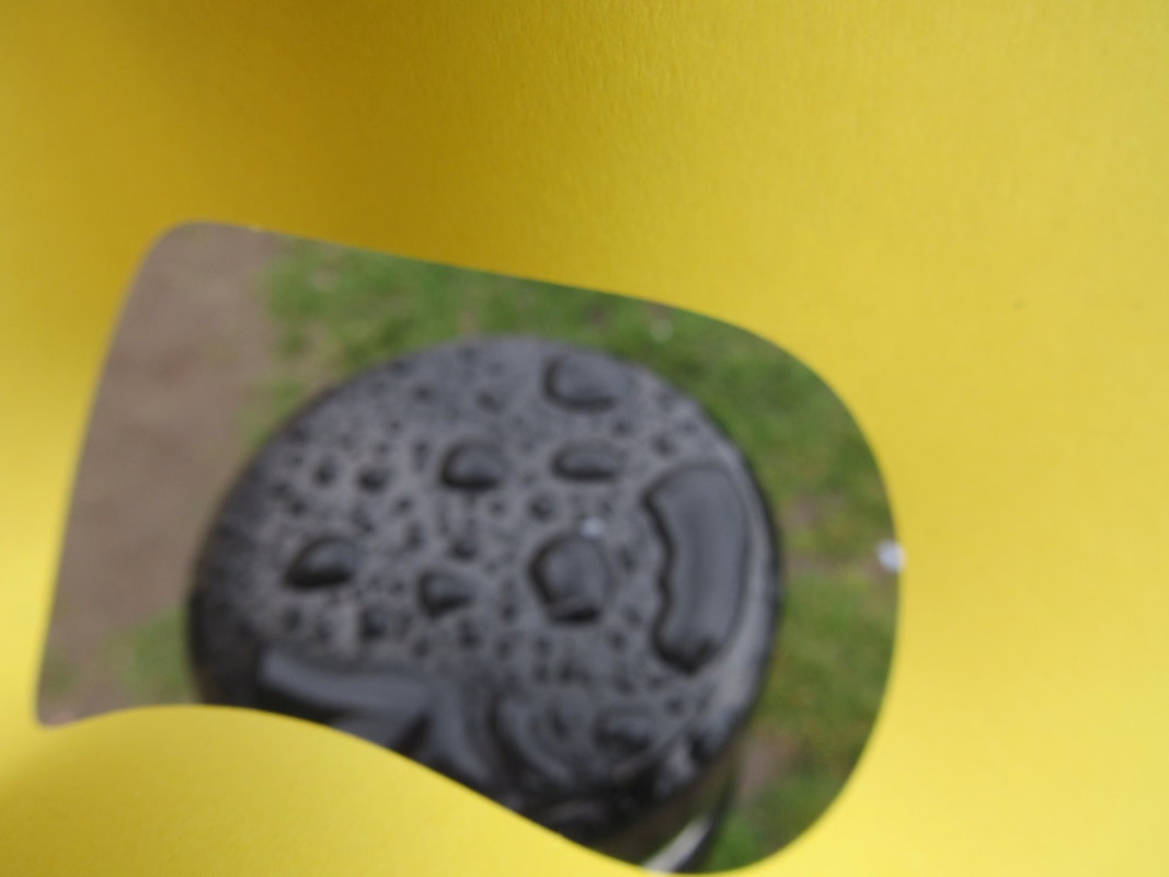
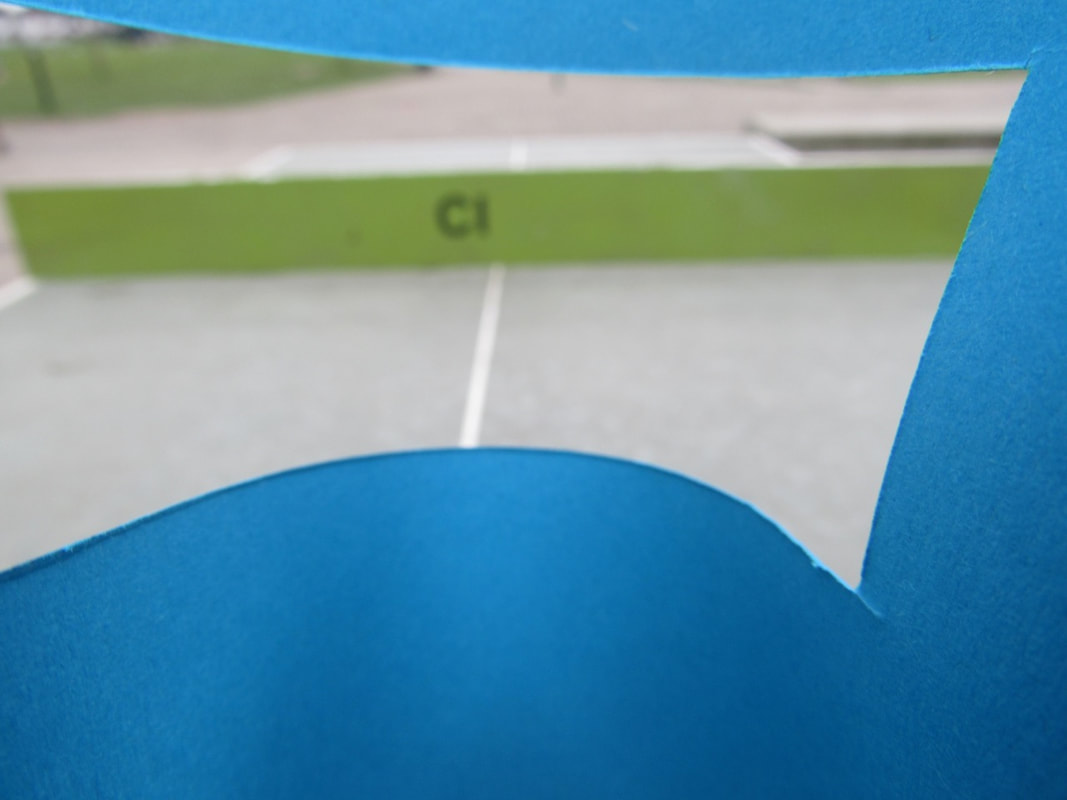
- Take pictures of buildings and objects and warp them in mysterious ways.
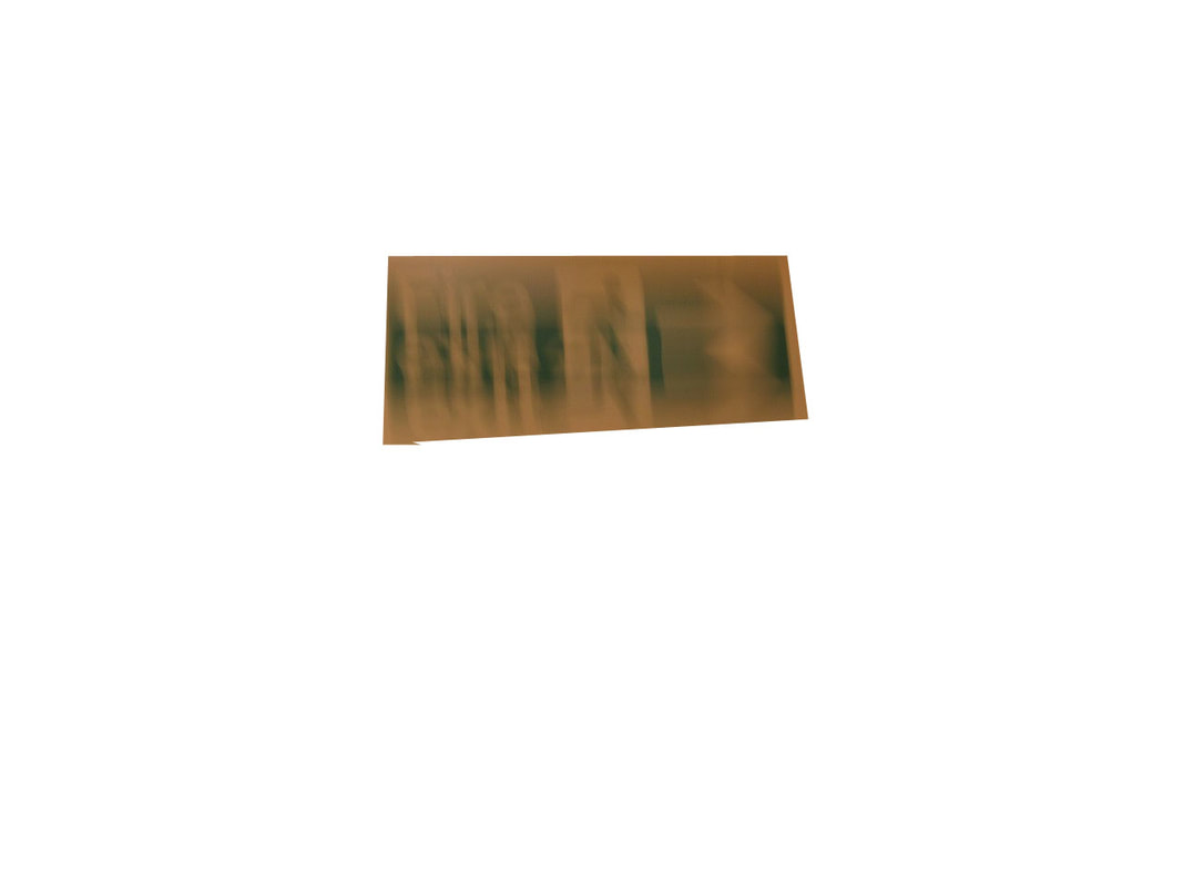
Unedited photos.
WWW: These photos are good for and edit to make them more abstract.
EBI: But they are all taken from simple angles and i could of experimented with the angles.
EBI: But they are all taken from simple angles and i could of experimented with the angles.
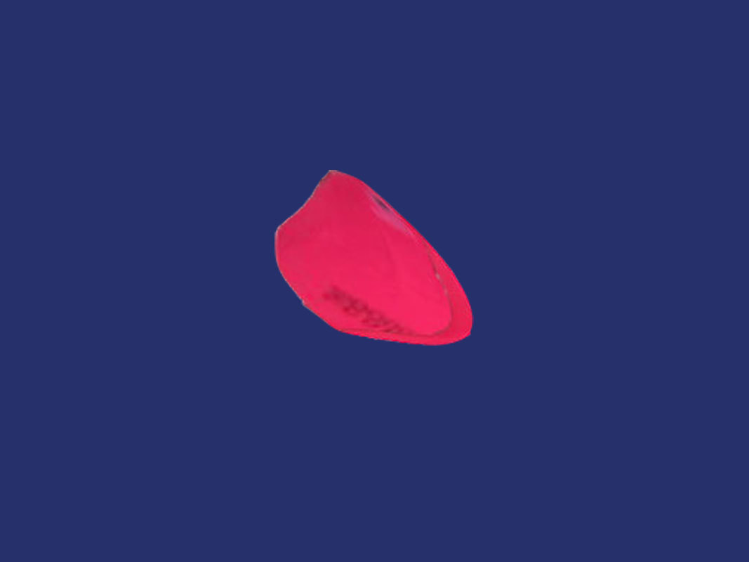
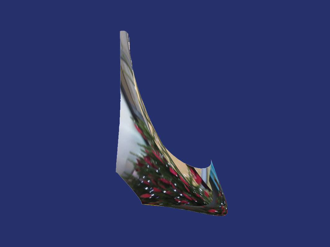
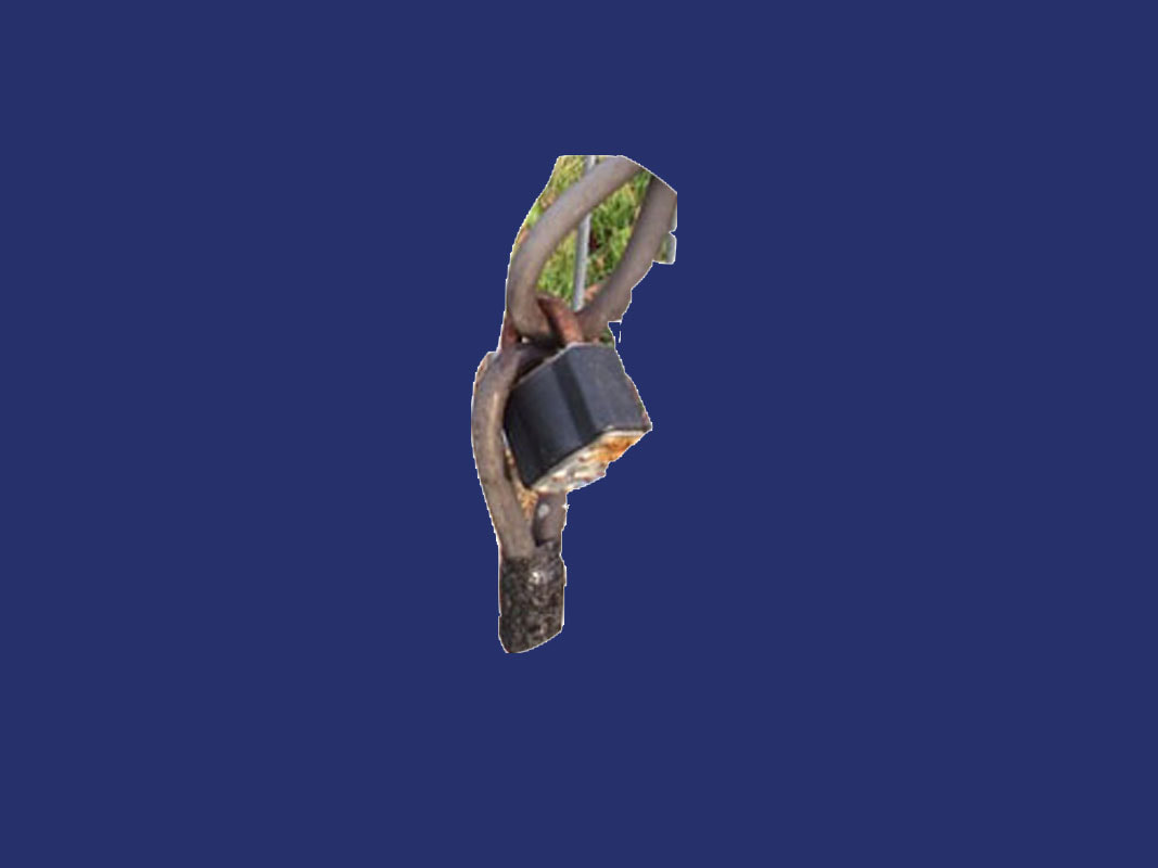
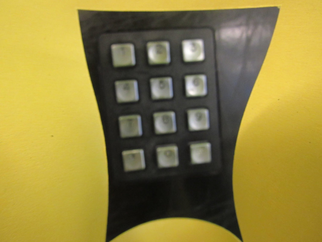
Edited photos.
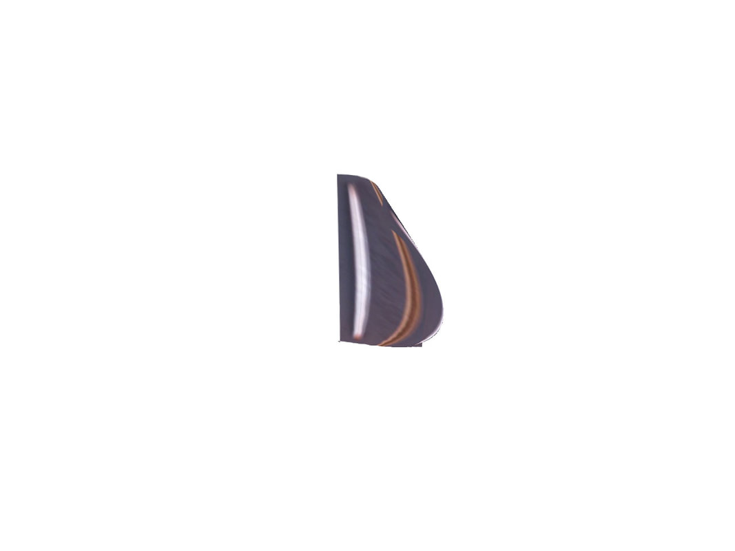
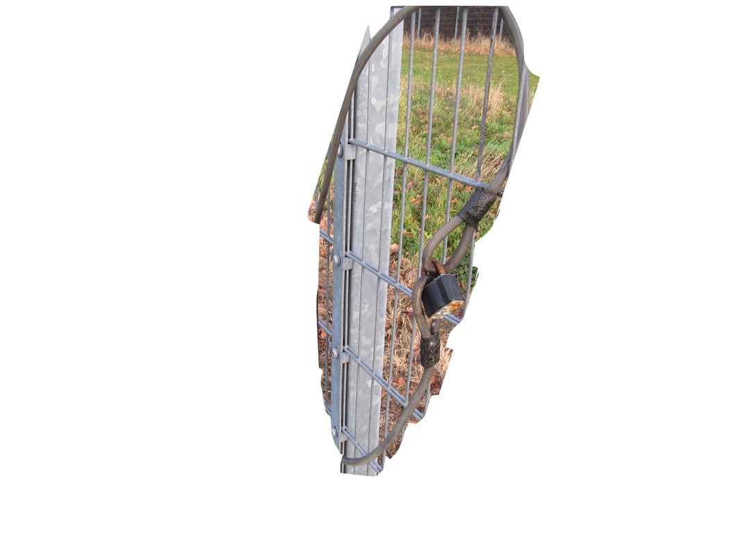
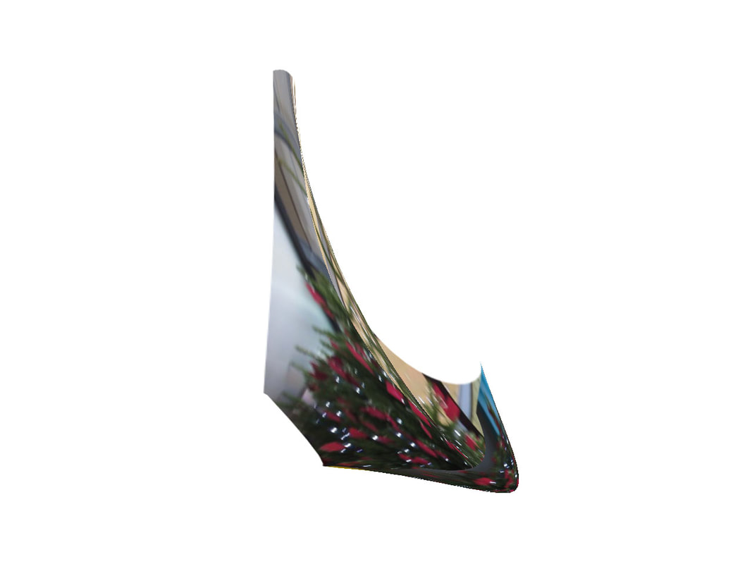
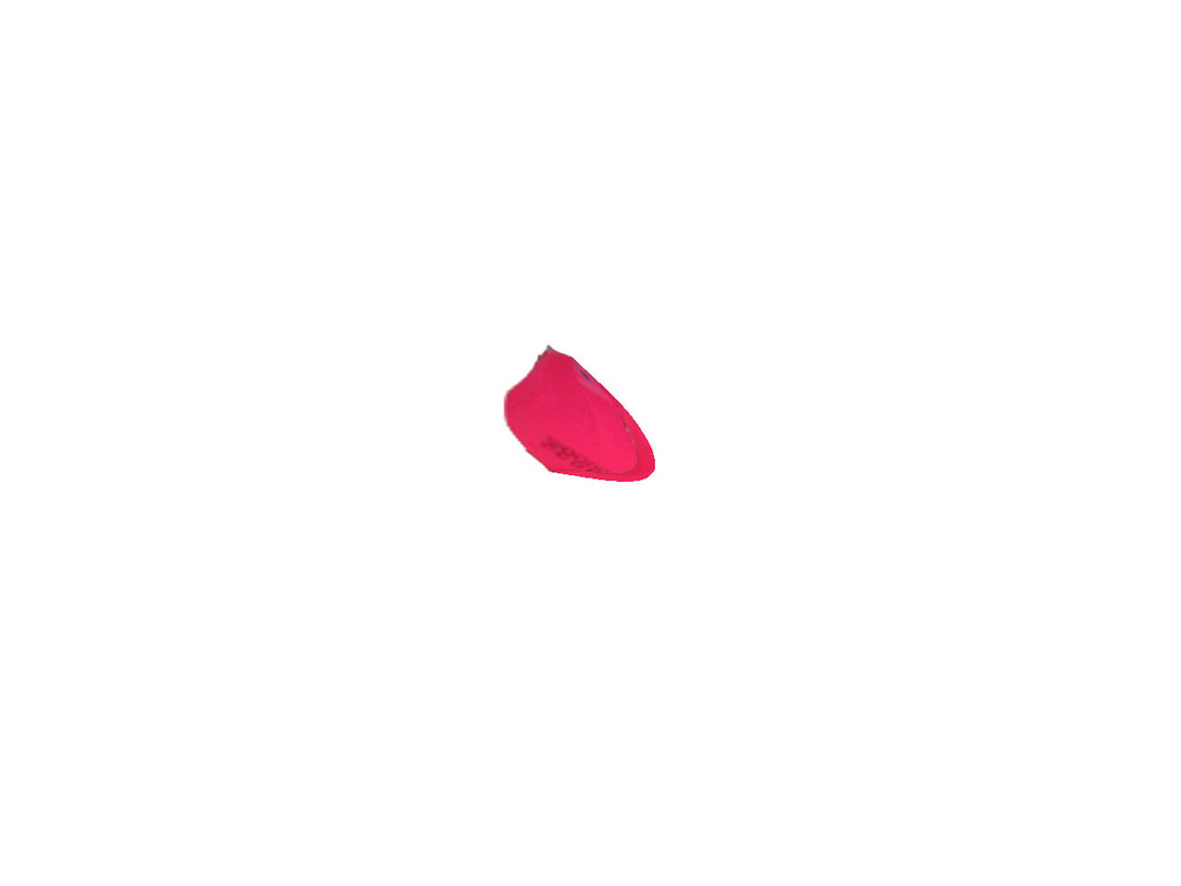
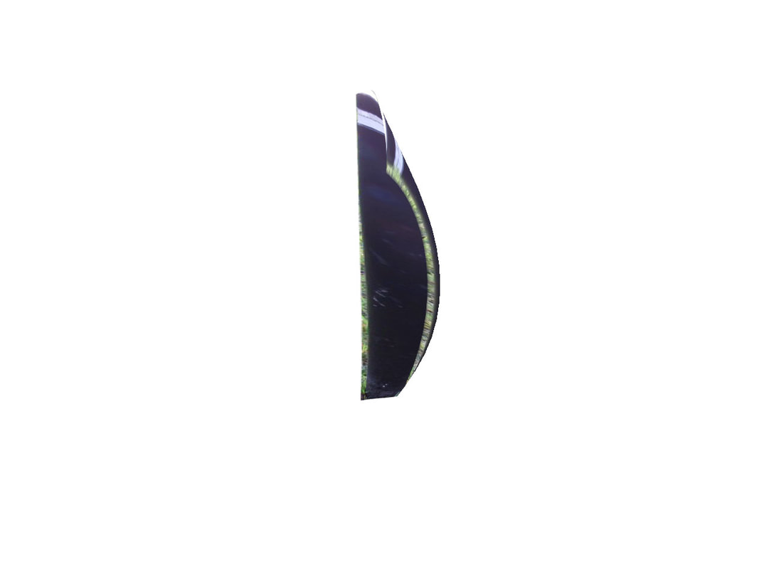
WWW: The edited makes it look more abstract and harder to see what they are.
EBI: But some of them blend into the white background making impossible to see so i am going to out a background that makes easier to see what they are but still are very hard to guess them.
EBI: But some of them blend into the white background making impossible to see so i am going to out a background that makes easier to see what they are but still are very hard to guess them.
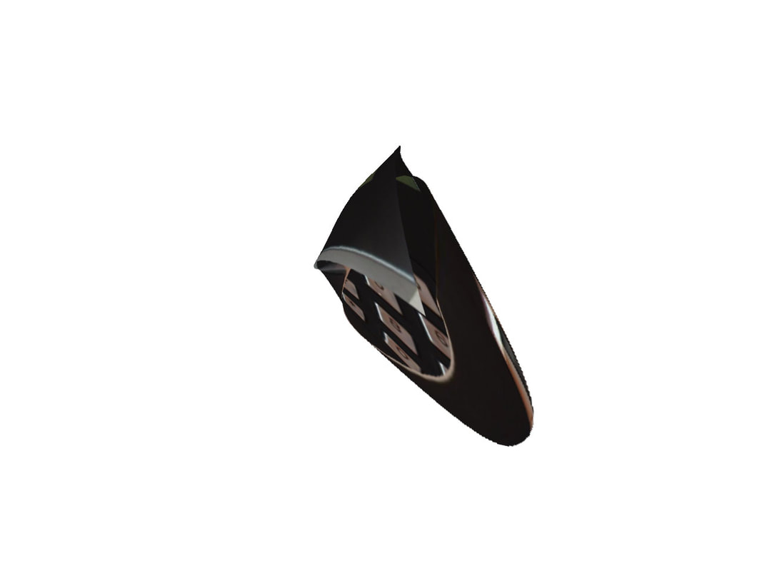
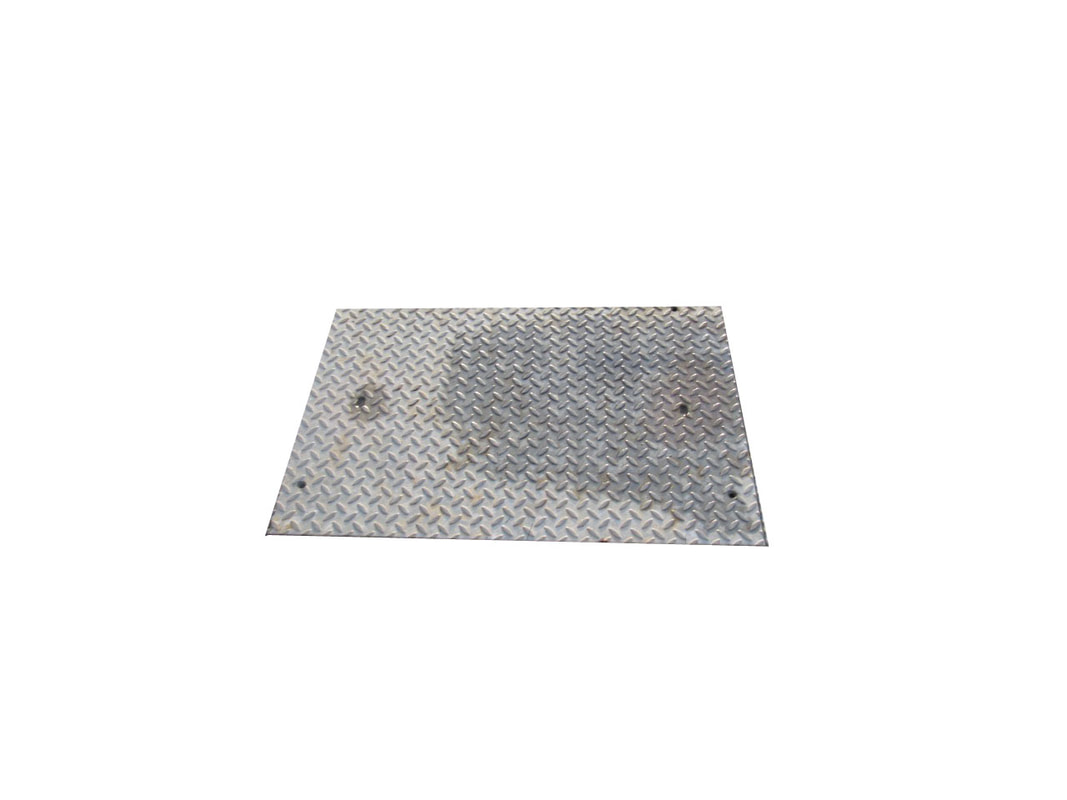
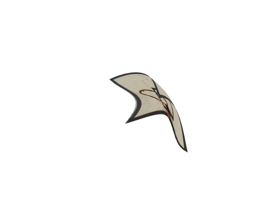
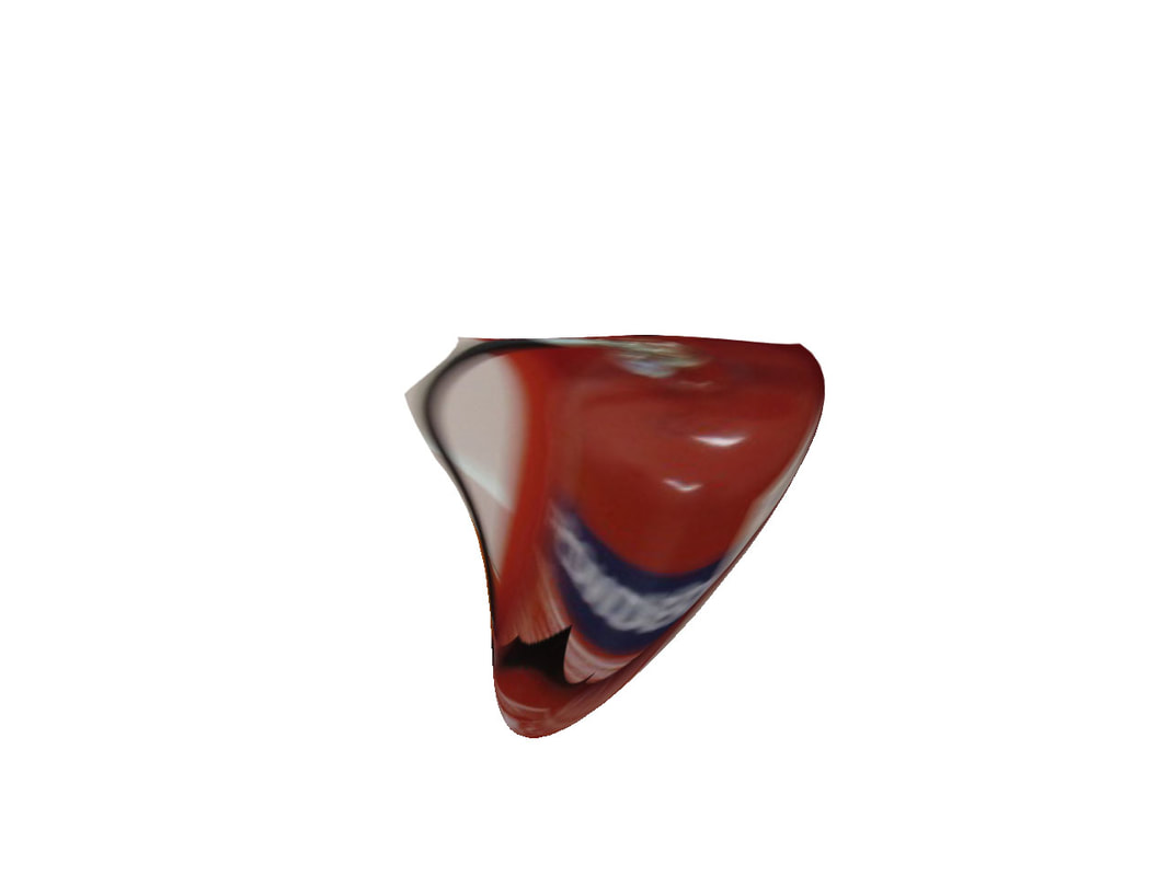
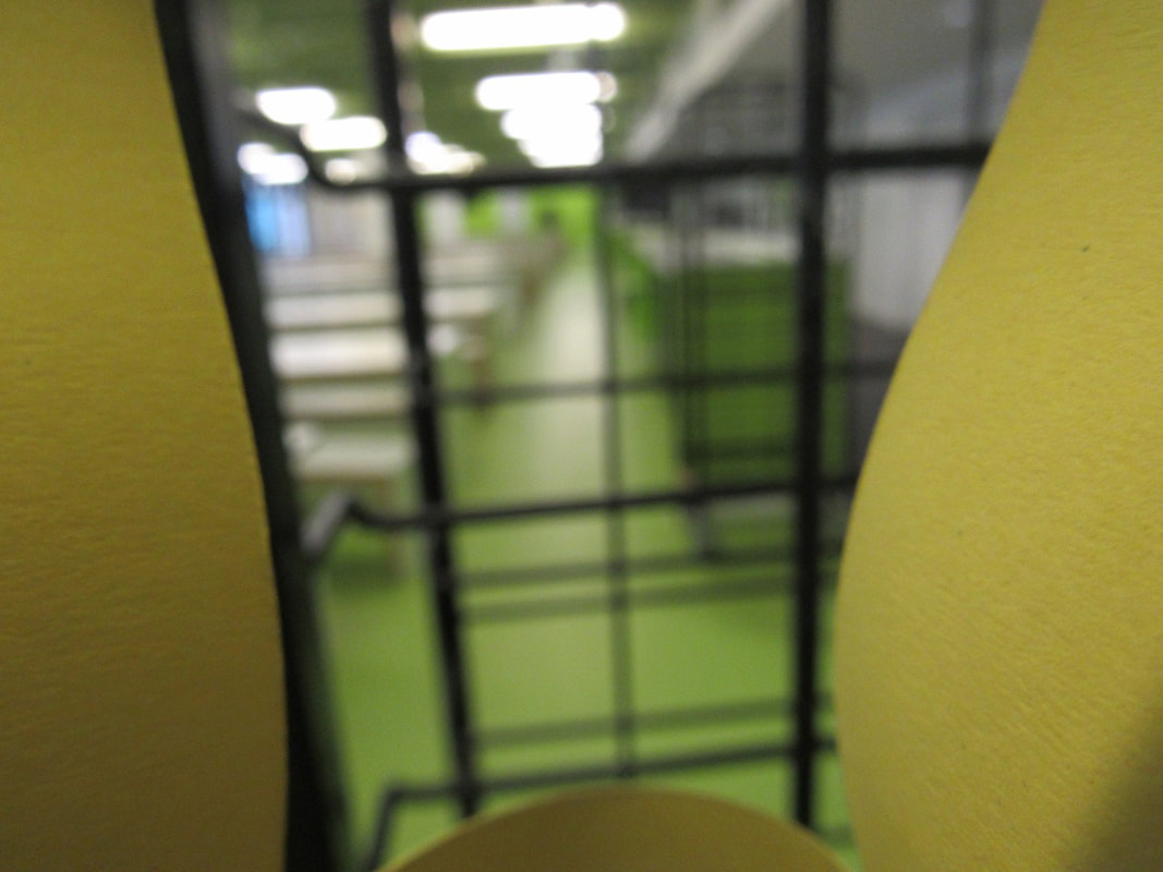
Final set of photos
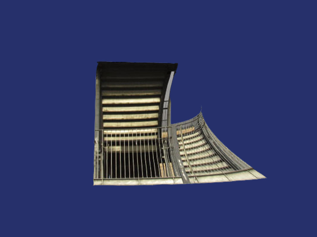
WWW: The final set are vey easy to get but there are a few that will stump people.
EBI: I could of found some more ways of making it harder.
EBI: I could of found some more ways of making it harder.
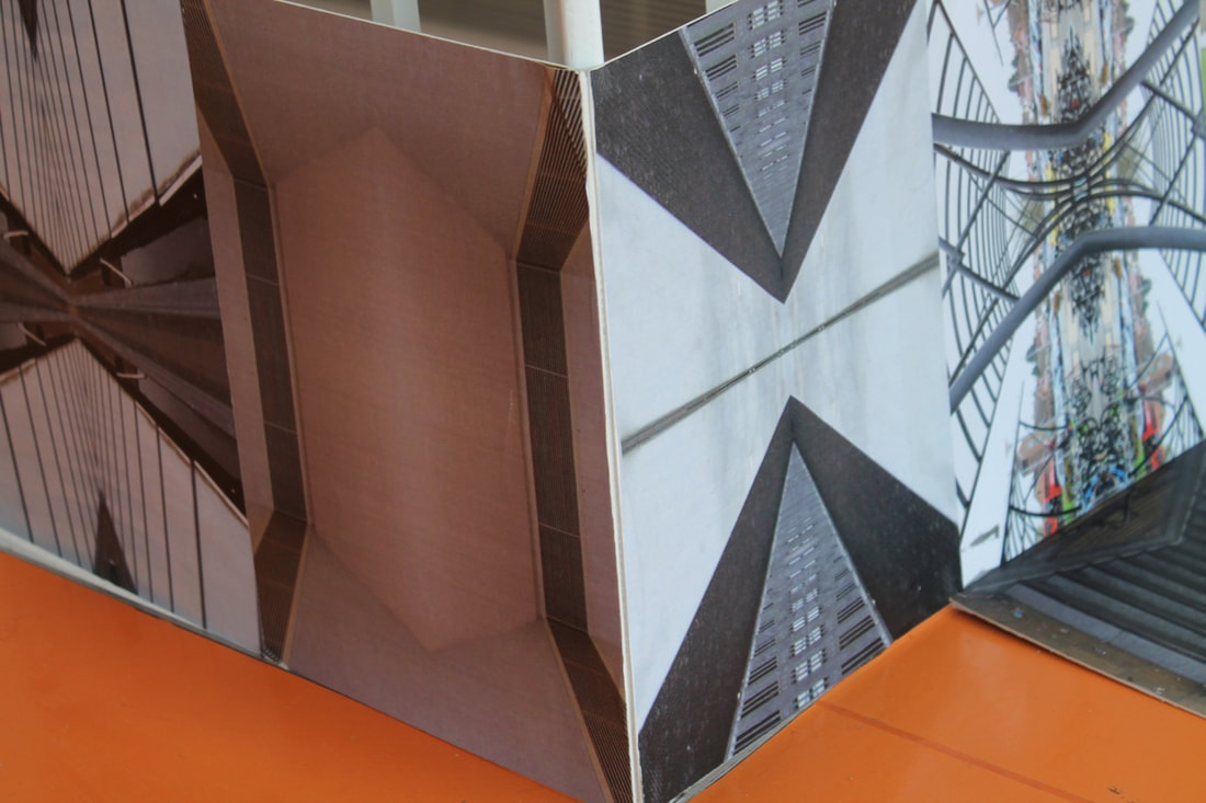
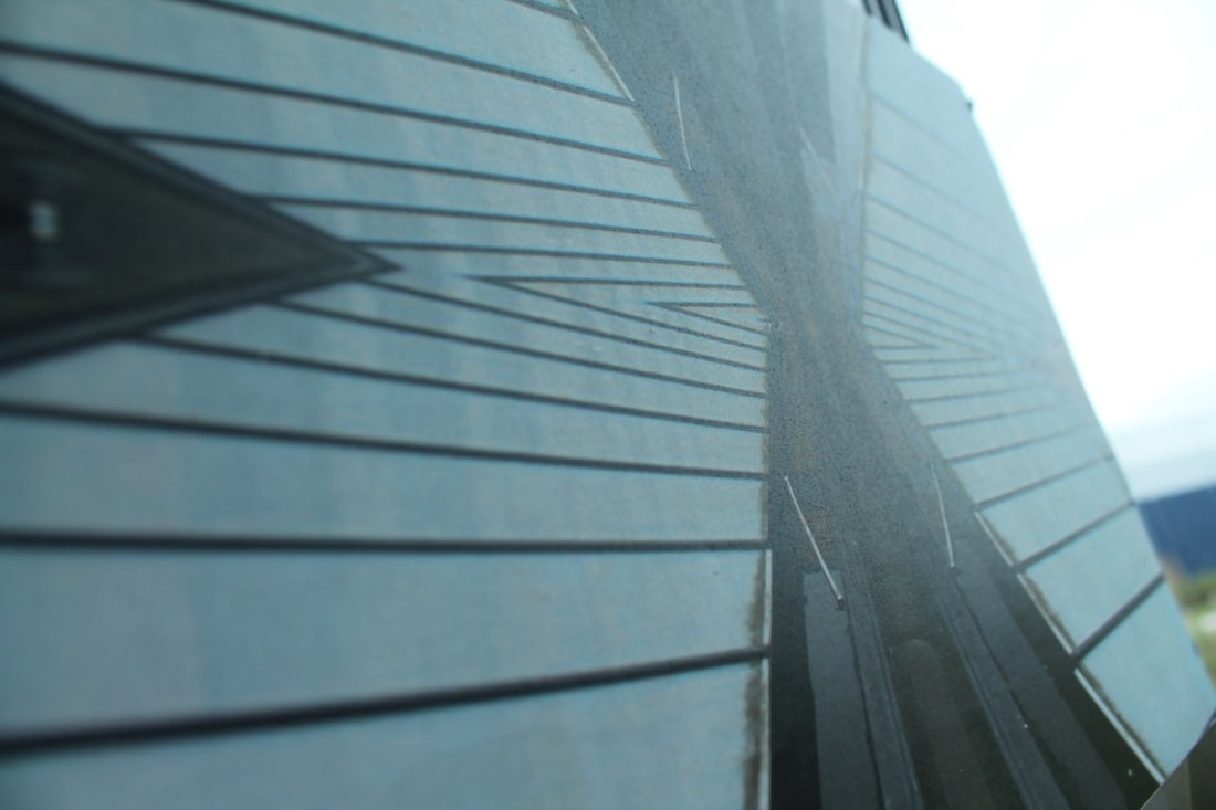
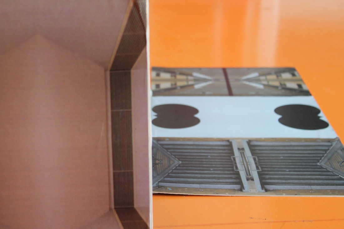
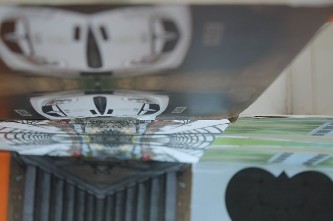
Final project
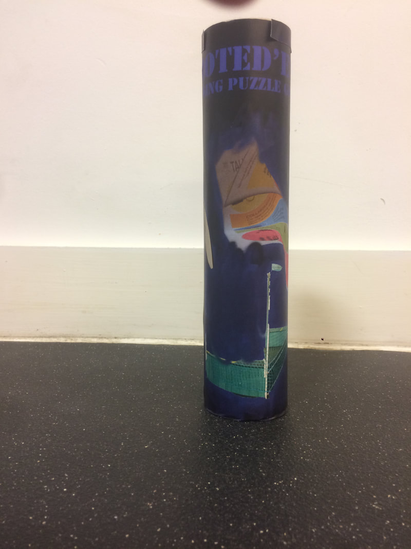
|
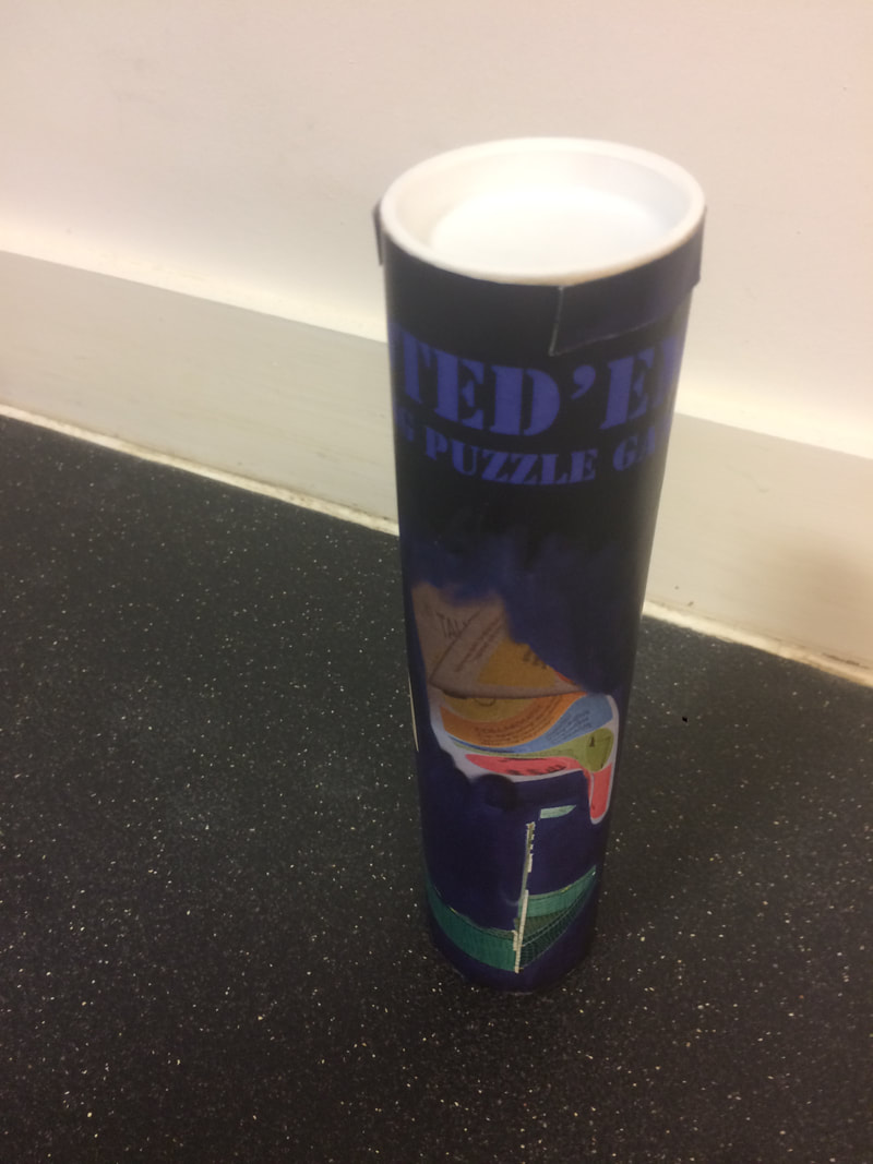
|
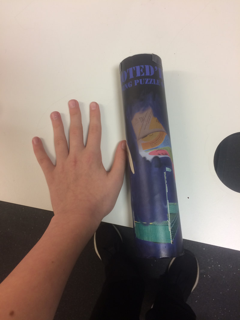
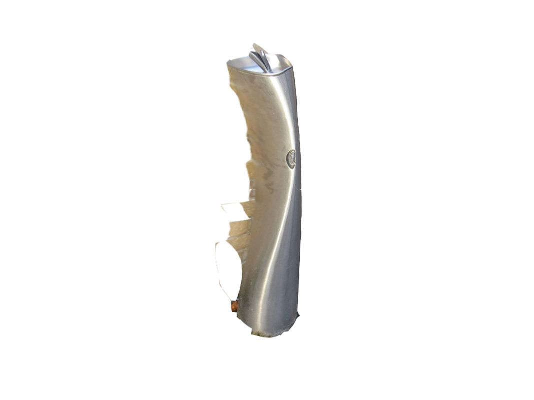
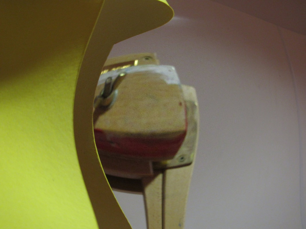
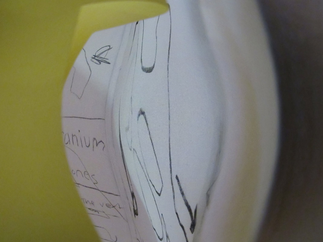
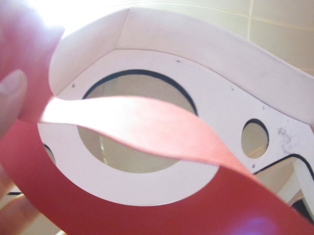
How I came to this product with using the cylinder as my box and the wrapping around it is at first my idea was to distort my images and keeping in a curved state adds to the distorted ways of my idea and the smudging on my cover is from a tool in photoshop called the mixer brush where it mixes and smudges the colours that you go over and then I made it bigger than I should of but not big enough so I had to use some black paper to fill in the blanks.
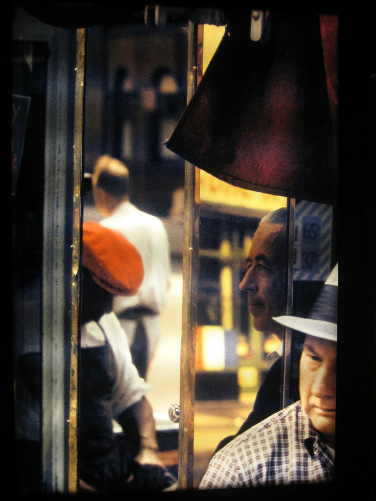
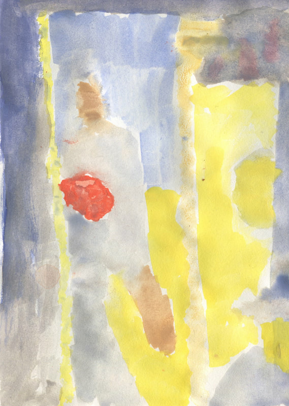
Saul Leiter painting
I made a painting of one of his photos and it was made of water colours.
|
|
WWW: I made something that resembles it partly.
EBI: I didn't make it out of water colours.
EBI: I didn't make it out of water colours.
My process that I did was first choosing a photo that has really bold colours to make it easier but that did not end well with I couldn't make black with the water colours at first I thought it was going well until I reached in the middle of the painting and the colour was so specific I gave up and just used yellow until I realised I missed parts and and had to go over the yellow bleeding the colours making it this.
Saul Leiter composition
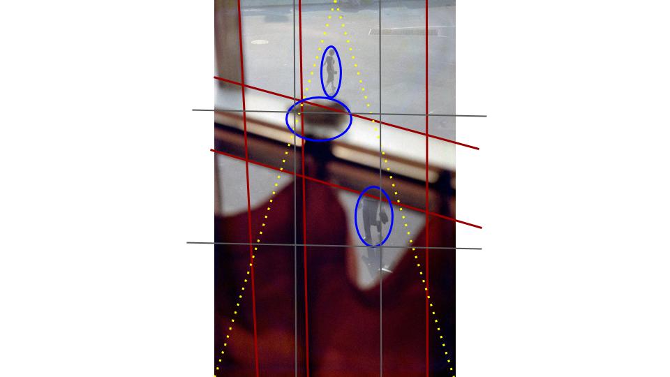
|
|
I made the composition that Saul Leiter used to make his photos
Half term homework
I had to make photos like Saul Leiter and this is them
First shoot with a viewfinder
WWW: I used an effect that made my photos more interesting.
EBI: I made some photos that used natrual elements.
EBI: I made some photos that used natrual elements.
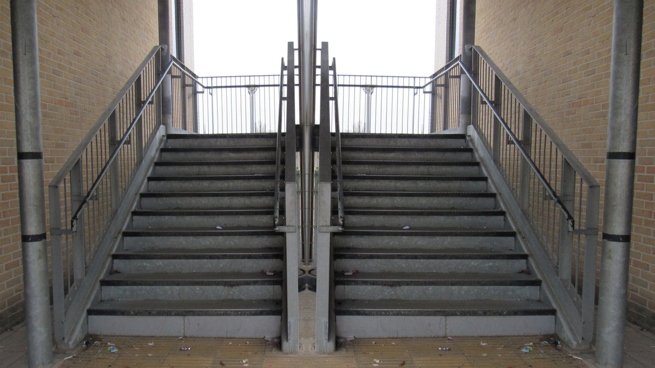
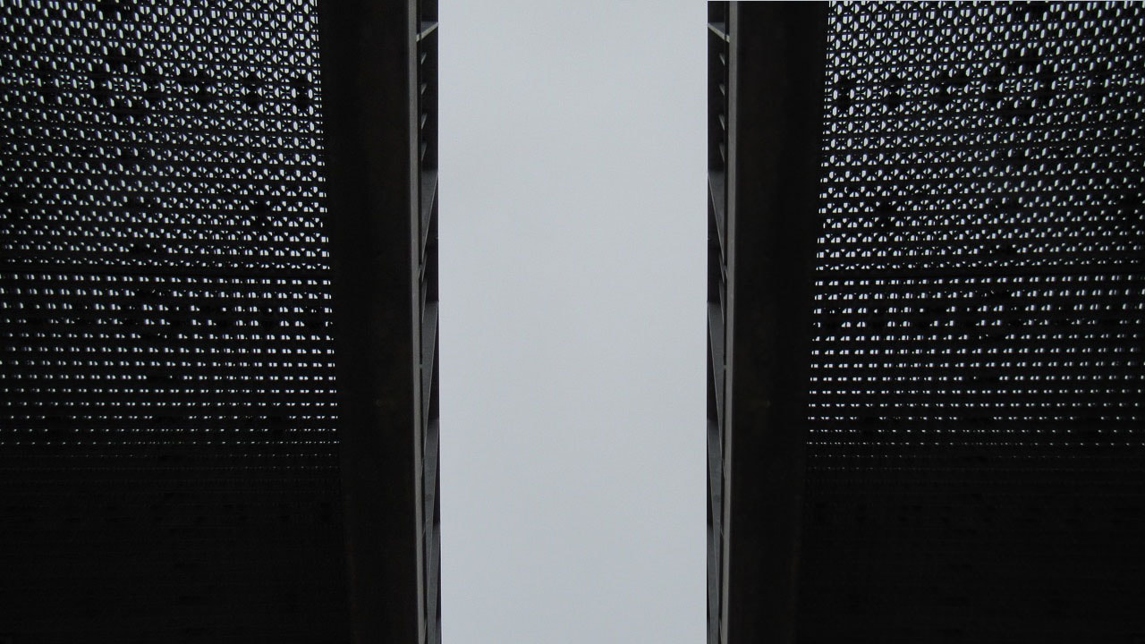
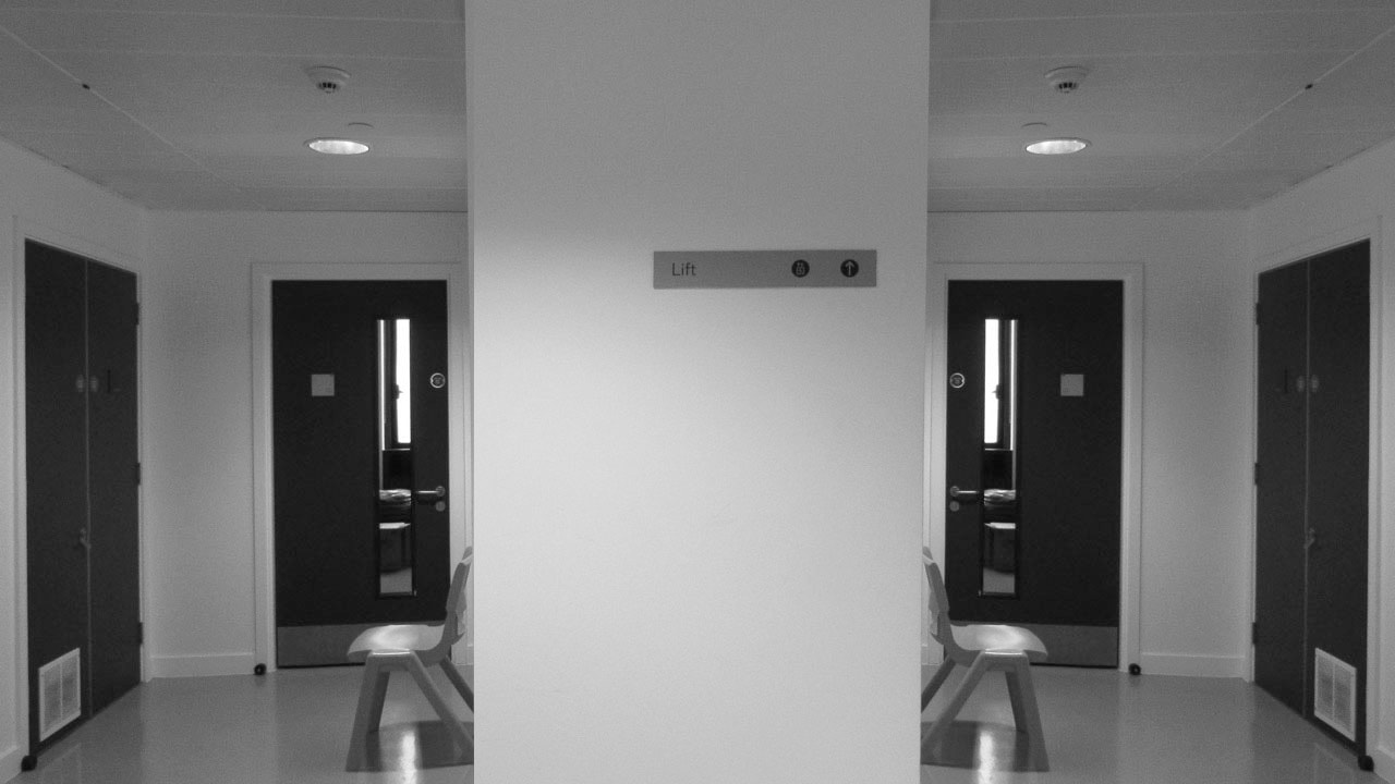
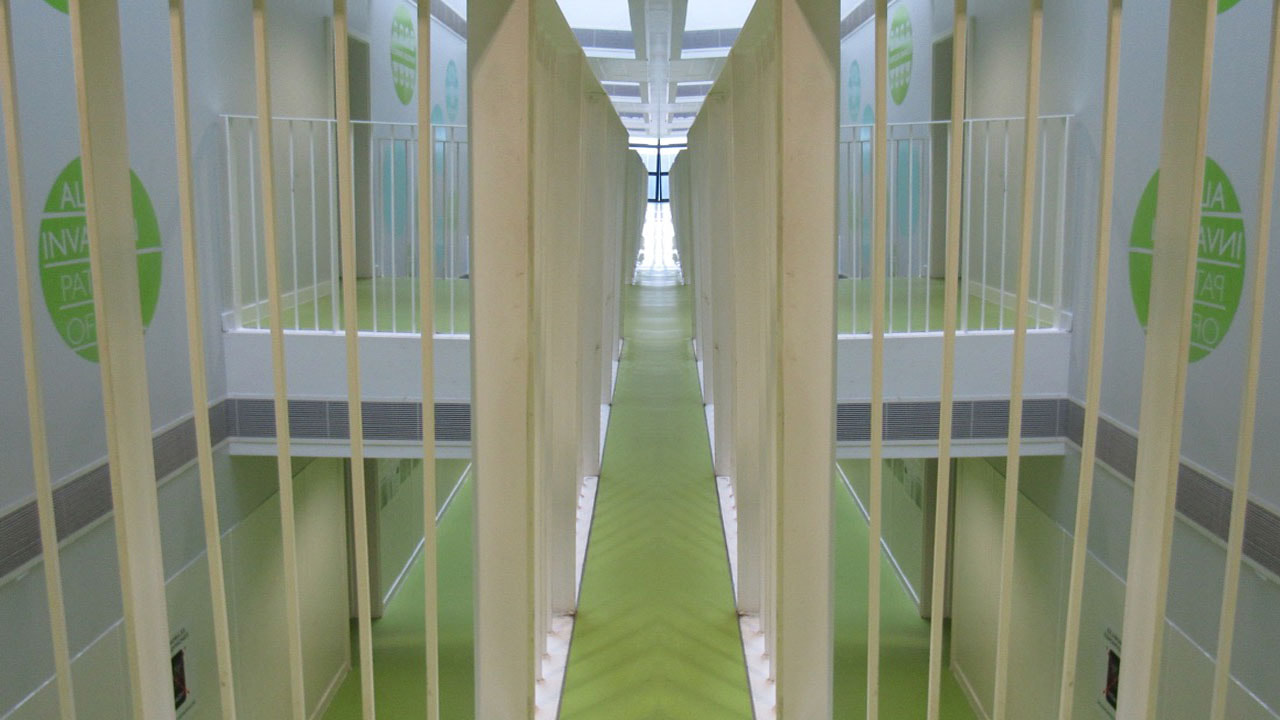
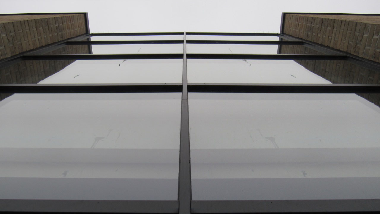
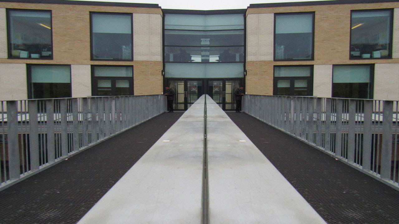
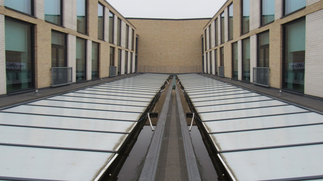
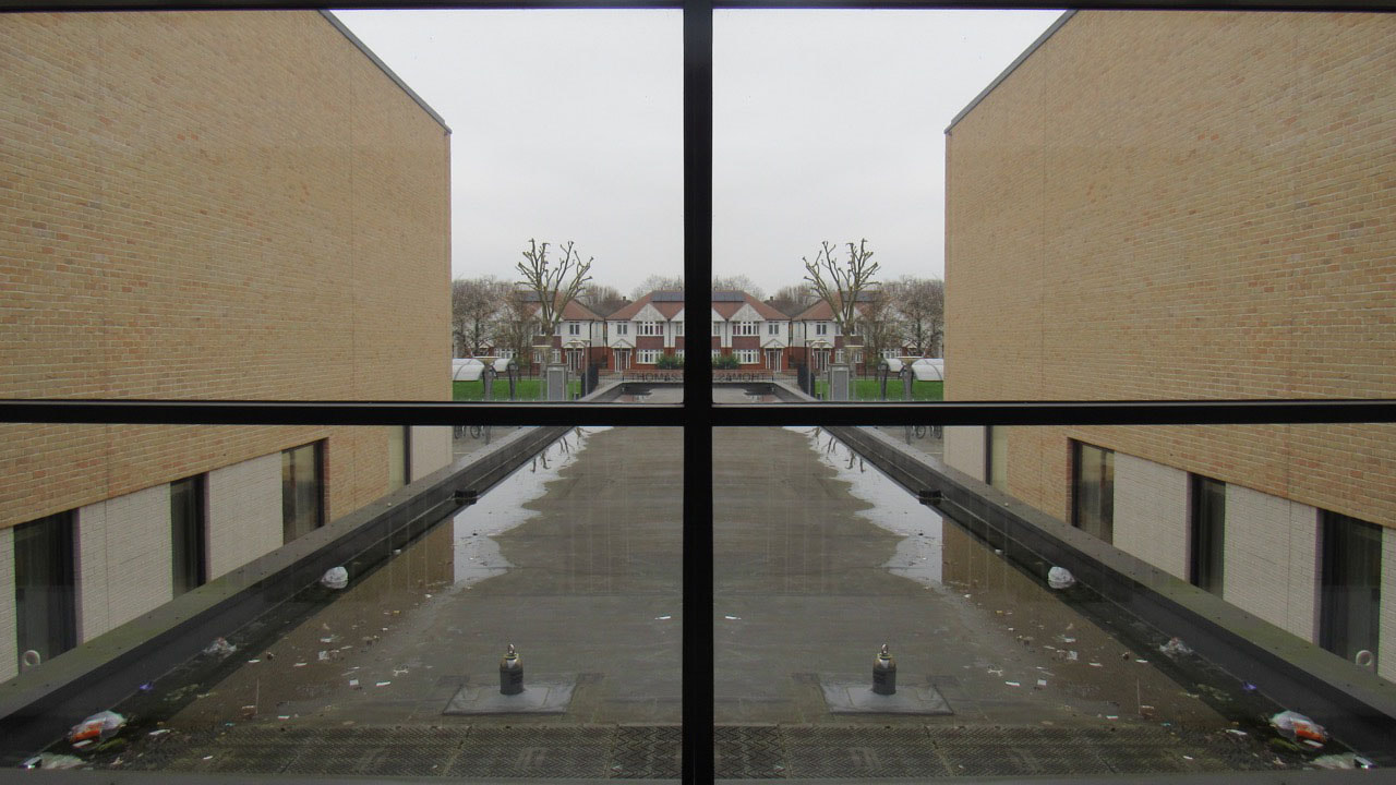
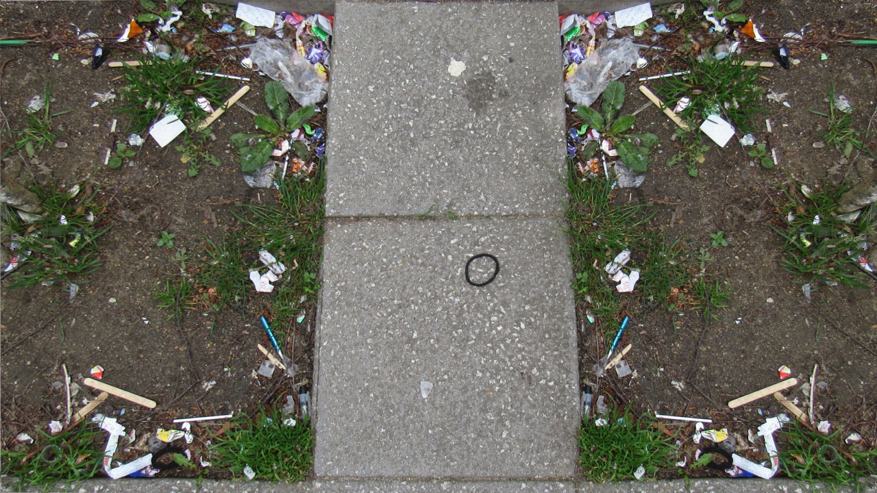
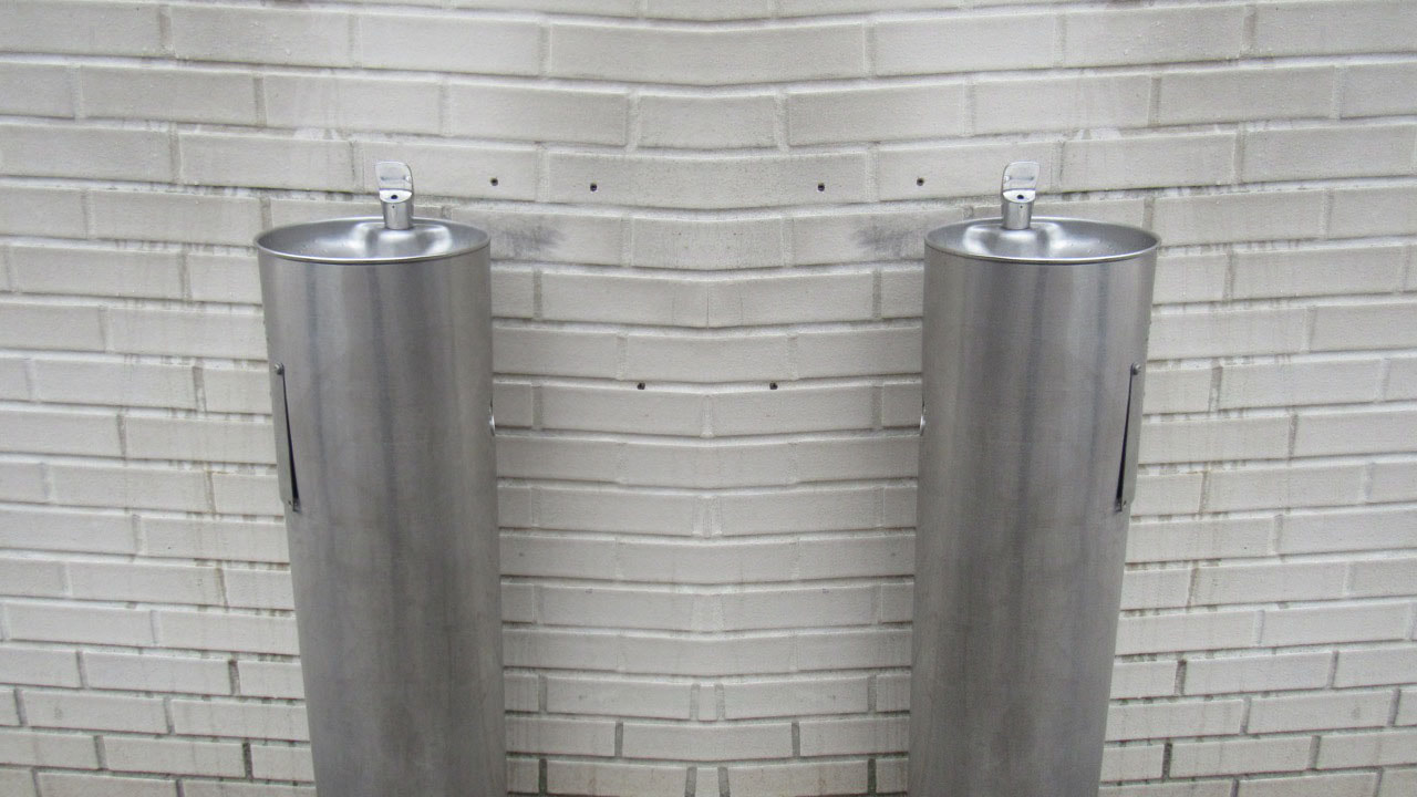
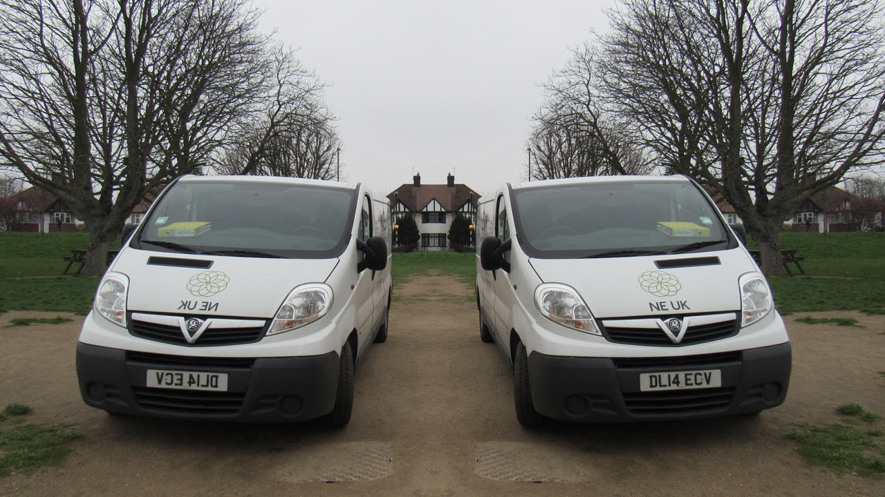
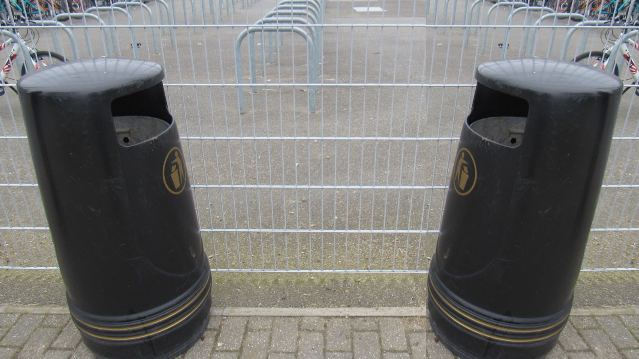
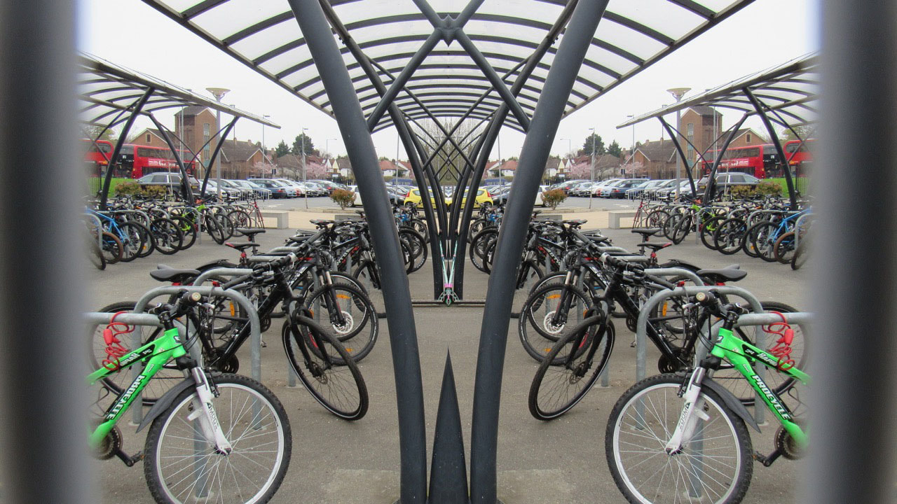
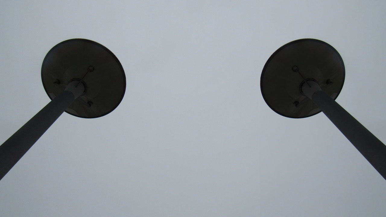
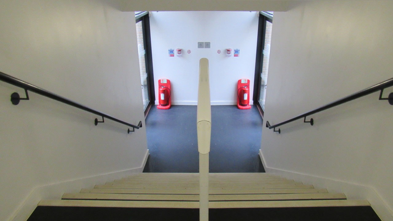
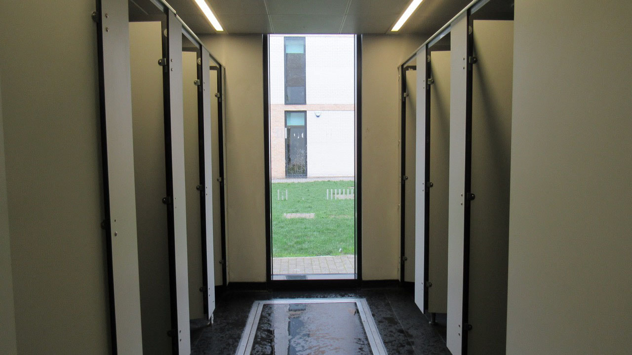
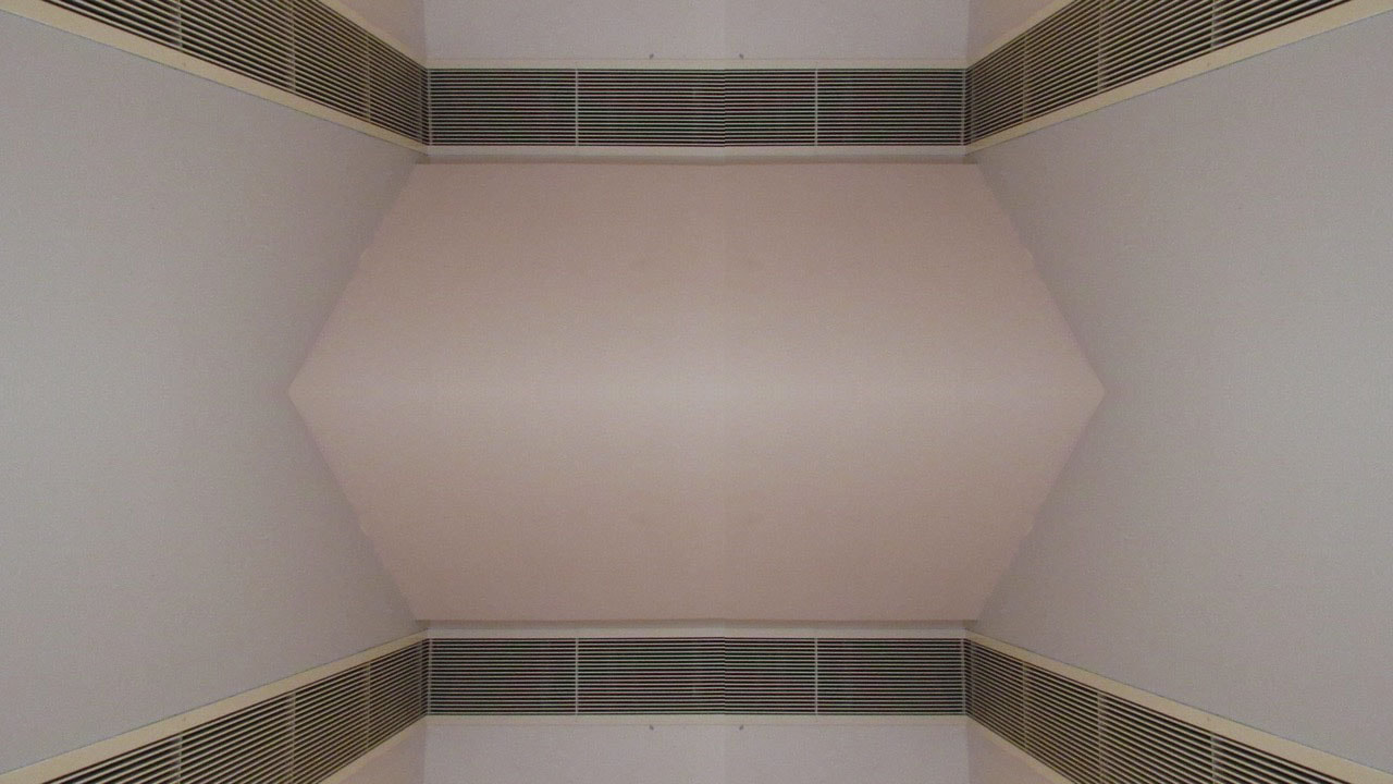
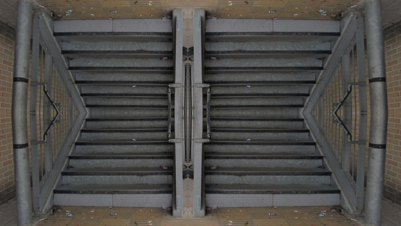
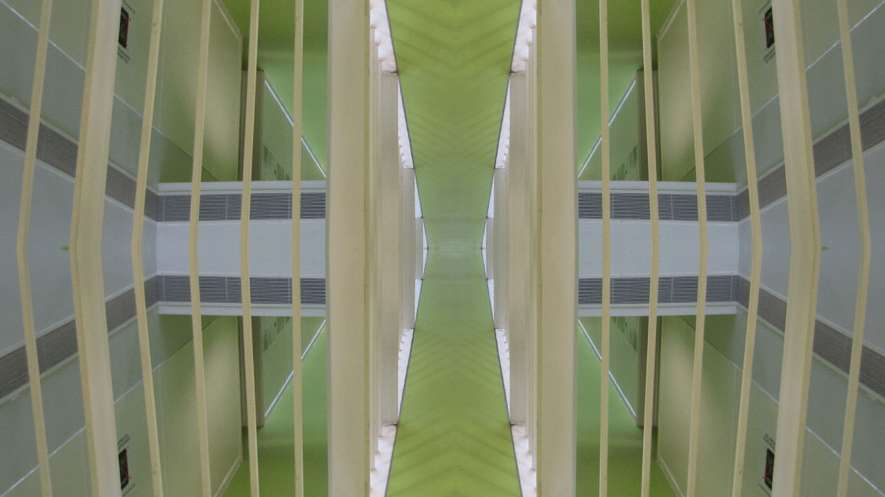
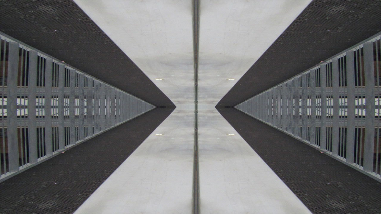
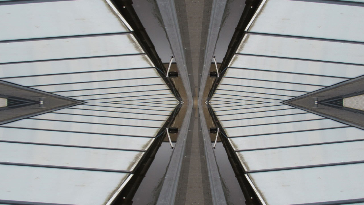
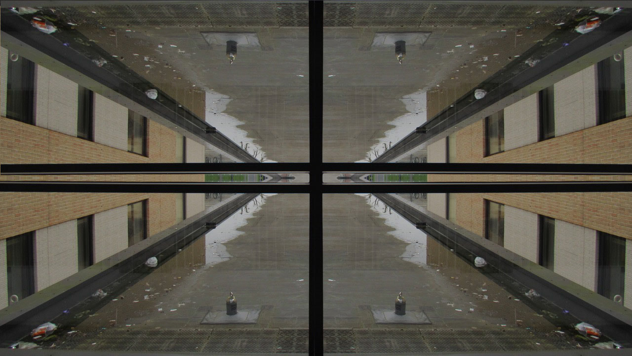
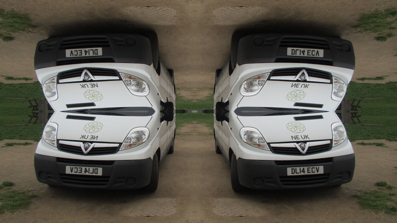
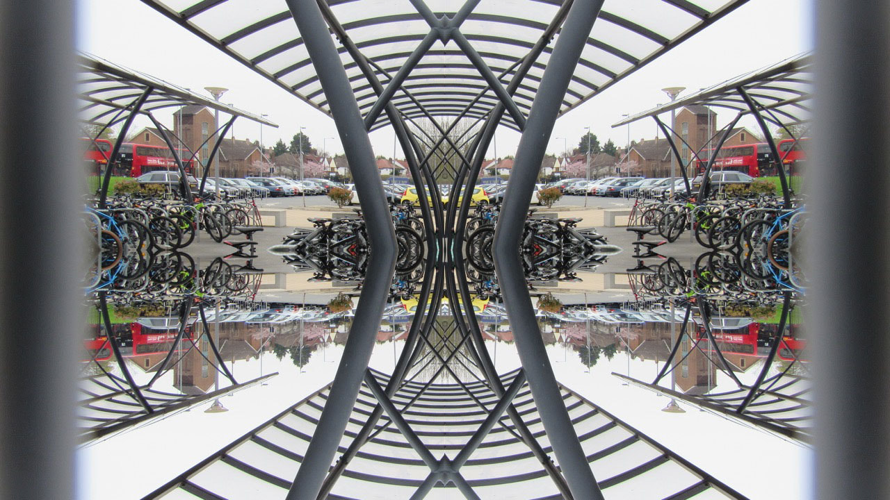
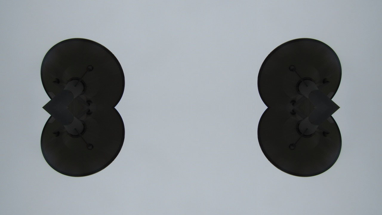
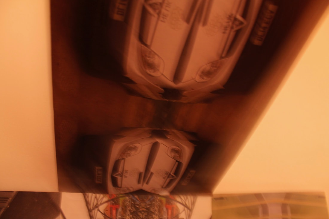
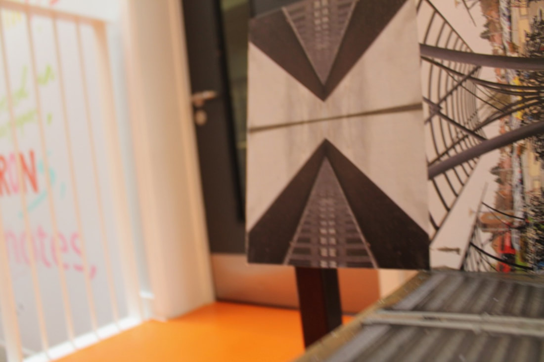
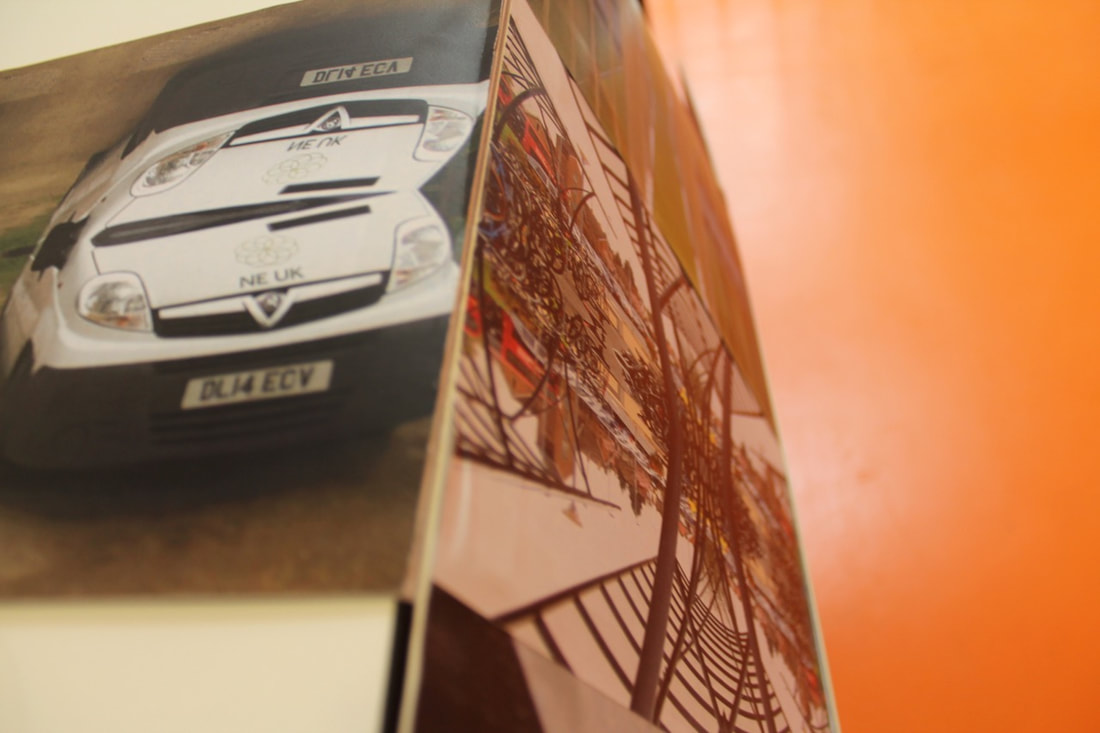
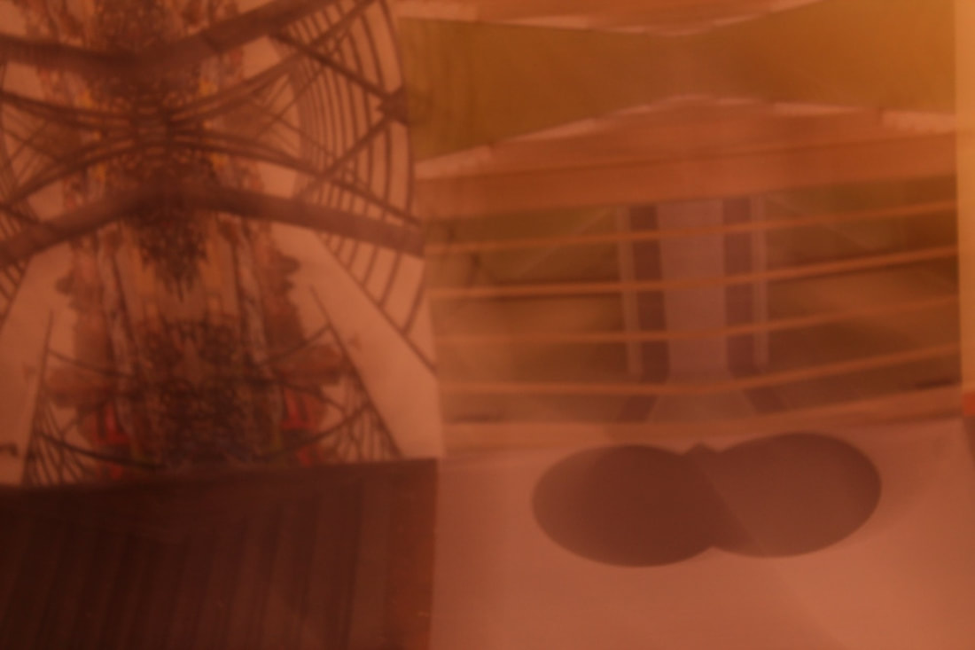
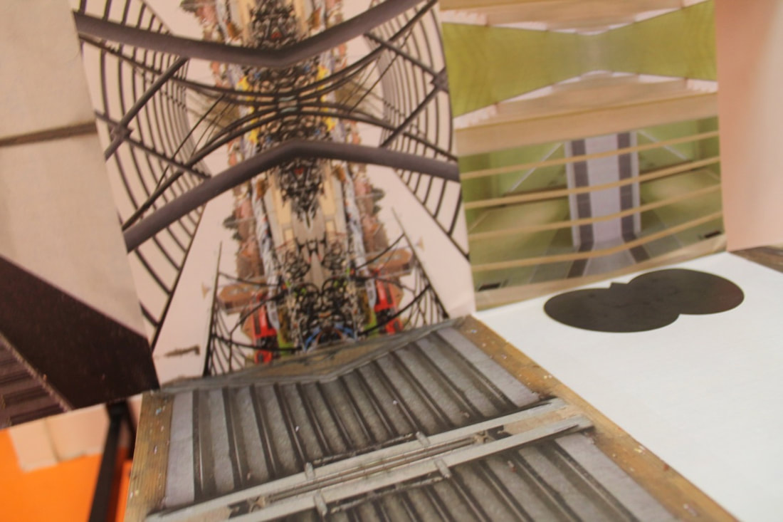
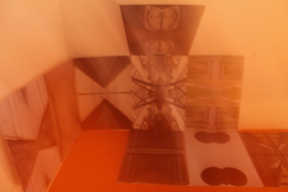
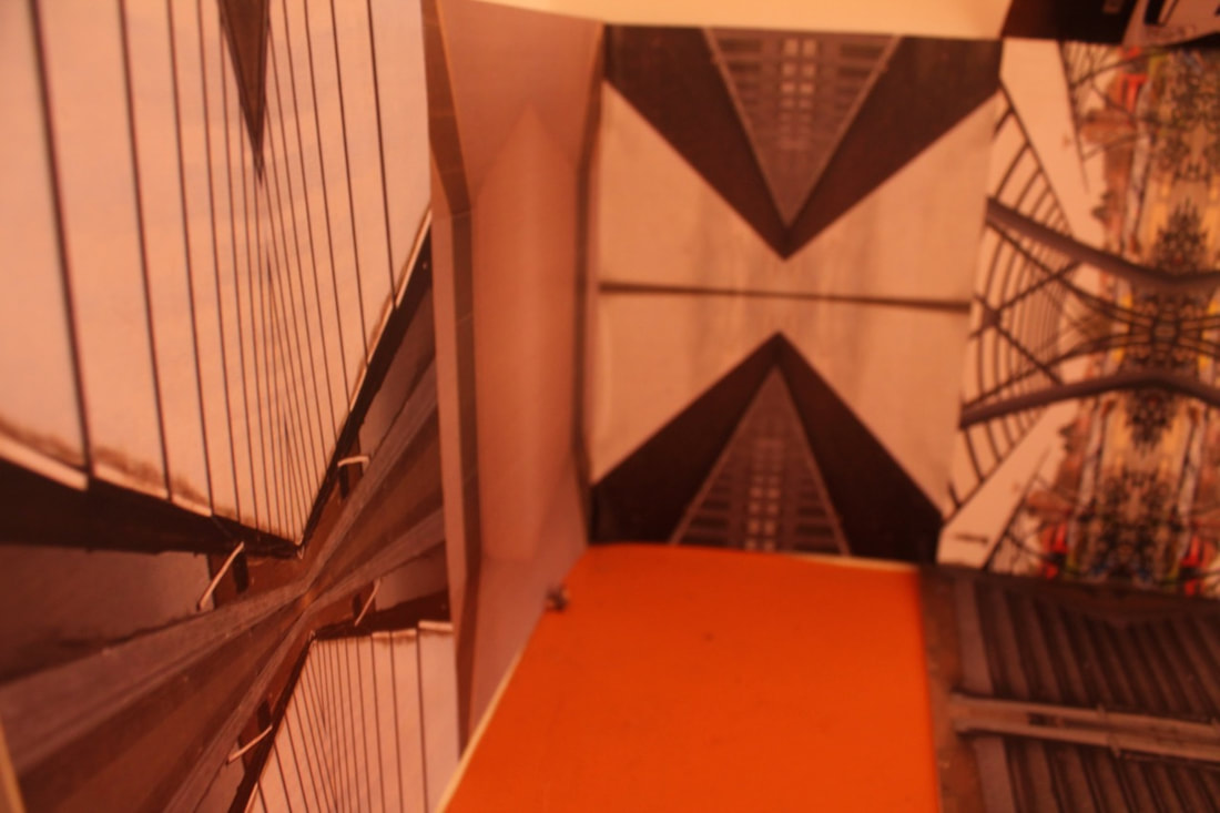
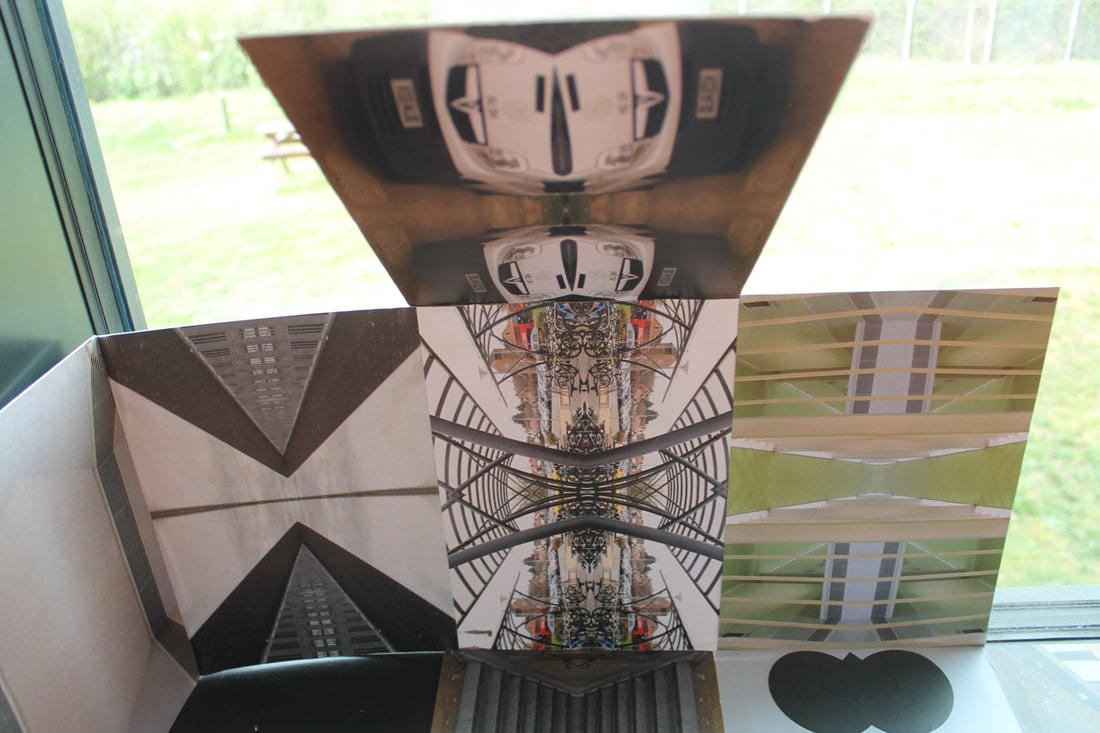
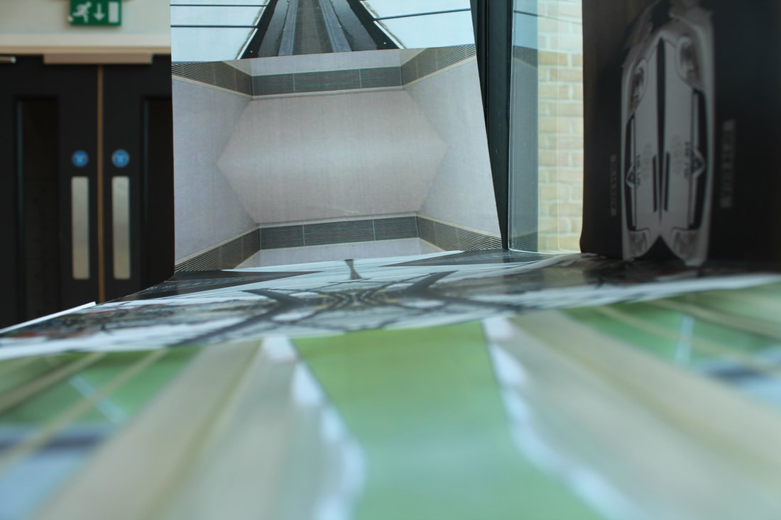
Personal project symmetry
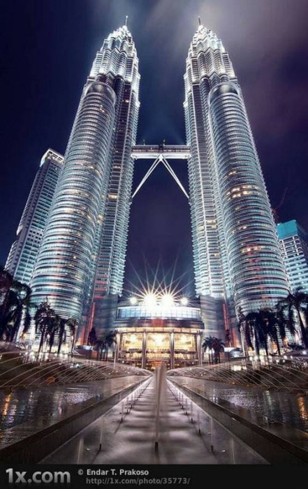
I am looking at the photographer Jim Zuckerman who does something to do with symmetry his photos are to with the symmetry with buildings where I am thinking of purposely editing the photo i take to be symmetrical.
The definition of symmetry is the quality of being made up of exactly similar parts facing each other or around an axis in photography terms it is the line that splits the image and on the other side is the exact same just flipped but i am going to do that by editing you can split them in any way top to bottom, side to side, corner to corner.
The definition of symmetry is the quality of being made up of exactly similar parts facing each other or around an axis in photography terms it is the line that splits the image and on the other side is the exact same just flipped but i am going to do that by editing you can split them in any way top to bottom, side to side, corner to corner.
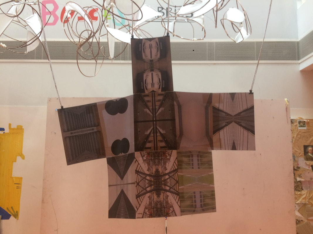
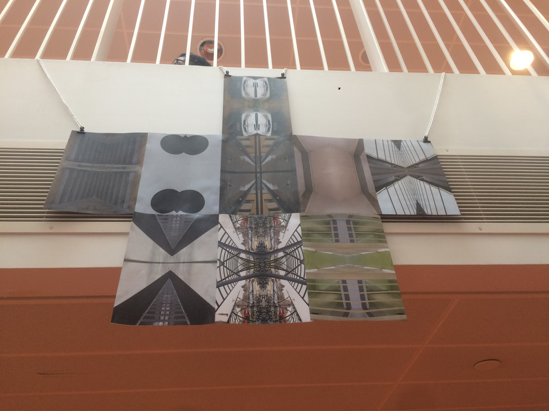
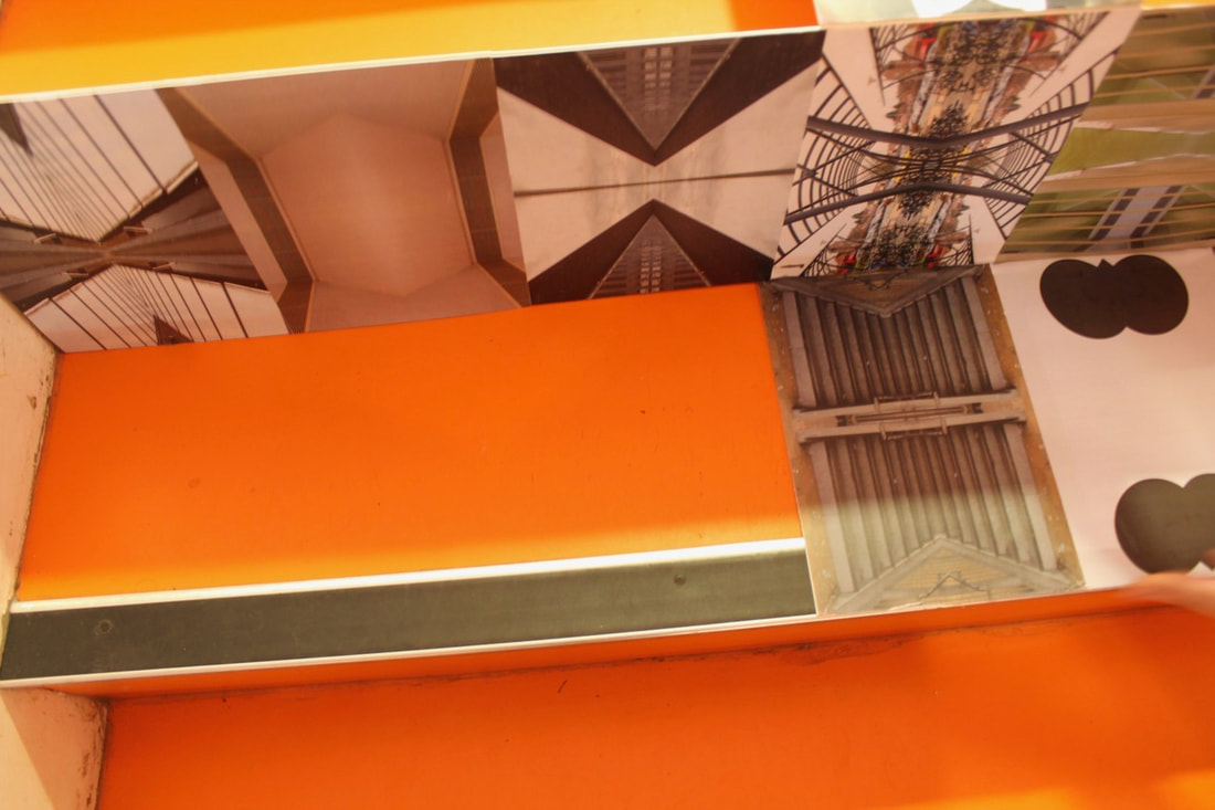
My final thought for my projects is to have one big symmetrical picture but have smaller symmetrical pictures around it but symmetrical to the big one.

Edited photos.
Final photos.
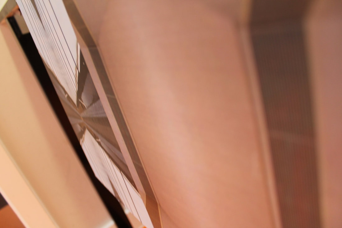
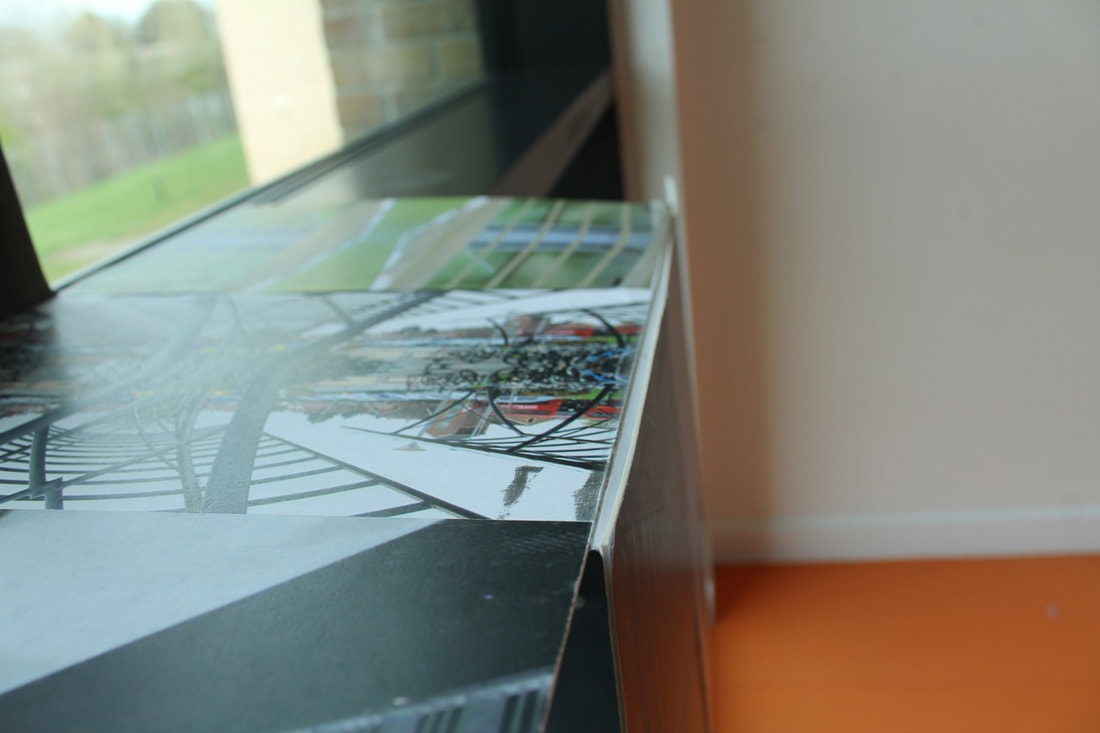
Final product
|
|
New final product
Evaluation
During this project i have researched a photographer Jim Zuckerman and what I found interesting is how he finds perfect symmetrical buildings and then takes a photo of them in all different ways. I learnt that symmetry can be found anywhere if you look hard enough. My ideas about abstraction in photography were at first about the unusual and the common but now my idea is that anything can be abstract in its own way. The types of abstraction I have explored is distortion symmetry composition these are the main three I have explored. My best idea was probably using the fish eye effect with a view finder of sorts with how everything curved creating something new that I haven't tried before. Some of the experiments I have carried out through abstraction are creating a game which you identify the object another trying to copy the composition of another photographer but the one that probably worked the best is the symmetry of creating something big but still symmetrical I have improved on the coping of the composition with changing the effect I am using in the photos. Some of my final outcomes in this project is a big piece of symmetry a game that you can play and i am happiest with the game because you can still enjoy it even though you know what it is, it is fun to look at people and they don't know what it is if I had more time I would like to make more final outcomes just with tiny differences and see how they compare to one another and if anyone else can see it. The most important thing I have learnt in abstraction is that anything can be abstract if you want it to be.
